In this blog

Need a design partner that scales with you?
See exactly how Design Shifu can become your on-demand design team. Book a free demo call.
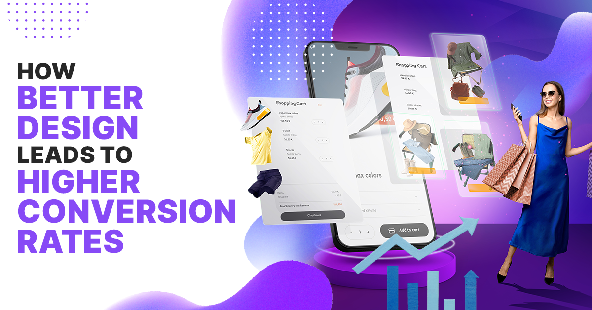
Did you know that 94% of first impressions are design-related? In today’s ultra-competitive, digital-first world, better design isn’t just a visual upgrade, it’s a revenue driver.
Whether you're designing landing pages, logos, email templates, or social ads, smart design decisions can increase your conversion rate by 200% or more.
Let’s design your way to higher conversions.
Why Design is the New Conversion Engine
1. Design Sets the First Impression
- Users judge a website in 50 milliseconds (Google Research).
- Poor design loses 38% of visitors instantly (HubSpot).
- Clean, intuitive, professional design builds trust fast.
2. Visual Hierarchy Guides Action
- Use contrast, whitespace, and typography to guide the eye.
- Something as simple as a button color change can drive 32% more clicks.
3. Speed and Performance Matter
- A 1-second delay = 7% drop in conversions (Akamai).
- Optimize design for fast load times with clean code and compressed assets.
4. Mobile-First Is a Must
- 57% of users won’t recommend a brand with a poor mobile site.
- Responsive design = smoother experience = more conversions.
Psychology-Backed Design Principles
1. Hick’s Law: Less is More
- Fewer choices = faster decisions.
- Simplify navigation and forms to reduce cognitive load.
2. Fitts’s Law: CTAs Should Be Easy to Click
- Make buttons large, bold, and strategically placed.
- Amazon’s 1-click checkout? Textbook example.
3. Von Restorff Effect: Make Key Elements Pop
- Highlight CTAs or offers with bold colors or contrast.
- Draw the eye naturally without overwhelming the user.
4. Social Proof Enhances Credibility
- 88% trust user reviews like personal recommendations.
- Incorporate testimonials, reviews, logos, or trust badges.
7 Proven Design Strategies to Boost Conversions
1. Craft Magnetic CTA Buttons
- Action-oriented language: “Try Free,” “Book a Demo,” “Get My Offer.”
- High contrast colors like red, green, or orange convert best.
2. Prioritize Readability
- Use short sentences, headings, and bullet points.
- Minimum font size: 16px; line height: 1.5x for comfort.
3. Use High-Impact Visuals
- Visuals boost conversion by up to 86%.
- Include explainer videos, product demos, or animated logos.
4. Minimize Form Friction
- Shorten forms to essential fields.
- Enable auto-fill and real-time validation.
5. Apply Color Psychology
- Red = urgency; Green = growth; Blue = trust.
- Match your palette to your audience’s emotion.
6. Feature Social Proof
- Highlight testimonials near CTAs.
- Display client logos, case study links, and ratings.
7. Speed Up Your Experience
- Compress files, reduce plugins, and cache assets.
- Aim for a load time under 3 seconds on mobile.
Real-World Case Studies: Better Design = Real Results
1. HubSpot: CTA Optimization
- HubSpot changed from a generic call-to-action of “Download” to a value-based call-to-action of “Get your free guide” and lead generation increased by 121%.
- The change was purely the text of the call-to-action was updated, the size of the call-to-action was increased, and it was a color that wasn’t as similar to the surrounding elements; drawing the users eye.
2. Airbnb: Making the UX Easier
- Airbnb redesigned their booking flow on both the app and website. The redesign simplified the user experience and reduced steps in the reservation process.
- They also added better color palettes, image designs, and layouts in general. The results? 25% more completed bookings from when the process just required fewer steps, as well as an ability to tell visual stories within their content.
3. Walmart: Load Speed Optimization
- Walmart did a series of performance tests across their web properties and found that for every 1 second improved load time, there was a 2% gain in revenue.
- Designers focused on keeping pages as simple as possible, reducing file sizes, and allowing the calls-to-action that they really cared about, above the fold.
4. Basecamp: New Homepage redesign
- Basecamp’s team completed work on a website redesign of their homepage by providing the user with clarity: clearing clutter, making the messages sharper, enhancing visual hierarchy, etc.
- This led to an increase of 14% in sign-ups within the first week of the new version releasing.
5. Trello: Visual Demos
Trello added a short explainer video as well as some visual interactive elements to their product pages. The two changes led to an increase in time-on-page and a not less than 20% increase in conversion rate.
Design Optimization Tools
ToolPurposeHotjarHeatmaps, session recordingCanvaEasy drag-and-drop visualsUnbounceLanding page A/B testingGoogle OptimizeMultivariate & A/B testsFigmaUI design + prototyping
Conclusion: Design for Conversions, Not Just Looks
Good design isn’t decoration, it’s persuasion. It grabs attention, builds trust, and guides action. From mobile responsiveness to CTA placement, every design decision can either lift or limit your conversion potential.
Take action
- Audit your landing pages for visual clarity and hierarchy.
- Use A/B testing tools to fine-tune your CTAs, colors, and layouts.
- Keep user psychology at the core of every creative decision.
Remember: The fastest path to more conversions isn’t more traffic, it’s better design.
FAQ
How does design affect conversion rates?
Design impacts how users perceive and interact with your brand. A clean layout, fast load time, mobile responsiveness, and clear CTAs reduce friction and guide users toward conversion. Good design builds trust, which is critical for driving action.
What are the most important design elements that influence conversions?
Key elements include visual hierarchy, color contrast, CTA buttons, page speed, mobile optimization, and social proof. Each of these supports a seamless user journey that encourages signups, purchases, or clicks.
Can improving design really increase revenue?
Yes. Real-world case studies show significant ROI from design changes. For instance, Walmart saw a 2% revenue increase per second of faster load time, and HubSpot boosted lead gen by 121% with a simple CTA redesign.
What tools should I use to improve my design for conversions?
Start with tools like Hotjar for heatmaps, Google PageSpeed Insights for performance, Canva for visual creation, and Unbounce or Google Optimize for A/B testing. These help you track, test, and iterate your design effectively.
How often should I update or test my designs?
Continuously. User expectations evolve quickly. Run monthly A/B tests, review performance metrics regularly, and refresh visuals or layouts quarterly based on user behavior and conversion data.
What role does typography play in conversion optimization?
Typography affects readability and user experience. Clear fonts, proper spacing, and hierarchy make content easier to scan, helping users quickly understand your message and take action.
About the author
Sameena is an Organic Growth Specialist and Content Writer at Design Shifu, crafting SEO-driven content that boosts visibility, builds brand authority, and drives meaningful organic growth.