In this blog

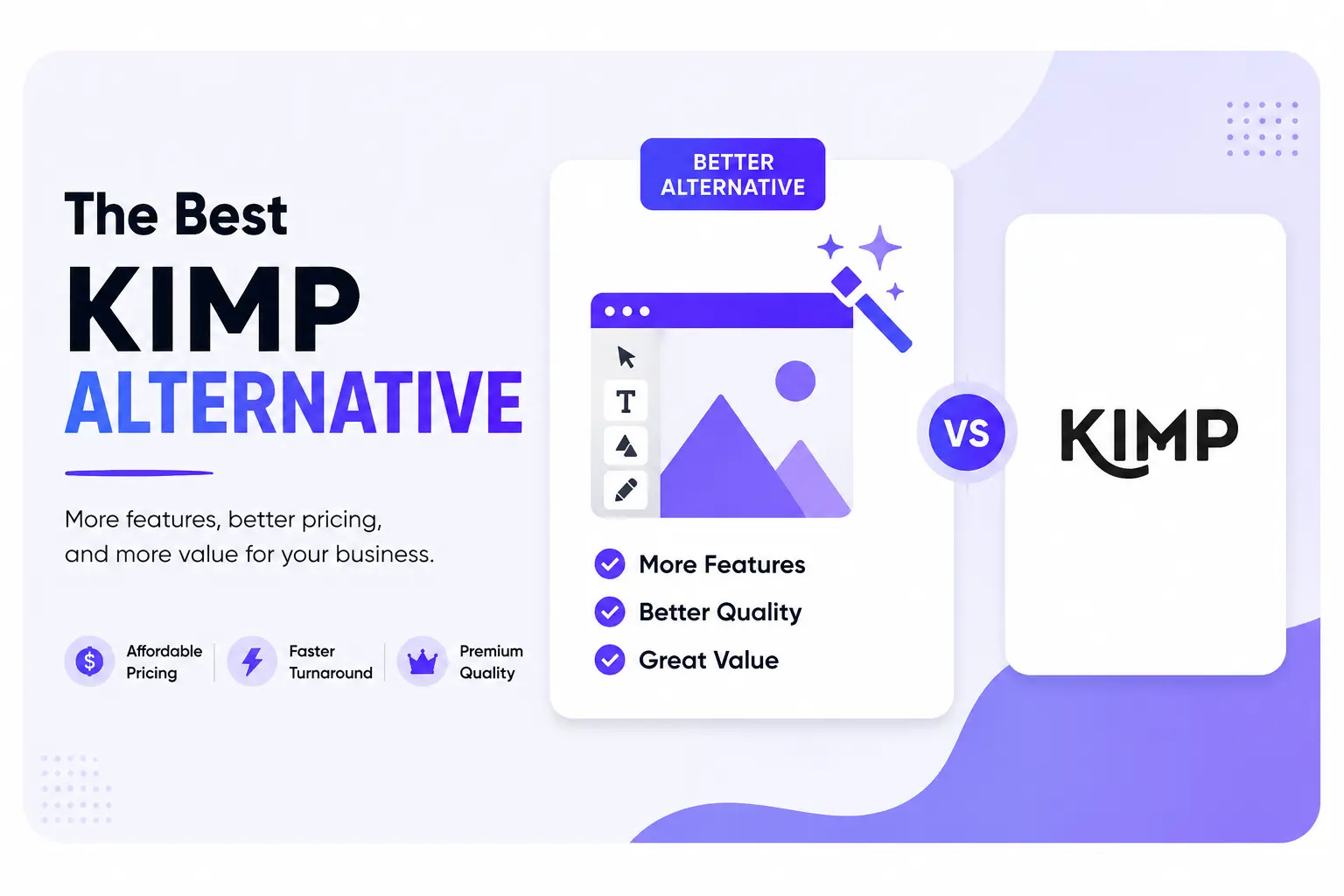
Need a design partner that scales with you?
See exactly how Design Shifu can become your on-demand design team. Book a free demo call.
Some logos are redesigned every few years. Badge logos tend not to be. Harley-Davidson's bar-and-shield has remained structurally consistent for over a century. BMW's roundel has held its core form since the brand's founding era.
The Porsche crest has been in continuous use since the 1950s. That consistency reflects something structural about the format.
Badge logo design packages a brand's name, symbol, and personality inside a single enclosed mark. The result is self-contained, scalable, and instantly legible as a unified identity.
This guide covers what defines the format, how it differs from related logo types, the five main variants, and real brand examples. The elements that make one work, and the mistakes that reliably break them.
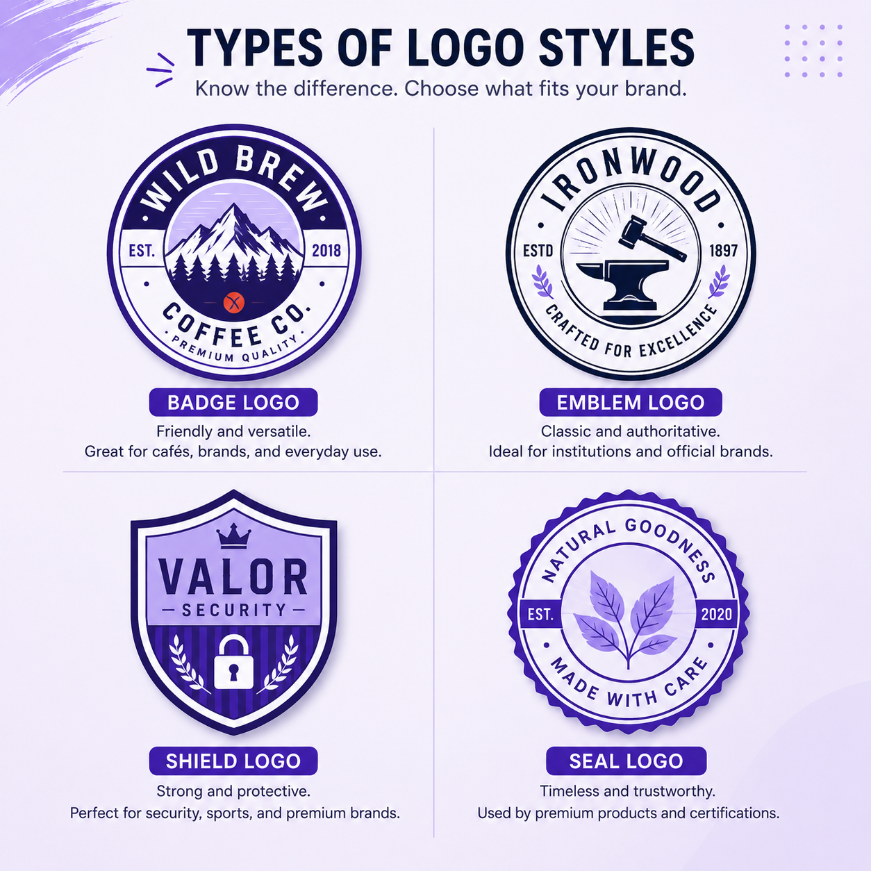
Badge, Emblem, Shield, Seal: Clearing Up the Terminology
These four terms are frequently used interchangeably. They are not the same thing. Before examining badge logo design types, the terminology needs to be precise.
Emblem logo
An emblem logo is the parent category. It refers to any logo that encloses typography and imagery within a single unified shape. Badges, shields, and seals are all subtypes of emblem logos. "Emblem" and "badge" are often used interchangeably in casual conversation, but in design taxonomy, emblem is the broader term.
Badge logo
A badge logo is a subtype of emblem logo. It is typically circular or oval, contains a layered composition of icon, brand name, and often a tagline or founding year. This is built for applications like apparel labels, packaging, and brand marks where a stamp-like, self-contained identity is needed.
Shield logo
A shield logo is an emblem subtype defined by its heraldic shape. The enclosing form has a pointed or curved base, traditionally associated with protection, authority, and institutional heritage. Sports teams, insurance providers, and security companies favor this variant.
Seal logo
A seal logo shares the circular structure of a badge but draws from official and governmental visual language. Radial typography, wax seal references, and formal compositional rules are common. Universities, financial institutions, and government bodies use this variant. The visual message is certified rather than branded.
The practical rule: If the logo reads as a stamp or patch, it is a badge. If it reads as a coat of arms, it is a shield. If it reads as a certificate or official mark, it is a seal. All three sit inside the emblem category.
What Is a Badge Logo?
A badge logo is a self-contained brand mark that combines typography, iconography, and decorative elements into one unified design. It is enclosed within a circle, oval, or shield shape, creating a cohesive, recognizable, and distinctive brand identity.
Three structural properties define the format:
Primary enclosure
The design reads as contained within an outer boundary. Internal elements may occasionally extend to or slightly break the frame for stylistic effect (as seen in some Harley-Davidson variants), but the overall composition is understood as bounded.
Layered hierarchy
Text and image are stacked or integrated, not floating separately as in a combination mark where a wordmark and icon sit side by side.
Stamp-like legibility
The full mark communicates as a single unit even at small sizes, making it well-suited for embossing, embroidery, and single-color applications.
Badge logos differ from standard combination marks in one critical way: the typography is inside the shape, not adjacent to it. Remove the enclosing frame from a badge logo and the design collapses. That structural dependency is both its constraint and its strength.
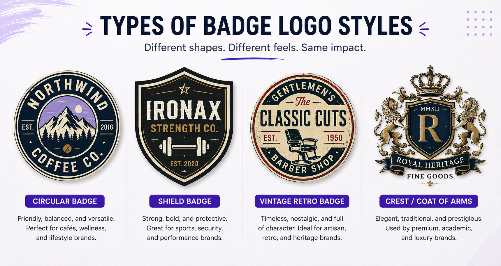
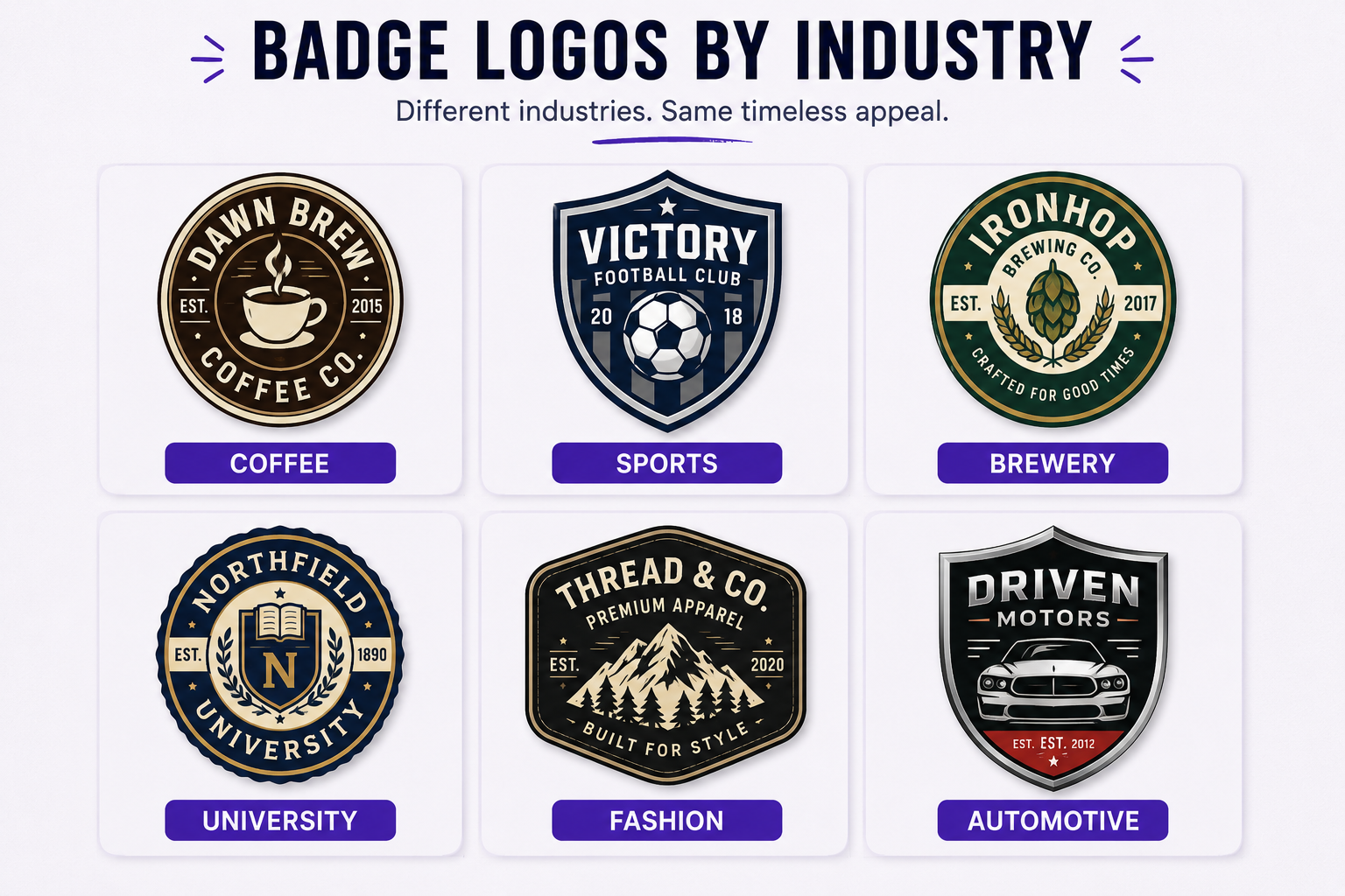
The Five Types of Badge Logo Design
1. Classic Circular Badge
A classic circular badge is the most common badge logo form: a circular outer ring enclosing a central icon, brand name, and optional secondary text.
The brand name is typically set along the curve of the outer ring. A central icon anchors the composition. A tagline, founding year, or location may appear in a secondary inner band. The circular frame communicates unity, continuity, and accessibility.
Best for: Consumer food and beverage brands, craft producers, lifestyle companies.
2. Shield Badge
A shield badge uses a heraldic enclosing shape, typically pointed or arched at the base, to signal authority and institutional legitimacy.
The internal composition is more symmetrical and vertically oriented than a circular badge. The shape's heraldic origin translates across sectors as protection and credibility, which is why it is the default choice for sports organizations, insurers, and security companies.
- Best for: Sports teams, insurance providers, security companies, financial services.
3. Vintage/Retro Badge
A vintage or retro badge is defined by visual language rather than shape alone: aged textures, distressed letterforms, hand-drawn illustration, and typography referencing 19th and early 20th century commercial printing.
The shape may be circular, oval, or irregular. The effect is achieved through palette restraint (typically two to three colors), roughened edges, and illustration styles that predate digital design tools.
- Best for: Craft breweries, barbershops, heritage food brands, independent outfitters.
4. Crest Badge
A crest badge draws from heraldic tradition, incorporating banners, animal figures, scrollwork, or divided fields within a complex enclosing shape.
It is the most compositionally demanding badge type. Scalability is the primary design challenge: a crest badge contains more internal elements than any other variant, and each requires deliberate sizing decisions to survive reproduction at small sizes.
- Best for: Luxury brands, automotive marques, academic institutions, heritage fashion houses.
- Brand examples: Porsche (Stuttgart horse within a divided crest, in use since the early 1950s), Versace (Medusa head within a Greek-key bordered circle), Cambridge University Press (shield with cross and open books).
5. Minimal Circular Badge
A minimal circular badge applies badge structure (primary enclosure, layered hierarchy, stamp-like legibility) while eliminating all vintage or ornamental styling in favor of clean geometry and contemporary typography.
The outer ring is thin or implied rather than heavy. The interior is reduced to a geometric icon and a clean sans-serif wordmark. This is the variant that allows technology companies and modern direct-to-consumer brands to access the authority signals of a badge without the heritage aesthetic associations.
- Best for: Technology companies, fintech brands, and modern D2C businesses needing structural authority without vintage styling.
- Examples in practice: Several fintech brands and modern SaaS startups have adopted this approach, using the clean circular structure to project institutional credibility without any heritage styling. The minimal circular badge works in this context because the trust signal comes from the compositional structure, not the visual era it references.
Badge Type Comparison Table
Famous Brands That Use Badge Logo Design
Harley-Davidson
Harley-Davidson's bar-and-shield is among the most recognized badge logos in the world. The mark is technically a shield subtype: the bar element cuts horizontally through the shield face, and in many variant applications, design elements extend to or across the frame boundary.
This is why the more accurate structural criterion for the format is "primary enclosure" rather than strict containment. Brand identity has remained consistent for more than a century, with only incremental visual refinements.
- What it demonstrates: A badge logo design can become so identified with a brand's identity that it functions as a product asset in itself, appearing on merchandise, apparel, and accessories independent of any other brand context.
BMW
The BMW roundel has been in use since the brand's founding era, with the design emerging when BMW separated from its predecessor, Rapp Motorenwerke, in the late 1910s.
The blue-and-white quadrant pattern references the colors of the Bavarian state flag, a detail the brand has acknowledged and amplified in its storytelling. BMW has modernized the mark's rendering over decades (most recently moving to a flat, transparent treatment) without altering the core badge architecture: shape, proportion, and color assignment have remained stable across radically different production contexts.
- What it demonstrates: A badge logo can be re-rendered for contemporary aesthetics while retaining structural identity across generations.
Starbucks
The Starbucks logo is instructive as a case study in badge evolution rather than badge permanence. The 1971 founding mark was a classic circular badge: outer ring, brand name set along the curve, central siren illustration.
Through successive simplifications in 1987, 1992, and 2011, the composition tightened. The 2011 update removed the outer wordmark ring entirely, leaving only the siren figure within a green circle. By the structural definition used in this article, the current mark has moved beyond the badge format into standalone icon territory.
- The lesson: badge logos can be simplified over time as brand equity transfers from the wordmark to the icon, but that transition requires decades of built recognition before the wordmark can be safely removed.
Porsche
The Porsche crest has been in continuous use since the early 1950s. It is a divided heraldic shield featuring the Stuttgart coat of arms horse figure combined with regional color references, belonging to the Crest Badge type.
The mark demonstrates how complex heraldic composition can hold across a full range of scales, from a small hood emblem to full-size print.
- What it demonstrates: Crest badges work at scale when internal hierarchy is designed with sufficient contrast between compositional regions. Each area of the Porsche mark reads independently before being read as a whole.
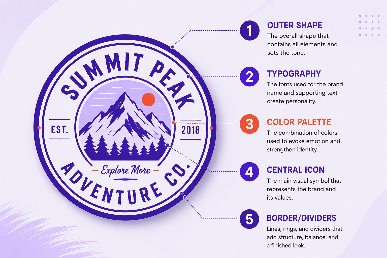
Core Elements of a Badge Logo Design
Every effective badge logo design resolves five design decisions. These are defined here as reference points. The step-by-step section below shows how to apply them in sequence.
1. Outer Shape and Frame
The primary enclosing shape sets the emotional register before any text or icon is read. Circles suggest community and continuity. Shields suggest authority and protection. Ovals suggest approachability. Frame weight (thin line vs. thick band) signals modernity vs. heritage respectively.
2. Central Icon or Illustration
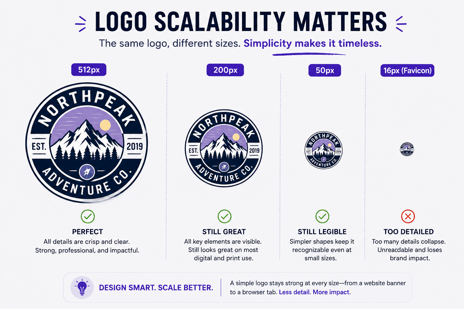
The primary image inside the badge. Can be abstract, illustrative, or typographic (a monogram). Complexity must be calibrated to the smallest reproduction size the badge will appear at. Fine-line illustration that reads clearly at 300px becomes noise at 32px.
At Design Shifu, the most common cause of badge logo design revision requests is icon detail that passes the design stage but fails in production. Simplifying the icon during the concept phase, rather than during the revision cycle, consistently produces better final marks.
3. Typography Hierarchy
Badge logos typically carry two or three type treatments: a primary brand name (largest), a descriptor or tagline (smaller, often curved or set in a secondary band), and occasionally a founding year or location (smallest, decorative).
Each level must be legible independently and read as a clear hierarchy together.
- Best fonts for badge logos: Serif and slab serif typefaces perform well in Classic Circular and Crest badges because their stroke variation supports compositional formality. Condensed geometric sans-serifs work in Minimal Circular badges. Avoid display or decorative fonts in the primary name position: they date quickly and create legibility problems at small sizes.
4. Color Palette
Badge logos favor limited palettes of two to four colors because they must reproduce well in single-color contexts, including embossing, screen printing, and engraving. Build the palette in this order: full color first, then two-color, then single-color dark, then single-color light. If the badge only works in full color, it will create production problems across applications.
5. Interior Framing and Negative Space
The space between the outer ring and the interior elements is structural, not decorative. Too little space produces a compressed, illegible mark. Too much reads as unfinished. Embroidery constraints are one of the most common reasons badge logos require refinement after initial approval: thread counts and minimum stitch sizes impose spacing requirements that are invisible during on-screen review.
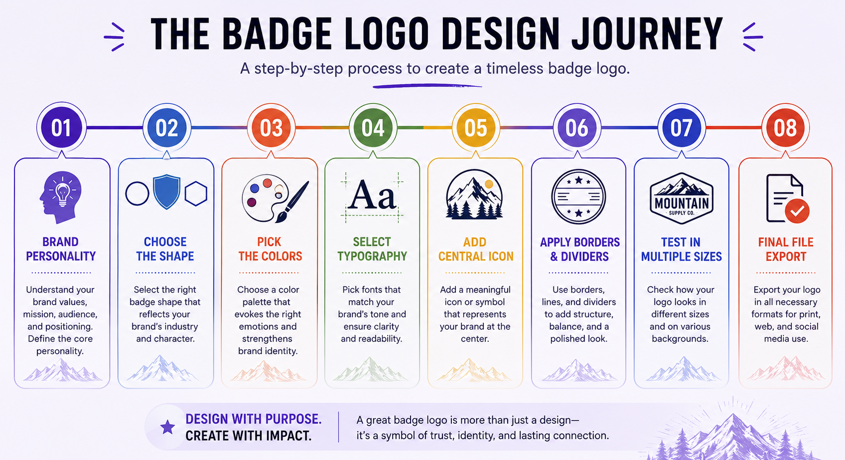
How to Design a Badge Logo: Step-by-Step
Step 1: Define brand personality attributes.
Before opening any design tool, write three to five adjectives that describe how the brand should feel. "Heritage, approachable, handcrafted" points toward a vintage circular badge with illustration. "Authoritative, minimal, modern" points toward a minimal circular badge or thin-frame shield. Every shape and styling decision in the following steps should trace back to this list.
Step 2: Choose the primary enclosing shape.
Select the shape type (circle, shield, oval, crest) that aligns with the personality attributes and sector conventions from Step 1. Sketch three to five rough compositions at this stage before adding any type or icon. Shape choice alone significantly alters the tone of the final mark.
Step 3: Design the central icon independently.
Develop the icon before placing it inside the badge frame. Test it on its own at multiple sizes. An icon that needs the badge frame to make sense will create problems in applications where the full badge cannot be used, including app icons, favicons, and embossed card details.
Step 4: Set the type hierarchy.
Place brand name, descriptor, and any secondary text. Test curved type against horizontal type: curved text signals heritage, horizontal text reads as more contemporary. Ensure each type level is visually distinct in weight or size before combining them inside the frame.
Step 5: Apply color, then immediately test in single color.
Apply the primary palette, then strip to single color and check whether the mark holds. This is the most common failure point for overdesigned badge logos. If the single-color version is illegible or unclear, the design needs simplification before full color is restored.
Step 6: Refine negative space and interior framing.
Adjust spacing between the outer frame and interior elements. Add or remove interior dividers. At Design Shifu, the strongest badge logos produced through revision cycles almost always reduce element count during the refinement stage rather than increase it. Every line and shape inside the badge should be doing structural work.
Step 7: Test across applications.
Place the final badge on a dark background, a light background, at favicon size (32x32px), at large format (12 inches), and on a three-dimensional mockup (garment label, bottle cap, embossed card). Failure in any one context indicates a refinement needed before the design is production-ready.
Ready to put these principles into production?
Design Shifu handles logo systems, vector production, and application testing through a flat-rate subscription model. Initial concepts in 24 to 48 hours, unlimited revisions, no hourly billing.
Book a demo call to see how it works.
When NOT to Use a Badge Logo
Badge logos are not universally appropriate. There are four contexts where a different format will perform better.
Early-stage brands with no heritage to reference. A badge logo design implies longevity and institutional standing. For a brand launched recently, a heavily stylized vintage badge creates an authenticity gap.
If heritage positioning is not earned, use a cleaner format and introduce badge elements later once brand equity has accumulated.
Purely digital products with complex app icon requirements. Mobile apps and SaaS products often require a standalone icon that works at 60x60px on a phone screen.
Badge logos at that size frequently collapse into visual noise. If the primary brand touchpoint is an app icon, consider building a simplified icon mark first and treating the badge as a secondary brand asset.
Industries where badge logos have become generic. Craft beer, artisanal food, and barbershops are now so saturated with vintage circular badges that the format no longer differentiates by default.
In these categories, a badge logo design requires a more original internal composition to avoid blending into category visual noise. The format alone is no longer distinctive; the execution has to be.
Brands require extreme typographic flexibility. Badge logos lock typography into a fixed compositional relationship. Brands that need to adapt their logo to multiple languages, scripts, or highly variable text strings will find the format too constrained for that use case.
Common Mistakes in Badge Logo Design
Overloading the interior.
The most common error. Multiple icons, three type levels, detailed illustration, and decorative borders combined produce a mark that reads impressively at full size and becomes unreadable in application.
Set a maximum element count before design begins: one icon, two type levels, one or two framing rings. Add elements only when there is a clear structural reason.
Choosing the wrong badge type for the sector.
A vintage distressed badge for a fintech startup signals aged craft in a sector requiring modern trust signals. A minimal circular badge for a craft brewery reads as corporate in a category built on handcrafted identity. The type selection is a positioning decision, not a stylistic preference.
Designing for the screen and ignoring production contexts.
Badge logos appear on embroidered patches, wax seals, embossed labels, screen prints, and digital interfaces. Fine-detail decisions that look refined on screen (thin strokes, tight type tracking, subtle gradients) often fail in physical production. Design for the hardest production constraint first.
Creating heritage aesthetics without heritage equity.
A heavily aged, crest-style badge for a recently launched brand can read as inauthentic. If the vintage styling is not supported by actual brand history or a credible brand narrative, use the minimal circular badge approach instead.
Skipping the single-color test.
Always present a single-color version alongside the full-color version before finalizing any concept. A badge logo design that only works in color is not a fully resolved design.
Production Readiness Checklist
What Does Badge Logo Design Cost?
Pricing varies significantly by market segment.
Three distinct tiers:
Crowdsourced design marketplaces
$50 to $300. The volume of options is high; quality and originality are inconsistent. Suitable for early-stage brands with limited budgets that need a functional mark quickly.
Freelance designers at mid-to-senior level
$800 to $2,500 or more for a badge logo design with a full file package, including vector source files, color variants, and basic usage guidelines. The higher end reflects designers with documented brand identity experience and a structured revision process.
Design subscription services
A flat monthly fee covering unlimited revisions across all design categories, including logo systems, packaging, social media, and marketing materials. This model makes practical sense for businesses with ongoing design requirements beyond a single logo project, where per-project freelance rates would compound quickly.
For businesses evaluating subscription options, Design Shifu's current pricing covers badge logos alongside all other brand design needs under one subscription.
Conclusion
Badge logo design earns its durability through structure, not style. This format works because it packages brand identity (name, symbol, and personality) into a single unified mark that performs at every scale and in every reproduction context.
Examples that have remained effective across decades share structural discipline: limited elements, clear hierarchy, and a primary enclosure that holds the composition together without competing for attention itself.
The five types covered here (Classic Circular, Shield, Vintage/Retro, Crest, and Minimal Circular) provide a framework for matching the format to a specific brand positioning. The type choice is not an aesthetic preference. It is a positioning decision. A heritage craft brand and a modern fintech company are both candidates for a circular badge.
The variant they choose signals who they are and who they are trying to reach before a single word is read.
If you are designing a badge logo for the first time, the principle that will save the most revision cycles is this: design the simplest version that communicates the brand clearly. Then stop.
Want a production-ready badge logo design without extended back-and-forth? Design Shifu delivers professional logo and brand identity work through a flat-rate monthly subscription, with initial concepts in 24 to 48 hours and unlimited revisions until the mark is right. Book a demo call
FAQ
What is the difference between a badge logo and an emblem logo?
A badge logo is a subtype of emblem logo. Emblem is the broader category: it refers to any logo that encloses typography and imagery within a unified shape. Badges are a specific emblem variant, typically circular or oval, with a multi-layered internal hierarchy optimized for stamp-like applications. All badge logos are emblems. Not all emblem logos are badges.
Can a badge logo work across digital and print applications?
Yes, and cross-application performance is one of the format's core strengths. A well-designed badge logo works on a website favicon, a business card emboss, a screen-printed garment, a packaging seal, and a social media profile image. The design must perform in single color and at small sizes. If it passes both tests, it is genuinely versatile across production contexts.
Can a badge logo work for a modern or technology brand?
Yes. The minimal circular badge type was developed specifically for this context. It applies badge structure (enclosed, layered, stamp-like) while eliminating all vintage or ornamental styling. Several fintech brands and modern SaaS companies use this approach to project institutional legitimacy without heritage aesthetic associations.
The trust signal comes from the compositional structure itself, not the visual era the styling references.
How long does badge logo design typically take?
With a professional freelancer: two to four weeks, including discovery, concepts, revisions, and file delivery. With a design subscription service: initial concept within 24 to 48 hours, refined through revision rounds over one to two weeks. Crowdsourced platforms return initial concepts faster but offer less structured revision support.
What file formats are needed for a badge logo?
At minimum: SVG or AI (vector source), PNG with transparent background at multiple resolutions, and a single-color version of each. For physical production: a print-ready PDF with all fonts outlined. For embroidery: a DST or EMB file from an embroidery digitizer, which is a separate service from logo design and is not included in standard logo deliverables.
Should a badge logo include a tagline?
Only if the tagline adds information not already communicated by the icon and brand name together. Taglines increase typographic complexity and reduce available compositional space. If included, the tagline should be the smallest type element in the hierarchy. Many effective badge logos carry no tagline.
Can I trademark a badge logo?
Yes. A badge logo is registrable as a design mark with trademark offices in most jurisdictions. The more distinctive the internal composition (unique icon, custom lettering, specific color combination), the stronger the trademark claim.
Generic shapes combined with standard fonts offer weaker protection. Consult an intellectual property attorney before relying on trademark rights for enforcement.
What makes a badge logo timeless rather than trendy?
Structural restraint and typographic discipline. Badge logos that remain effective across decades share these properties: a limited color palette of two to three colors, a typographic hierarchy using fonts without strong temporal associations, an icon abstract or iconic enough to avoid illustrative trend cycles, and a frame design with visual weight but minimal ornamentation.
Trend-driven badge logos fail when the style they reference dates. Structurally resolved badge logos outlast the trends they were designed alongside.
About the author
Sameena is an Organic Growth Specialist and Content Writer at Design Shifu, crafting SEO-driven content that boosts visibility, builds brand authority, and drives meaningful organic growth.
.webp)