

In this blog

Need a design partner that scales with you?
See exactly how Design Shifu can become your on-demand design team. Book a free demo call.
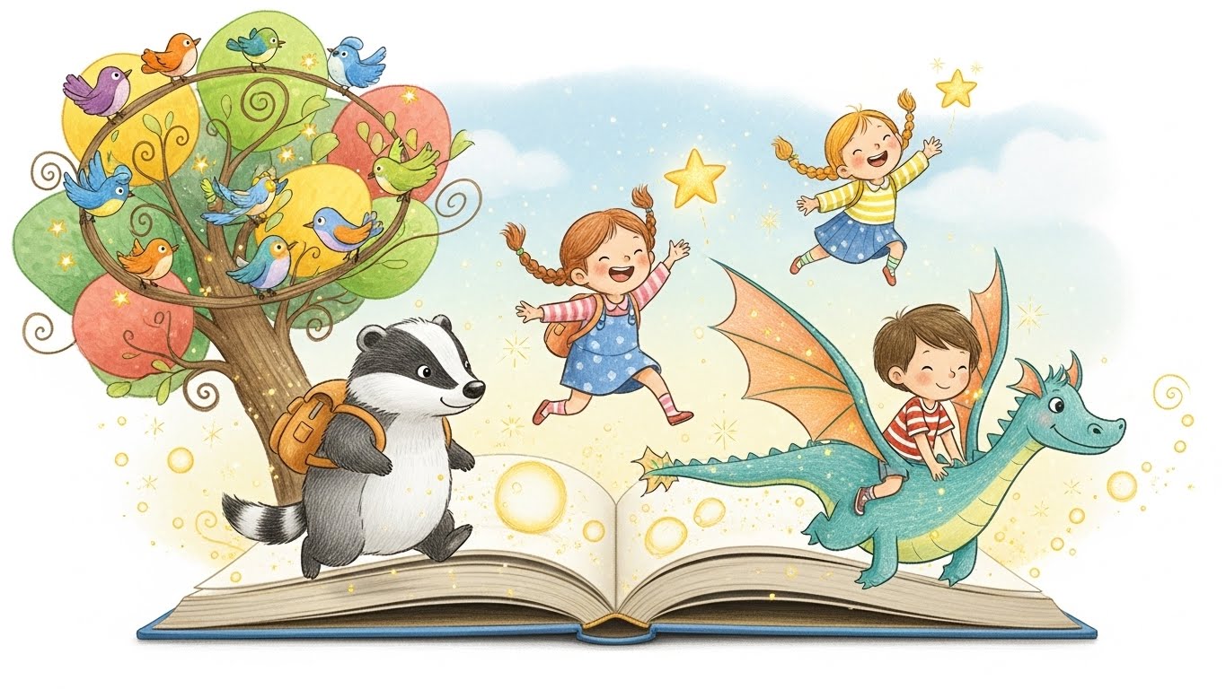
Children's book illustrations do far more than decorate pages; they tell stories, evoke emotions, spark imagination, and often teach young readers how to interpret visual narratives before they can fully decode written words.
The most memorable children's books succeed not despite their illustrations but because of them, creating magical reading experiences that children return to again and again. Understanding what separates forgettable illustrations from those that captivate young minds can transform a simple story into a beloved classic.
Children's Book Illustrations- Emotional Connection and Character Appeal
Children connect deeply with characters they can relate to or aspire to be. Successful illustrations create characters with expressive faces that clearly communicate emotions, joy, fear, curiosity, and mischief. Young readers need to understand how characters feel at a glance, without requiring narrative explanation. Oversized eyes, exaggerated expressions, and body language that mirrors real emotional responses help children recognize and name their own feelings.
Character designs should be distinctive and memorable. Think of classics like Peter Rabbit, The Very Hungry Caterpillar, or Where the Wild Things Are. Each character has a unique visual identity that's instantly recognizable. Simple, clear shapes often work better than overly complex designs, especially for younger audiences. Children should be able to draw their favorite characters from memory after a few readings, which means designs need clarity and distinctiveness.
The emotional tone conveyed through color, line quality, and composition should align with the story's mood. Soft, rounded shapes and warm colors create feelings of safety and comfort, perfect for bedtime stories. Angular shapes and bold contrasts generate excitement and tension, suitable for adventure tales. The illustration style itself communicates genre and tone before a single word is read.
Age-Appropriate Visual Complexity
To choose appropriate levels of detail and content for different age groups, many children’s book creators refer to established children’s publishing standards that outline recommended reading and visual practices for each developmental stage (Scholastic’s guidance on books and reading is a helpful resource).
Different age groups require different approaches to visual complexity. Board books for infants and toddlers need high-contrast, simple images with minimal background detail. At this stage, children are learning to identify objects and recognize shapes, so clear, uncluttered illustrations of individual items work best. Think bold outlines, solid colors, and one primary subject per page.
Picture books for preschoolers (ages 3-5) can handle more detail and visual storytelling. Multiple characters can appear on the same page, backgrounds can include interesting details, and illustrations might show sequential action. However, the main subject should still dominate each page, with supporting details enhancing rather than distracting from the primary narrative focus.
Early readers (ages 5-8) enjoy discovering hidden details and visual jokes within illustrations. This age group appreciates more complex scenes with things to notice during repeated readings, a mouse hiding in different spots throughout the book, background details that tell a parallel story, or visual puns related to the text. These Easter eggs reward careful observation and encourage engagement.
Middle-grade illustrated books serve readers who are competent with text but still appreciate visual support. Illustrations become less frequent but can be more sophisticated, using shading, perspective, and detailed environments. These images enhance specific moments rather than appearing on every page.
Color Theory and Palette Choices
Color wields enormous psychological power in children's books. Bright, saturated colors energize and excite, making them perfect for playful, active stories. Pastel palettes create gentleness and calm, ideal for quiet, introspective narratives or bedtime books. Limited color palettes using just two or three colors throughout can create striking, cohesive visual experiences that feel intentional rather than restrictive.
Color consistency helps children follow characters and objects across pages. If the protagonist wears a red coat on page one, it should remain red throughout unless there's a narrative reason for change. This consistency aids recognition and comprehension, particularly for emerging readers who rely heavily on visual cues.
Strategic use of color can direct attention and emphasize important elements. A predominantly blue spread with one red object immediately draws the eye to that red item, signaling its significance. Warm colors advance visually while cool colors recede, a principle useful for creating depth and hierarchy within illustrations.
Consider cultural color associations, particularly if your book might reach international audiences. While some color meanings are fairly universal, green for nature, blue for water, others vary significantly across cultures. Understanding your primary audience's cultural context ensures your color choices communicate what you intend.
Narrative Flow and Page Turns
Successful children's book illustrations create visual rhythm and anticipation. The pacing of images should complement the text's pacing quick, dynamic illustrations for fast-paced action sequences, and slower, contemplative images for quiet moments. Varying the size and placement of illustrations maintains visual interest across the book.
Strategic page turns heighten suspense and surprise. The right-hand page is the reveal page; it's what children see when turning from the previous spread. Cliffhangers, questions, or moments of tension work brilliantly on left-hand pages, with the resolution appearing when the page turns. Maurice Sendak mastered this in "Where the Wild Things Are," with Max's room transforming gradually across page turns.
Illustrations can show what text doesn't explicitly state, adding layers of meaning and encouraging visual literacy. A character might say they're fine, but their slumped posture and downturned mouth tell a different story. Background details might foreshadow upcoming events or reveal what characters are thinking.
Conclusion: Bringing Stories to Life Through Illustration
The most successful children's book illustration balances imagination with intention. They respect developmental stages, use visuals to support storytelling, and invite children to explore emotions, details, and meaning beyond the written word. When illustrations align seamlessly with the narrative, they don’t just tell a story; they create a world children want to return to again and again.
Need professional children’s book illustrations? Design Shifu offers unlimited illustration and design support to help authors bring stories to life.
FAQ
What makes a good children’s book illustration?
A good children’s book illustration tells part of the story visually, evokes emotion, and supports comprehension through expressive characters, clear composition, and age-appropriate detail.
How important are illustrations in children’s books?
Illustrations are essential; they help children understand emotions, follow the narrative, and build visual literacy before they can read independently.
How do illustration styles change by age group?
Younger readers need simple, high-contrast visuals, while older children enjoy detailed scenes, visual humor, and narrative complexity.
What role does color play in children’s book illustration?
Color sets the mood, guides attention, and supports emotional storytelling. Consistent color use helps children recognize characters and follow the story.
Should illustrations show exactly what the text says?
Not always. The best children’s book illustrations add meaning by showing emotions, subtext, or parallel stories that enrich the narrative.
How do page turns affect storytelling in children’s books?
Strategic page turns build suspense, create surprise, and control pacing, making them a powerful storytelling tool in picture books.
About the author
Sameena is an Organic Growth Specialist and Content Writer at Design Shifu, crafting SEO-driven content that boosts visibility, builds brand authority, and drives meaningful organic growth.

.webp)


