In this blog

Need a design partner that scales with you?
See exactly how Design Shifu can become your on-demand design team. Book a free demo call.
If you run an online store, you already know how hard it is to turn browsers into buyers. Up to 90% of snap judgments about products are based on color (HubSpot). And studies show it takes less than 90 seconds for customers to decide whether to trust a website -Shopify.
According to the Baymard Institute’s e-commerce UX research, design choices including colors directly influence whether a shopper completes checkout or abandons their cart.
That means your color choices aren’t just about aesthetics, they directly impact whether someone clicks “Buy Now” or abandons their cart.
Color psychology might sound like a marketing buzzword, but it’s actually a powerful tool for boosting e-commerce sales, building trust, and shaping customer behavior. Let’s break it down
TL;DR
- Colors influence customer decisions in powerful, often subconscious ways.
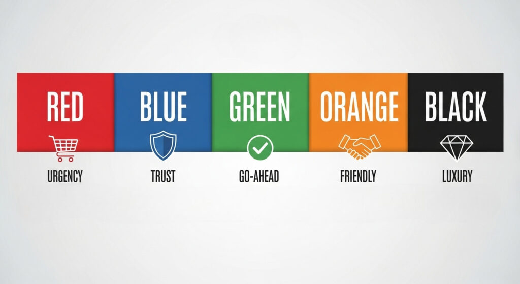
- In e-commerce, up to 90% of snap judgments are based on color. Red creates urgency, blue builds trust, green encourages action, orange persuades with warmth, and black signals luxury.
- The right colors, used strategically, can boost conversions, build customer trust, and make your store stand out.
Why Colors Hijack Your Brain
Think about the last time you walked into a fast-food restaurant. Did you notice all that red and yellow everywhere? That's not an accident.
Those colors literally make you feel hungry and... well, a bit rushed. It's like your brain has these ancient shortcuts built in, and colors trigger them whether you want them to or not.
Here's what happens in that split second when someone lands on your site: their brain starts making associations faster than they can consciously think. Red might scream "urgent" or "exciting." Blue whispers "trustworthy" and "calm." Green says "natural" or "go ahead, it's safe."
Your customers aren't consciously thinking, "Oh, this blue button makes me trust this company more." But subconsciously? That's exactly what's happening.
Colors That Boost Conversions (Based on Real Data)
Let me share what I've learned from watching countless A/B tests and talking to store owners who've actually tried this stuff:
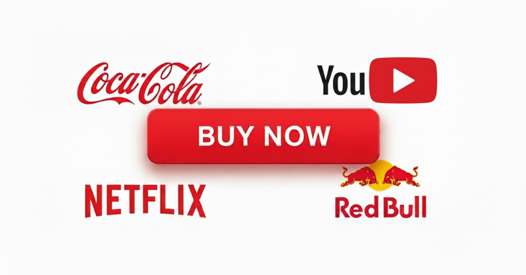
Red: The Urgency Creator
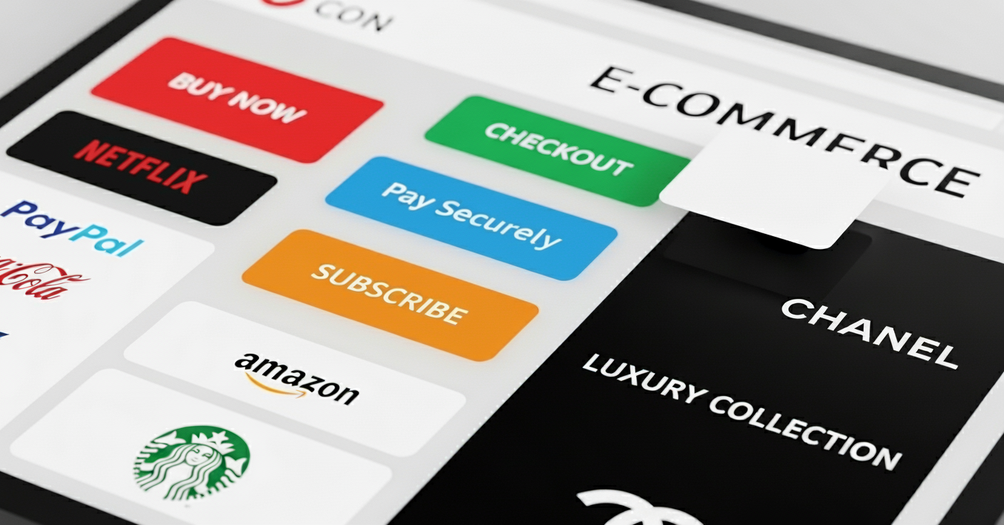
Red is like that friend who's always rushing you out the door, it creates urgency and excitement. Amazon uses red for their "Add to Cart" buttons for a reason. It makes people feel like they need to act NOW.
But here's the catch... red can also signal danger or make people feel stressed. I've seen online stores lose sales because they went overboard with red. It's like hot sauce, a little goes a long way.
- Best for: Sale banners, urgent CTAs, limited-time offers
- Skip it if: You're selling luxury items or anything that requires careful consideration
Blue: The Trust Builder
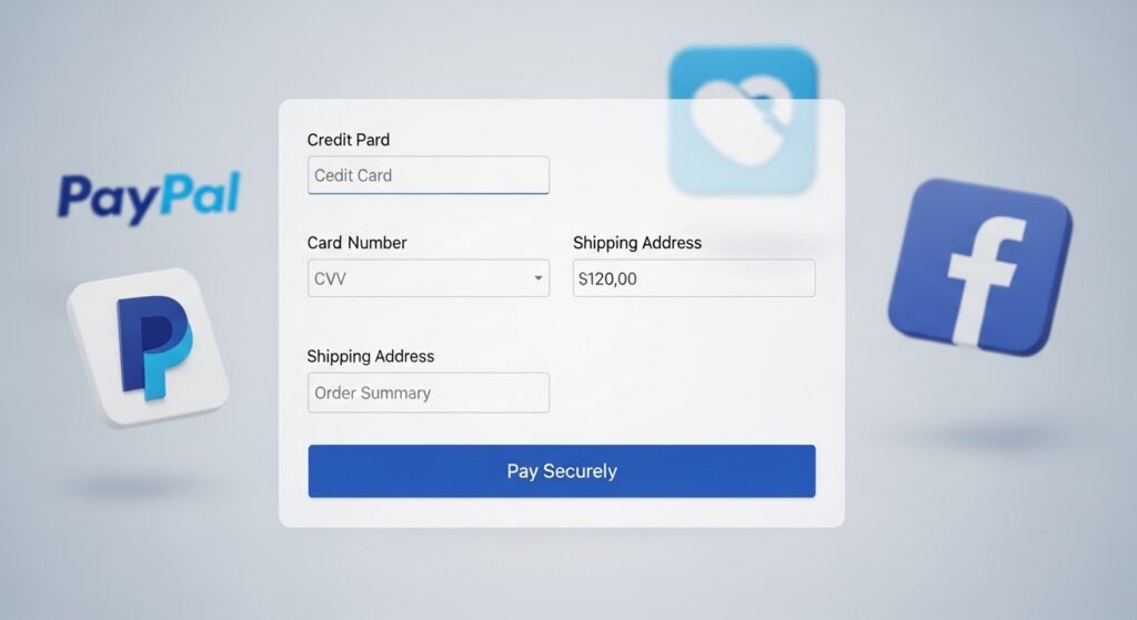
If red is your pushy friend, blue is your dependable best friend. It's the color of trust, security, and "everything's going to be okay." That's why every bank, insurance company, and tech giant uses it.
PayPal, Facebook, Twitter, they're all swimming in blue. And for good reason. When people are about to enter their credit card info, blue makes them feel safer.
- Best for: Payment buttons, security badges, professional services
- Use with caution: Fashion or food sites (blue food looks... unnatural)
Green: The "Go Ahead" Signal
Green is fascinating because it hits so many psychological buttons. It means "go" (think traffic lights), means money and It means natural, healthy, sustainable. Somehow, our brains just trust it.
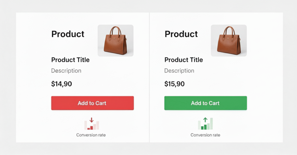
I've seen conversion rates jump 15-20% just by switching from red to green on checkout buttons. Why? Because green feels less pushy. It's like the difference between someone shoving a contract at you versus calmly saying, "Whenever you're ready."
- Best for: Checkout buttons, eco-friendly products, health/wellness sites
- Works everywhere: Seriously, green is hard to mess up
Orange: The Friendly Persuader
Orange is like the golden retriever of colors- friendly, energetic, and impossible to ignore. It's bold without being aggressive, warm without being overwhelming.
Amazon's "Buy with 1-Click" button? Orange. Home Depot's entire brand? Orange. It creates just enough urgency to motivate action but stays friendly enough not to scare anyone away.

- Best for: CTAs, subscription buttons, casual brands
- Skip if: You're going for luxury or professional vibes
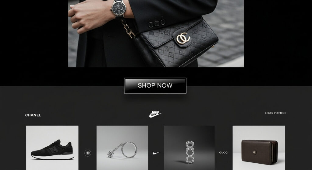
Black: The Luxury Statement
Black doesn't mess around. It says "premium," "sophisticated," and "worth the money." Luxury brands love black because it makes everything feel more expensive and exclusive.
But here's what's interesting, black can also feel a bit intimidating. I've seen small businesses struggle with black because it can make them seem less approachable. It's all about context.
- Best for: Luxury products, high-end services, minimalist designs
- Be careful: Can feel cold or intimidating for some audiences
The Mistakes Everyone Makes And How to Avoid Them
- Copying what "works" without testing Just because red worked for Amazon doesn't mean it'll work for your handmade jewelry store. Context matters. A lot.
- Going crazy with color I've seen websites that look like a rainbow exploded. Your customers' brains need a break. Pick 2-3 colors max and stick with them.
- Ignoring your audience, teenagers respond differently to colors than 50-year-olds. Men and women often have different preferences. Know who you're talking to.
- Forgetting about accessibility If your green button disappears for colorblind users, you just lost 8% of your male customers. Always check your contrast.
Real-World Examples (That Actually Happened)
Let me tell you about Sarah, who runs a small online boutique. She was using a bright red "Add to Cart" button because she'd read that red increases urgency. But her conversion rate was stuck at 2.1%.
On a whim, she tested a soft green button instead. Same text, same placement, just a different color. Her conversion rate jumped to 3.4% overnight. Why? Her customers were mostly women shopping for comfortable, casual clothes. Red felt too aggressive for that vibe.
Then there's Marcus, who sells premium coffee online. He switched his checkout button from blue to black, and his average order value increased by 18%. The black button made the whole experience feel more premium, so customers were more comfortable buying the expensive stuff.
How to Actually Use This (The Practical Stuff)
Start with your brand personality.
- Are you fun and energetic- Try oranges.
- Professional and trustworthy- Blue's your friend.
- Luxury and exclusive- Black it is.
Test one thing at a time
Don't change your entire color scheme at once. Test your main CTA button first, that's where you'll see the biggest impact.
Consider the customer journey
Use calming blues early in the shopping process, then switch to action-oriented greens or oranges for the checkout.
Think about color combinations
A green button on a white background hits differently than a green button on a red background. Context is everything.
Key Takeaways
- Color drives decisions: Up to 90% of online shopping judgments are based on color (Shopify).
- Each color has a role:
- Red = urgency
- Blue = trust
- Green = action & eco-friendly
- Orange = friendly persuasion
- Black = luxury
- Red = urgency
- Context matters: Test different colors, what works for Amazon may not work for your boutique.
- Less is more: Stick to 2–3 primary colors to avoid overwhelming your customers.
- Accessibility counts: Always ensure contrast and visibility for colorblind users.
- Test, don’t assume: A/B testing button colors alone can improve conversion rates by up to 21% (HubSpot).
Sum Up
At the end of the day, color psychology isn’t about manipulating customers, it’s about creating an experience that feels right and natural. The right color choices can reduce friction, build trust, and increase conversions.
Here’s the action plan for e-commerce owners:
- Audit your store’s color choices: Are your CTAs, checkout buttons, and banners aligned with customer psychology?
- Test one color at a time, A/B test your CTA buttons (HubSpot reports businesses that run 50% more A/B tests see 45% higher ROI).
- Match color with brand personality
- Luxury- Try black.
- Trust- Go with blue.
- Urgency- Use red sparingly.
Ready to revamp your store? Start small, test your main button color. Or partner with expert designers who know how to use color to convert clicks into sales. Because in e-commerce, every shade counts.
FAQ
Does color really affect e-commerce sales?
Yes. Studies show that up to 90% of snap judgments about products and brands are based on color. In e-commerce, the right color choices can increase trust, reduce cart abandonment, and boost conversions.
What is the best color for “Buy Now” or checkout buttons?
It depends on your audience and brand. Green often performs well because it feels safe and signals “go,” while orange creates friendly urgency. Testing with your audience (A/B testing) is the best way to find your winning color.
Why do luxury brands use black and gold?
Black signals sophistication, exclusivity, and luxury, while gold adds a premium, timeless appeal. Together, they create a perception of higher value, which works well for high-end e-commerce products.
Should I use red everywhere if it creates urgency?
Not necessarily. Red is great for sale banners or limited-time offers, but too much red can feel aggressive or stressful. Balance it with calming colors to avoid overwhelming your customers.
How many colors should an e-commerce website use?
Ideally, stick to 2–3 primary colors with a few complementary shades. This creates visual consistency without confusing shoppers. Overloading your site with too many colors can hurt user experience.
What about accessibility, how do I ensure colors work for everyone?
Always check color contrast ratios so text and buttons are readable. Remember, around 8% of men are colorblind, so don’t rely only on color cues, use icons, labels, or text to support actions.
Can changing button colors really boost conversions?
Yes! Even small tweaks can have a big impact. HubSpot reports that A/B testing button colors can increase conversions by up to 21%, proving that color psychology has a direct effect on e-commerce performance.
About the author
Sameena is an Organic Growth Specialist and Content Writer at Design Shifu, crafting SEO-driven content that boosts visibility, builds brand authority, and drives meaningful organic growth.