In this blog

Need a quality design at scale?
Subscribe to receive the latest blog posts to your inbox every week.
Users form a visual opinion of your website in 50 milliseconds that's 0.05 seconds, before they've read a single word. Before your headline. Before your price. Before your offer registers. This was confirmed by a peer-reviewed study in Behaviour & Information Technology (Lindgaard et al., 2006). And 94% of those first impressions are design-related (Forbes). Which means your design has already won or lost the customer before your copy even gets a chance.
Most marketing teams track clicks, leads, and revenue but very few track whether their design is doing its job. That's a problem, because design directly determines whether people click, stay, buy, or leave. A McKinsey study of 300 companies over five years found companies in the top quartile for design had 32% higher revenue growth and 56% higher returns to shareholders than their industry peers. The numbers are clear. What's less clear is which design KPIs actually matter and what good performance looks like
This guide breaks it down.
Why 50% of Teams Have No Idea If Their Design Works
More than 50% of companies admit they have no way to measure design output, according to the same McKinsey research. That means half of all businesses are spending on design with no idea whether it's working. Part of the problem is that design affects so many different things, page speed, brand trust, click rates, conversions that it's hard to know where to start measuring.
This is exactly why many marketing teams partner with a dedicated design service. Without a measurement system in place, design decisions stay subjective and improvement stays guesswork.
The 7 Design KPIs for Marketing Teams That Actually Matter
1. Conversion Rate
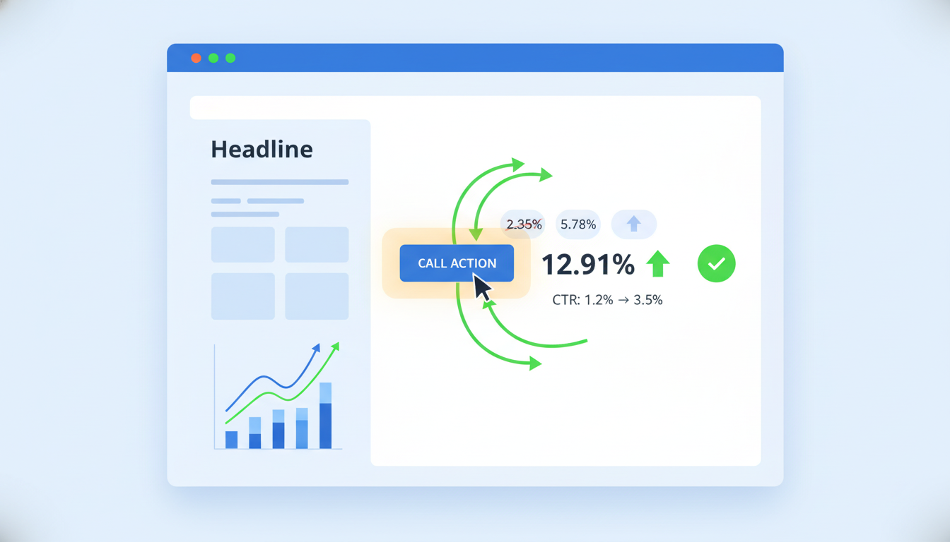
- What it is: The percentage of visitors who complete a goal, a purchase, signup, form fill, or download.
- Why it matters: This is the clearest signal that your design is working. If your layout, CTA placement, and visual hierarchy are strong, people convert. If they're not, they don't.
Benchmarks:
- Average website conversion rate across industries: 2.35% (InvespCRO)
- A/B testing landing pages can improve conversion by 30%
- Moving a CTA above the fold produced a 304% increase in conversions in tested campaigns
- A button color change alone produced a 21% lift in clicks in a HubSpot A/B test
Design lever: CTA size, color, placement, and copy. These four variables have more impact on conversion rate than almost any other design decision.
2. Click-Through Rate (CTR)
- What it is: How often people click a link, button, ad, or email after seeing it.
- Why it matters: CTR is a direct measure of whether your visual design is creating action. If no one clicks, the design isn't working even if it looks great.
Benchmarks:
- Emails with images: average CTR of 4.84% vs. 1.6% for text-only (InvespCRO)
- Nielsen Norman Group found that redesigning ads using usability principles increased CTR by 55% to 310%
- Headline hierarchy, image selection, CTA button design, and color contrast between the button and the background.
Design lever: Headline hierarchy, image choice, CTA button design, and color contrast.
3. Bounce Rate
- What it is: The percentage of visitors who land on your page and leave without taking any action.
- Why it matters: A high bounce rate often points to a design problem, poor visual messaging, confusing layout, or slow load times.
Benchmarks:
- A 2-second delay in page load increases bounce rate by 103% (NitroPack)
- 53% of mobile visitors leave if a page takes longer than 3 seconds to load (Google)
Design lever: Page speed, visual clarity above the fold, and mobile layout.
4. Time on Page / Session Duration
- What it is: How long a visitor spends on your page or across your site.
- Why it matters: If people are reading and scrolling, your design is doing its job, the visual hierarchy is clear, the content is readable, and nothing is pushing them away.
- Design lever: Typography size and line spacing, content layout, use of white space, and visual pacing through the page.
5. Brand Consistency Score
- What it is: A measure of how consistently your visual brand- colors, fonts, logo, tone is used across all marketing channels.
- Why it matters: Inconsistent branding costs money and erodes trust.
Benchmarks:
- Consistent branding can increase revenue by 10% to 33% (Marq / Lucidpress State of Brand Consistency)
- 85% of organizations have brand guidelines, but 81% still produce off-brand content
- 68% of companies say brand consistency directly increased their revenue growth
How to track it: Run quarterly brand audits across email, social, ads, and web. Score each touchpoint for compliance with guidelines. Tools like Canva Brand Kit flag off-brand usage automatically.
Consistent branding doesn’t just improve perception, it directly impacts revenue outcomes (ROI of Brand Consistency in Design)
6. Engagement Rate (Social and Email)
- What it is: The ratio of interactions (likes, comments, shares, replies) to total reach or impressions.
- Why it matters: Visual content drives engagement. The format and quality of your design directly affects how much your audience responds.
Benchmarks by content type (Rival IQ 2024 Social Media Benchmark Report):
- Video posts: 5.55% median engagement
- Image posts: 4.55%
- Text posts: 2.79%
- Link posts: 2.34%
Design lever: Video quality, thumbnail design, image composition, and consistency of visual style.
7. Core Web Vitals (Page Experience Score)
What it is: Google's three performance metrics that measure how pages load and behave:
- LCP (Largest Contentful Paint): How fast the main content loads
- CLS (Cumulative Layout Shift): How much the page jumps around while loading
- INP (Interaction to Next Paint): How fast the page responds to clicks
Why it matters: These metrics directly affect SEO rankings and user experience. Vodafone tested two visually identical pages, one with a 31% better LCP score and the faster version produced an 8% increase in sales (Conductor).
Design lever: Image compression, font loading strategy, layout stability, and code efficiency.
Key Benchmarks to Know Before Your Next Design Review
3 Tools That Actually Track These KPIs
You don't need ten tools. You need the right three.
1. Google Analytics (GA4)
Tracks bounce rate, session duration, conversion funnels, and page-level behavior. It tells you what is happening. Free.
2. Hotjar
Heatmaps, session recordings, and scroll maps. It shows you where users click, how far they scroll, and where they drop off. This is how you find out why a page isn't converting. Starts free. (Hotjar)
3. VWO or Google Optimize (now replaced by A/B testing tools)
A/B test design variants button colors, CTA text, page layouts. The median ROI on CRO (Conversion Rate Optimization) tools is 223%, according to data cited by Nielsen Norman Group.
What First Impressions Have to Do With All of This
Here's a stat that should change how you think about every design decision:
Users form a visual opinion about your website in 50 milliseconds that's 0.05 seconds. This was confirmed by a peer-reviewed study published in Behaviour & Information Technology by Lindgaard et al. (2006).
And 94% of first impressions are design-related (Forbes).
That means before anyone reads a headline, checks a price, or clicks a button they've already judged your brand. Design KPIs are just the measurable proof of what that judgment produces.
How to Use These KPIs Together
Don't track these metrics in isolation. They tell a story when read together:
- High bounce rate + low time on page = design problem above the fold. Check load speed and visual clarity.
- Good time on page + low conversion = CTA problem. Check placement, contrast, and copy.
- High CTR on ads + low landing page conversion = mismatch between ad design and landing page design. The visual promise wasn't kept.
- Low engagement rate = content design problem. Try video over static image, improve thumbnail quality, test composition styles.
Quick Wins to Act on This Week
- Check your Core Web Vitals in Google Search Console. Fix any page scoring "Poor" on LCP or CLS first.
- Run a heatmap on your top-converting page using Hotjar. Find where people stop scrolling.
- A/B test one CTA changes the button color or the copy. Run it for two weeks minimum.
- Audit brand consistency across your last 10 social posts, 3 emails, and homepage. Score each out of 10.
- Measure email CTR by content type. Compare image-led emails to text-heavy ones for the same audience.
Design is not a soft function. It's a performance lever with measurable outcomes. The marketing teams that win are the ones that consistently track and improve their design KPIs for marketing teams.
Start with one metric. Improve it. Repeat. Want design that drives results? Get unlimited design support with fast turnaround.
FAQ
What is the most important design KPI?
Conversion rate is the most important because it directly ties design to revenue. If users aren’t converting, design isn’t doing its job.
How do you prove design ROI to stakeholders?
Tie design changes to: Conversion uplift, Revenue per visitor and Reduced bounce rate
Use tools like Google Analytics 4 and Hotjar to show before/after impact.
How often should design KPIs be reviewed?
Weekly → CTR, conversions, Monthly → engagement & bounce trends and Quarterly → brand consistency audits
What’s a good conversion rate benchmark?
Average: ~2.35%, Strong: 5%+. But it varies by industry, always benchmark against your own past performance first.
Can small design changes really impact revenue?
Yes. Even minor tweaks like CTA color, placement, or page speed improvements can significantly increase conversions and sales.
About the author
Sameena is an Organic Growth Specialist and Content Writer at Design Shifu, crafting SEO-driven content that boosts visibility, builds brand authority, and drives meaningful organic growth.