


In this blog

Need a design partner that scales with you?
See exactly how Design Shifu can become your on-demand design team. Book a free demo call.
Typography is one of the crucial elements of graphic design. Professional designers are well aware of the impact of typography in design. Understanding the typeface vs font differences is essential for creating impactful designs. Typography can dictate the mood of the design depending on the choice of fonts, and the choice of different typefaces, etc. Oh, Yes, we know.
The font vs typeface debate is an infamous one in the graphic design community. And yes, there is a difference between the two.
Interestingly, it is not uncommon to use the terms typeface and font interchangeably, but professional designers know the difference between the two.
Font vs Typeface has always been an ongoing topic of discussion in the community, so let's settle it once and for all.
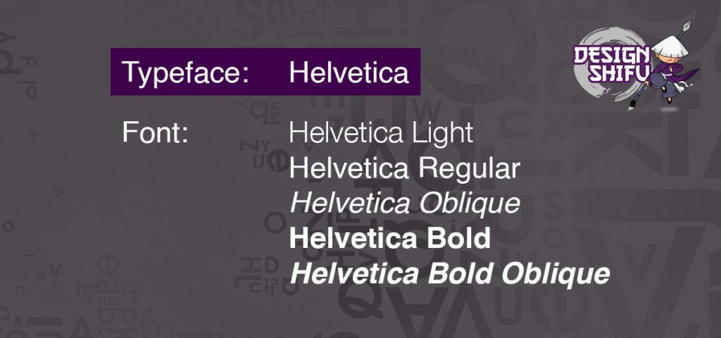
The major difference between typeface and font is that font is a part of the typeface. For example, Helvetica is a typeface, and Helvetica Bold, Helvetica Light, and Helvetica Regular are all fonts.
A simple analogy to understand the difference between typeface and font is to look at it as if it’s coffee. We have coffee, as in coffee beans and then we have different types of coffee, like a pour-over, or a french press, or an espresso.
Coffee then is the typeface and the different ways of making coffee are the fonts.
The real difference between Typeface and Font
A typeface is basically a type family, a collection of a set of certain related fonts.
Fonts, on the other hand, are the style, effect, or weight of a typeface. Each font has a specific condensation, italicization, width, etc.
The word font comes from the French word 'fonte’ which means cast in metal. Printers cast complete sets of metal letters that make up a font.
The whole font vs typeface debate became a thing because typeface and font began to be used interchangeably as desktop publishing emerged, where various applications used the term "font" in their menus instead of "typeface."
Typeface vs Typography
We have already discussed typeface, so let's move on to typography. Typography is the design and arrangement of typefaces on a page to create an effective composition. It can be broadly classified into two categories:
Display Typography
Designers use display typography to grab attention rather than for printing an entire document. Designers use display typography in logos and headlines to highlight key elements of the design and marketing message.
Text Typography
Text typography is mainly used for large volumes of text where clear communication is prioritized over creative visual design. For eg: magazines, books, documents, etc.
What is the difference between typeface and typography?
Typeface and typography are two different things, but they are related in a significant way.
In a document, a typeface is the lettering, while typography is how the type is arranged on the page. For example, Helvetica is a simple typeface, while Arial offers various weights and styles suited for different document types.
A typeface can be simple or complex, but typography should be well-designed for an overall appealing look. A great way to improve your typography skills is to study how fonts are applied across industries like advertising, logos, and packaging.
Once you understand the basics of typeface and typography, you can start to design your own typesetting projects more effectively.
Why should you care about the difference?
Ideally, if you have designers that can handle everything for you, like our designers at Design Shifu, you don’t need to care about the difference.
However, if you're working with a designer or creating something yourself, knowing the difference becomes essential. This understanding is also useful when coding for a specific display type or working on product or web design.
It is also important to understand font psychology before you choose a typeface. Choosing the wrong font can change the feel of your design and incite a different reaction from your audience than intended.
In brief, Serif fonts are classic and make your audience feel like your brand is trustworthy and respectable, Bold fonts are powerful, and can grab attention easily, and script fonts are special and elegant if implemented easily.
Similarly, choosing too many typefaces can also make your design look unprofessional and more so, make it illegible.
Pro tip - Don’t use more than two typefaces together in any design. Stick to two. Three is a crowd here too.
If you don’t want to go through the trouble of understanding the basics of graphic design, you can let Design Shifu handle all your design requirements. We offer unlimited design requests and unlimited revisions. Check out our portfolio and our subscription plans and get flyers, brochures, banners, logos, t-shirts, and much more with a 24 to 48 hour turnaround time.
FAQ
About the author
Sameena is an Organic Growth Specialist and Content Writer at Design Shifu, crafting SEO-driven content that boosts visibility, builds brand authority, and drives meaningful organic growth.

.webp)


