In this blog

Need a quality design at scale?
Subscribe to receive the latest blog posts to your inbox every week.
You write a long blog post. You spend hours on it. Then you check the traffic and it barely moves.
Sound familiar?
Here is the thing: your audience is not reading. They are scanning. And that is not laziness. That is just how the brain works. Scientists at MIT found the brain can process an image in just 13 milliseconds, a tiny fraction of a second. Reading one word takes up to 300 milliseconds. That is more than 20 times slower.
That is why infographics work. They show your message in a way the brain can grab fast. And when done right, they do not just grab attention. They sell.
What Is an Infographic? (And What Makes One Actually Sell?)
An infographic is a visual that turns data, facts, or steps into a picture. Instead of writing five paragraphs, you show the same idea in one image. This kind of visual storytelling makes complex ideas easier to understand and faster to act on.
But not every infographic works. A pretty chart with no story is just clip art. If you want to see what effective infographics actually look like, here are some real-world infographic design ideas for small businesses.
An infographic that sells does three things:
- Shows data that your audience cares about
- Tells a story they can follow in under 30 seconds
- Points people somewhere like a link to click, something to sign up for, or a post to share
The goal is to make your message so clear no one can skip it.
The Numbers Behind Infographic Marketing
Before you make one, here is why it is worth your time:
- People are 30 times more likely to read an infographic than a written article
- Posts with images get 94% more views than posts with just text
- People like and share infographics on social media 3 times more than any other type of post
- 70% of social media users prefer learning about a topic through infographics rather than text
- Blog posts with infographics earn 178% more links from other websites than posts without them
- Businesses that use infographics get 650% more likes, shares, and comments than those that only post text
These are not small gains. These are huge differences.
Real Proof: Brands That Used Infographics to Grow
KISSmetrics: The Best Case Study in Infographic History
Between 2010 and 2012, the data company KISSmetrics published just 47 infographics.
The result?
- 2,512,596 total website visitors
- 41,142 links from 3,741 different websites
- 41,359 tweets and 20,859 Facebook likes
That is an average of 53,459 visitors and 875 links per infographic.
No paid ads. No tricks. Just well-researched infographics posted regularly.
Neil Patel: 10,000 Shares From Just 4 Infographics
Neil Patel ran a test where 4 infographics got over 10,000 shares on social media more than dozens of written articles. He also found that posting infographics regularly can bring up to 5,000 new visitors every week.
7 Types of Infographics That Actually Work
Not all infographics are the same. Here are the seven types that get the best results:
1. Data infographics
Show numbers from surveys or research. Great for building trust and getting other websites to link to you.
- What they do: Show numbers from surveys, studies, or reports in a visual format.
- Real example: The CDC publishes annual Health Statistics infographics showing U.S. health data - cancer rates, obesity trends, drug use. Used by journalists, doctors, and policymakers worldwide.
- Best for: Building trust, earning links from other sites, sharing research.

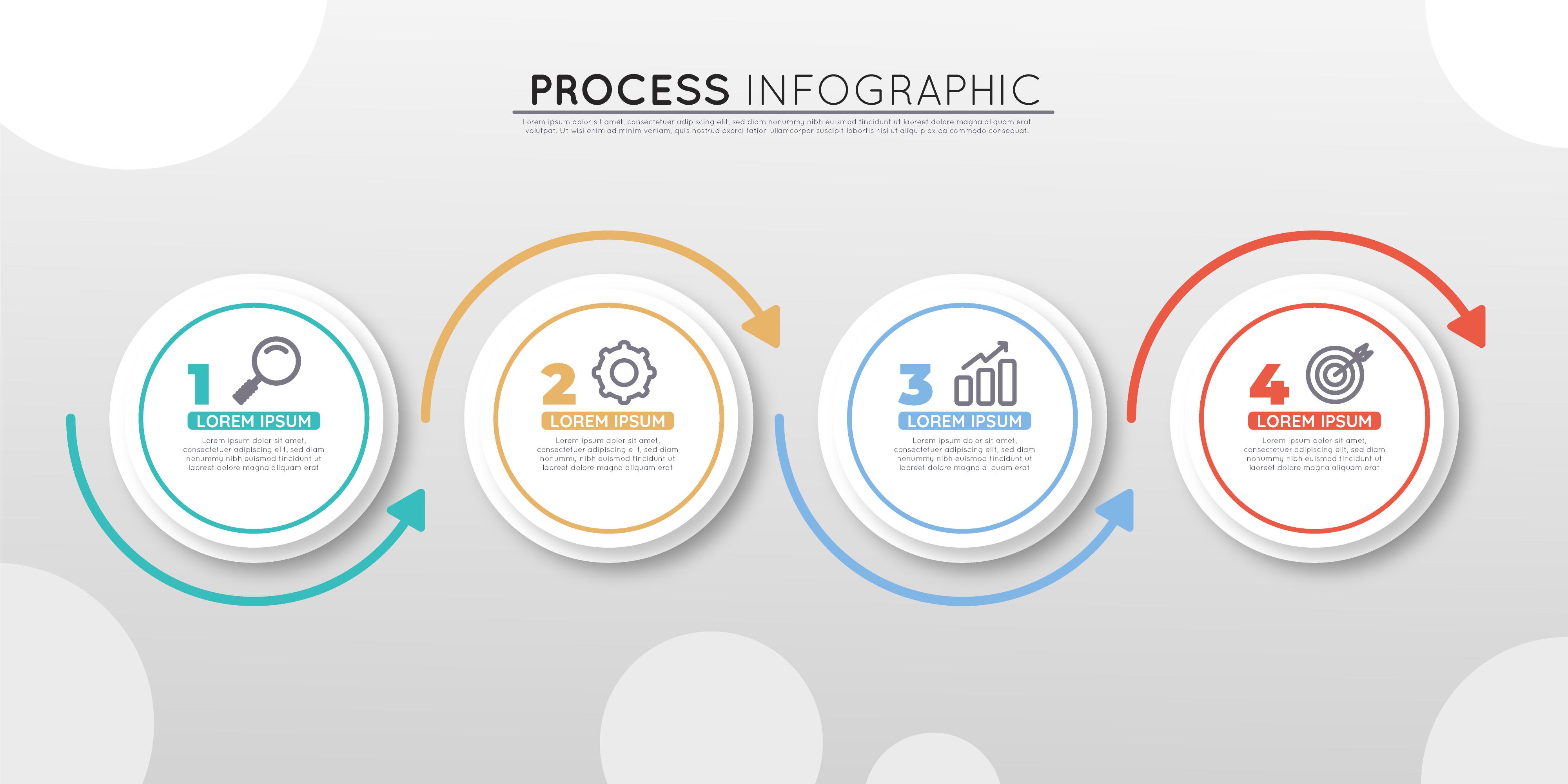
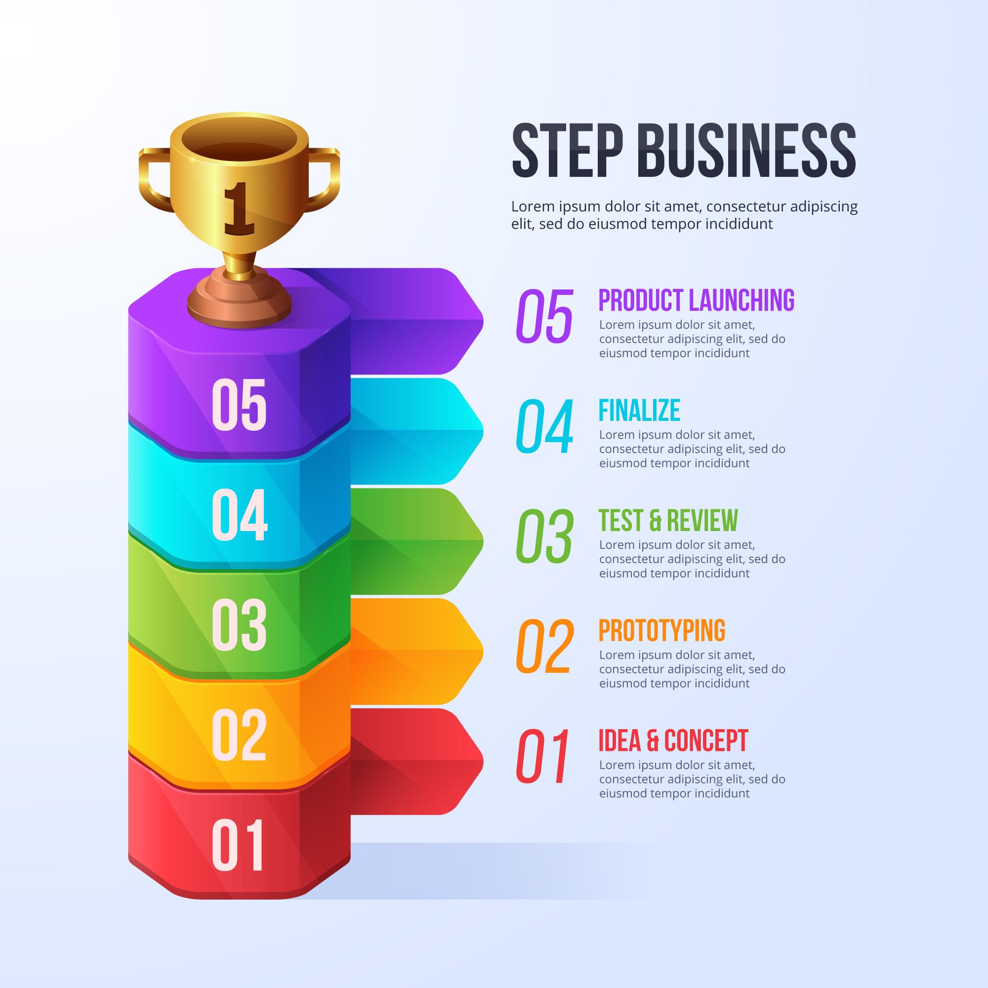
2. Process infographics
Show step-by-step instructions. Best for how-to guides and tutorials.
- What they do: Show a step-by-step flow or how something works.
- Real example: LinkedIn Marketing Solutions created "The Well-Balanced Blog" - a process infographic that used food nutrition as a metaphor for creating a good content mix. It told marketers exactly what types of posts to publish and in what ratio.
- Best for: How-to guides, tutorials, explainer content.
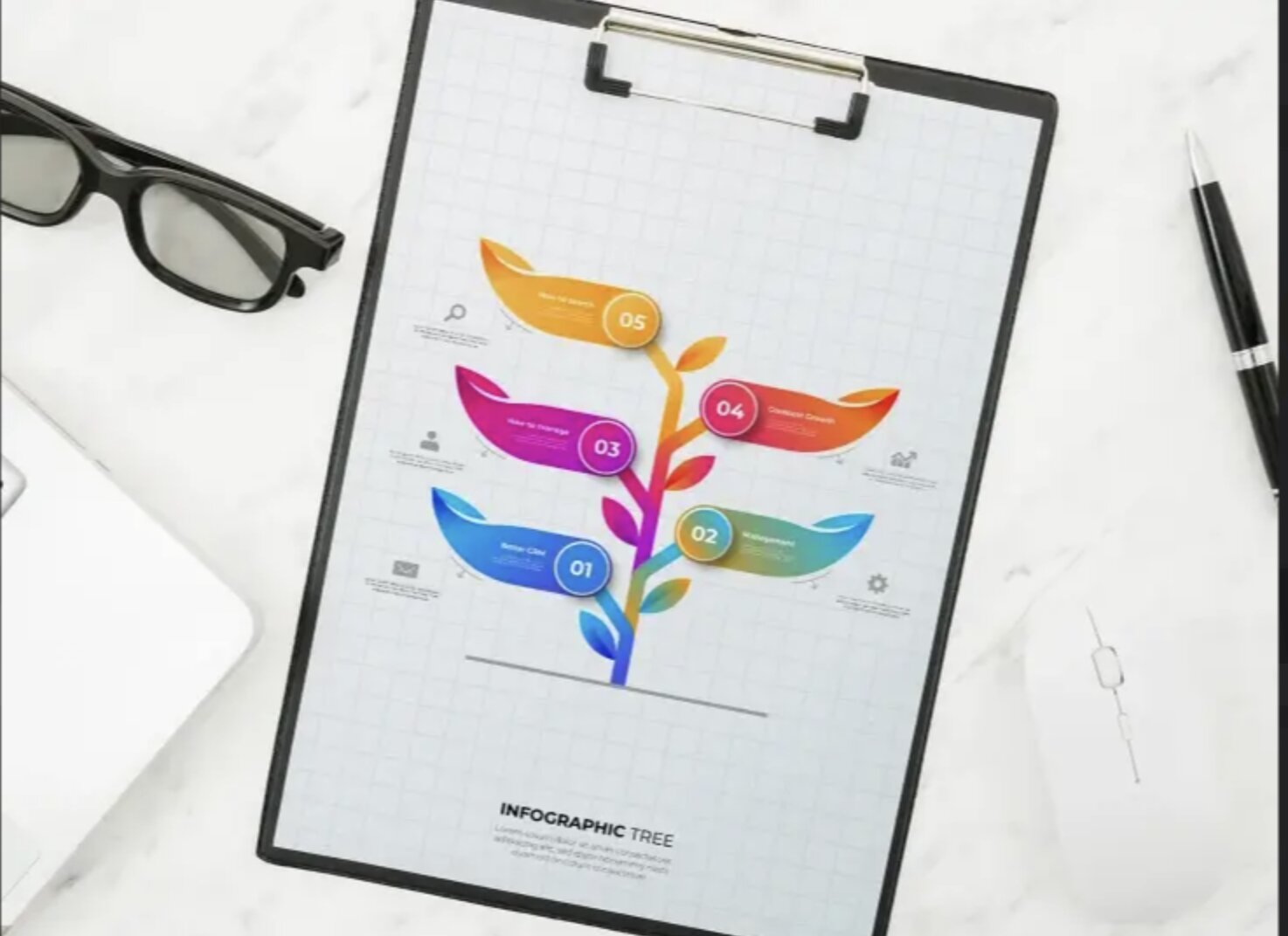
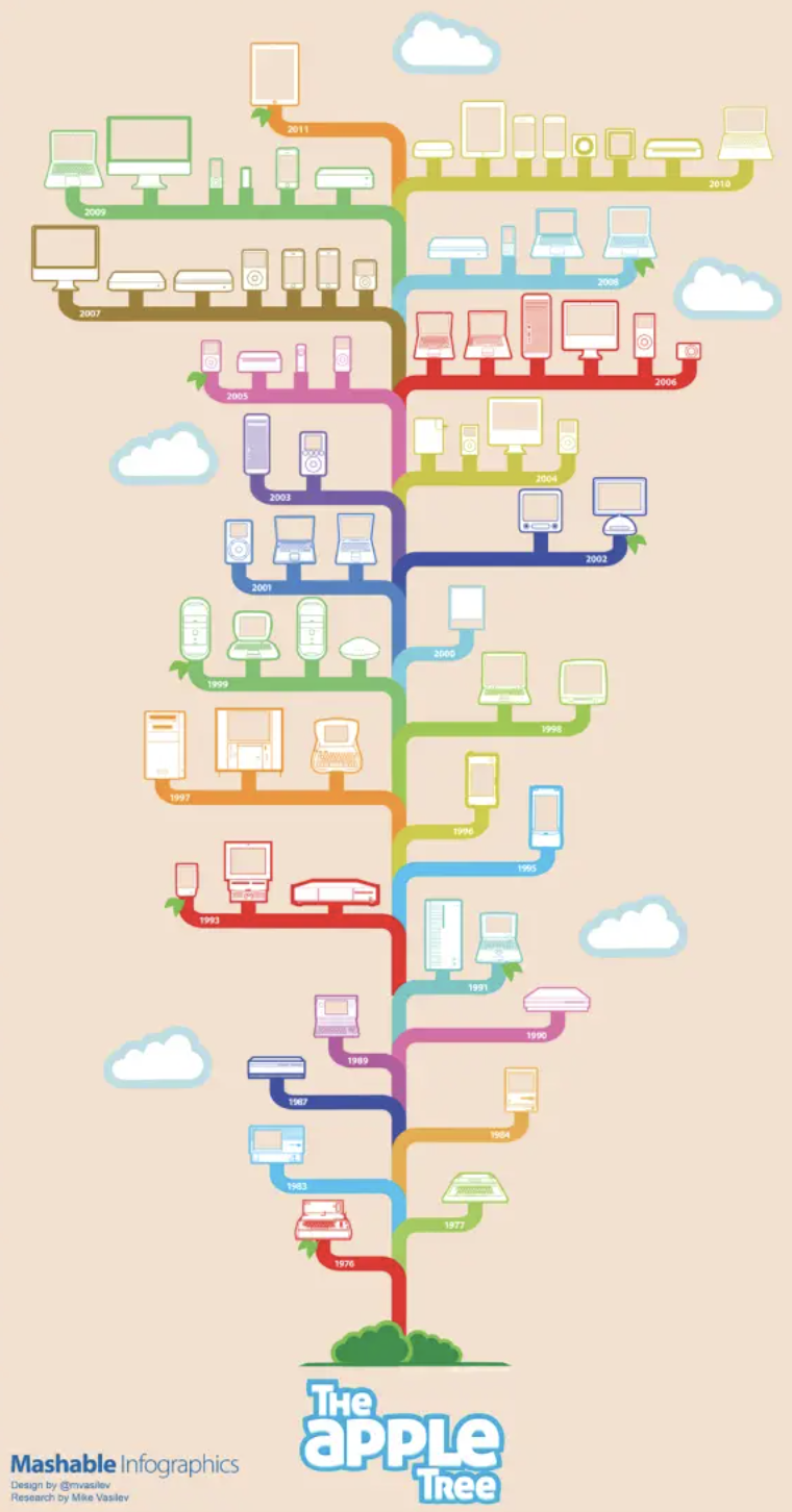
3. Timeline infographics
Show events in the order they happened. Best for telling a company's story.
- What they do: Show events in the order they happened.
- Real example: The "Apple Products Tree (1976-2011)" mapped every Apple product launch as branches of a growing tree, color-coded by product family. Shared millions of times after Steve Jobs' passing.
- Best for: Company history, product evolution, industry milestones.
4. Comparison infographics
Show two things side by side. Best for helping people decide what to buy.
- What they do: Show two things side by side so the reader can decide.
- Real example: The "Coke vs. Pepsi" infographic format has been used by dozens of publishers to compare the two brands across ingredients, marketing spend, and taste test results. It is the most cited example of this format in design courses.
- Best for: Helping buyers choose between products, brand positioning.
5. Map infographics
Use a map to show where things happen. Best for comparing different areas or countries.
- What they do: Use a map to show where something happens.
- Real example: Charles Minard's 1869 map of Napoleon's Russian campaign is considered the most famous infographic ever made. It shows troop count, geography, temperature, and direction of march all in one image. Edward Tufte called it "the best statistical graphic ever drawn."
- Best for: Location data, global or regional campaigns, geographical trends.

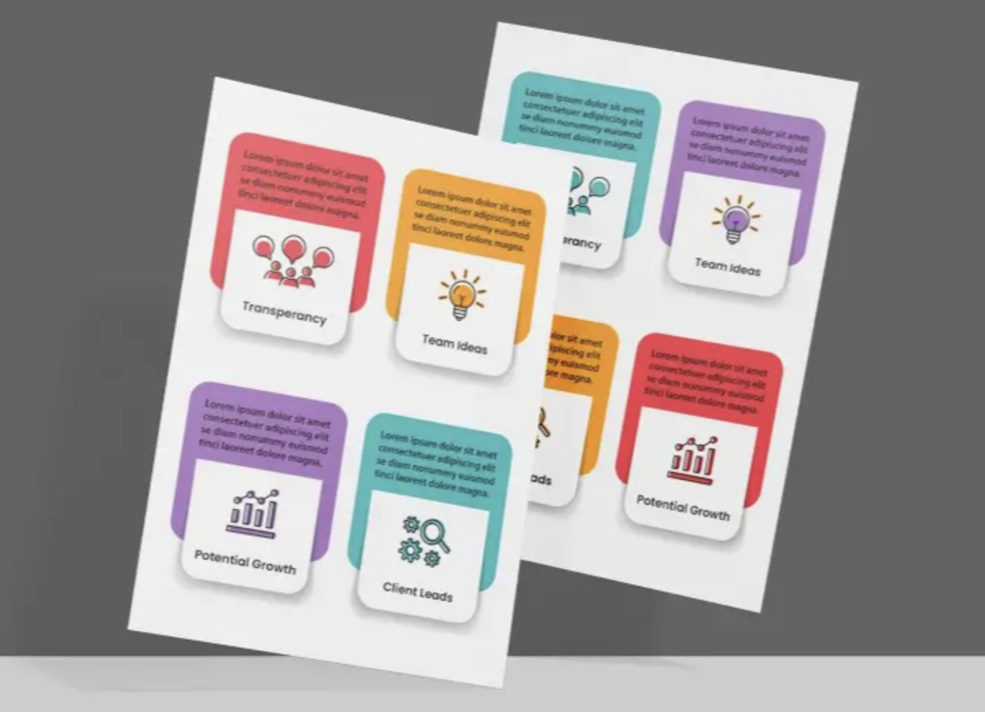
6. List infographics
Visual bullet points. The easiest to make and widely shared.
- What they do: Turn a bulleted list into a visual format with icons or images.
- Real example: Listerine created a list infographic showing which everyday objects carry more bacteria than people think — pencils, keys, dropped food, fingernails. It made dry oral hygiene data surprisingly shareable.
- Best for: Tips, surprising facts, product education.

7. Ranking infographics
Show things in order from most to least important. Best for detailed reports.
- What they do: Show things ordered from highest to lowest or most to least important.
- Real example: Visual Capitalist's "Top 50 Most Valuable Global Brands" shows brand values in descending order, including which brands gained or lost the most value in a year.
- Best for: Industry reports, research findings, benchmark data.
One survey found that 52% of marketers use charts and graphs as their favorite type of infographic.
5 Rules for Designing an Infographic That Converts
Good design is not just about looking nice. It is about removing every reason your audience has to stop reading.
1. Use Color: It Literally Changes How People Think
Colorful infographics are 82% easier to understand and 39% more memorable than black-and-white ones. People are 55% more likely to believe something when it is shown in color.
Stick to 2–3 colors. Too many colors create a mess.
2. Design for Phones First
More than 60% of business content is now read on phones. (HubSpot, 2025) Tall, narrow layouts scroll better on a phone screen. Wide infographics get cut off and abandoned.
3. Put Your Best Fact at the Top
Your reader does not want a wall of numbers. They want the "so what." Put your biggest finding at the top in large text. Then use the rest of the infographic to prove it.
4. Stick to One Main Point
An infographic trying to say ten things ends up saying nothing. Pick one main point. Every chart, icon, and label should support that one idea.
5. Add Your Logo and Your Source
This builds trust. It also lets people check your facts. When others share your infographic, your brand goes with it.
How Infographics Help Your Website Show Up on Google
SEO stands for "search engine optimization." It is the work you do to help your website show up higher in Google search results. Infographics are one of the best and most overlooked tools for this.
Here is how they help:
- Links from other websites: Every time someone adds your infographic to their website, you earn a link back to yours. Those links tell Google your site is worth showing to people. The KISSmetrics campaign averaged 875 of these links per infographic. Most web pages have zero.
- Visitors stay longer: Infographics keep people on your page longer. When visitors stay longer, Google takes that as a sign your content is worth reading.
- More visitors from Google image search: HubSpot improved how they used images and got 779% more visitors from Google image searches in under a year. (The HOTH)
- More visitors from social media: When people share your infographic on social media, it sends visitors back to your website. Instagram and LinkedIn are the two best social media sites for sharing infographics. (DemandSage, 2024)
- Pro tip: Add a small block of code below your infographic that lets bloggers copy and paste it onto their own site in one click. That also gives you a link back every time.
Best Tools to Make Infographics (No Design Skills Needed)
You do not need to hire a designer. These tools are built for regular people:
Canva has 260 million users every month. People have made 160 million infographics with it. 95% of America's biggest companies use it. (DemandSage, 2026)
Also worth knowing: 61% of marketers now use AI tools to help make graphics and images. (Venngage, 2024) Canva's Magic Design is a good place to start.
Who Should Use Infographics?
Short answer: anyone who wants more people to see their message.
But here is where they work especially well:
- Business marketers: 72% of business buyers like to see infographics when they first start researching a product.
- Content teams: 65% of marketers already use infographics as part of their plan.
- Software companies: Infographics that explain how an app works perform better than pages with only text.
- Online stores: Infographics that compare products help buyers decide faster.
- Agencies and experts: Infographics built on real data help people see you as an expert in your field.
The 3 Things Every Viral Infographic Has in Common
Researchers studied thousands of infographics that went viral and found they all shared three things:
- Clean, professional design — Not fancy. Just easy to read and follow.
- Real, checked facts — Your own research, or stats from a trusted source with a link to prove it.
- Real promotion — Shared and sent directly to bloggers, reporters, and online groups after you publish it.
The third point is where most people fail. An infographic on your blog that you never promote is just a decoration.
DIY Infographic Tools vs. Hiring a Design Team
Once you decide to make infographics, you face a second choice: do it yourself, or have a professional do it for you?
Here is an honest comparison:
DIY tools like Canva (260 million users, 160 million infographics created) are the right starting point for most people. They are fast, free to start, and good enough for a lot of use cases.
But if you are publishing infographics regularly or if your brand needs a consistent, polished look, doing every one yourself gets slow fast. That is where an on-demand design service like Design Shifu comes in. You submit your brief, a real designer builds it to your brand guidelines, and you get unlimited revisions on a flat monthly fee. No hiring, no project-by-project quotes.
It is the difference between cooking every meal yourself and having a chef on call.
Bottom Line
Infographics are not a design trend. They are a proven tool with hard numbers behind them. Your audience will not read everything you write. But they will stop scrolling for a well-made visual that tells them something worth knowing in 30 seconds or less.
Your audience will not read everything you write. But they will stop scrolling for a well-made visual that tells them something worth knowing in 30 seconds or less. The science backs it. The case studies back it. And the tools to do it are free. Start with one infographic this week. Pick a fact your audience cares about. Show it cleanly. Then share it everywhere. That is how data gets a design twist. And that is how content starts to sell.
FAQ
What is an infographic in marketing?
An infographic is a visual representation of data or information designed to make complex ideas easy to understand quickly. It combines text, icons, charts, and visuals to communicate a message clearly.
Why are infographics effective?
Infographics are effective because the human brain processes visuals much faster than text. This makes them easier to understand, remember, and share compared to traditional written content.
Do infographics help with SEO?
Yes. Infographics help SEO by: Getting links from other websites Increasing time spent on your page Driving traffic from image search Boosting social shares
What makes a good infographic?
A good infographic: Focuses on one main idea, Uses clean and simple design, Includes relevant data, Tells a clear story and Has a call-to-action
Which tools are best for creating infographics?
Popular tools include: Canva, Venngage, Piktochart and Visme
How long should an infographic be?
Most effective infographics are long enough to tell a complete story but short enough to scan in under 30–60 seconds. Vertical layouts work best for mobile users.
Are infographics still relevant in 2026?
Yes. With decreasing attention spans and increasing content overload, visual content like infographics is more important than ever for engagement and conversions.
About the author
Sameena is an Organic Growth Specialist and Content Writer at Design Shifu, crafting SEO-driven content that boosts visibility, builds brand authority, and drives meaningful organic growth.