Informational Poster Design Ideas & Examples
Poster Design7 min read
Written by Sameena SultanaPublished Updated
Informational poster design turns facts, steps and data into something people understand at a glance. Being loaded with information is one thing. Sharing it so people actually take it in is another.
We can only pay attention to a few things at once, and attention is what turns information into knowledge. So whatever you create for your audience has to be clear and strong enough to teach them something about your product.
Informational posters are one way to educate your target audience about your product. But before we get into informational poster design, check out some advertisement poster ideas.
TL;DR
- An informational poster teaches your audience about a product, process or topic in one glance.
- Good informational poster design gives enough information, gets to the point, avoids clutter and uses simple, clear fonts.
- The examples below cover 4 styles: infographic posters, information-led posters, image-led posters and more creative layouts.
Elements of a good informational poster design
Here's what makes a good informational poster:
- Adequate information should be provided in the poster
- Do not beat around the bush, be straight and to the point with your words
- Avoid cluttering of images and text
- Use simple, clear fonts and attractive images
How to design an informational poster in 6 steps
Whether you design it yourself or brief a designer, these steps keep an informational poster clear and useful.
1. Pick one goal and one audience
Decide what the reader should know or do after seeing the poster. "Wash your hands for 20 seconds" is a goal. "Everything about hygiene" is not. Then picture who will read it: patients in a waiting room, staff in a warehouse or shoppers in a store. That tells you the words, tone and level of detail to use.
2. Write the copy before you design
Write the headline first. Keep it to a few words that state the main message. Then list the supporting points and cut them down to three to five. Each point should be one short line. If a point needs a paragraph, it probably belongs on a web page, so link to it with a QR code instead.
3. Build a clear hierarchy
Readers should see three levels: the headline, the key points, then the small print, such as a logo, a source or a website. Make each level clearly bigger or bolder than the one below it. If everything is the same size, nothing stands out.
4. Choose a layout that fits the information
Match the layout to the type of content:
- Steps or a process: a numbered top-to-bottom flow or a timeline
- Numbers and data: a few large charts or big highlighted figures
- Comparisons: two columns side by side
- Rules or tips: a grid of icons, each with a short label
Use a simple grid so the blocks line up, and leave white space around each one.
5. Use fonts and colors people can read from a distance
Stick to one or two fonts, and use a clean sans serif for body text. A common rule of thumb for signage is about 1 inch of letter height for every 10 feet of viewing distance, so test your smallest text at the distance people will really stand. Use strong contrast, such as dark text on a light background or the reverse, and limit the palette to your brand colors plus one accent color for the key message.
6. Test it before printing
Print a draft at full size, or at least on A4, and pin it up. Step back and ask someone who hasn't seen it what the poster is about. If they can't tell you within a few seconds, simplify the headline or cut points. Check spelling, numbers, dates and phone numbers twice. Mistakes on a printed poster are expensive to fix.
Standard informational poster sizes
Size | Dimensions | Good for |
|---|---|---|
A3 / Tabloid | 297 × 420 mm / 11 × 17 in | Noticeboards, counters, close-up reading |
A2 / Medium | 420 × 594 mm / 18 × 24 in | Corridors, classrooms, store walls |
A1 / Large | 594 × 841 mm / 24 × 36 in | Lobbies, events, viewing from across a room |
If the poster will also be shared online, make a digital version too. Instagram or LinkedIn, for example, usually needs a portrait or square crop, not the print layout shrunk down.
Now, let’s take a look at some good examples of informational poster designs.
1. Infographics posters
Imagine you’re handling a lot of numerical data and you’re unsure how to showcase it. That's where infographics come in. Infographics combine pie charts and bar graphs with images and brief text.
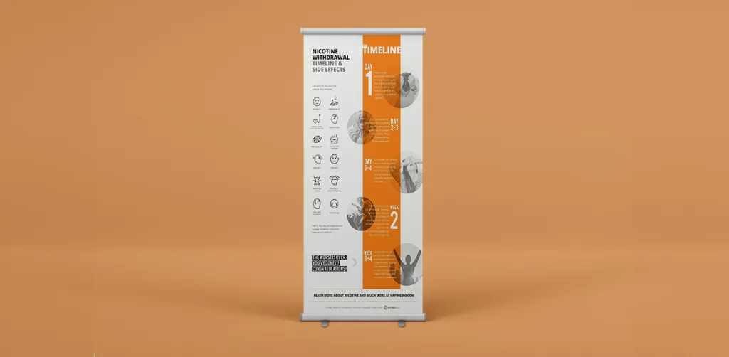
This poster looks like it's from a healthcare service that helps people quit nicotine. In a small space, it shows the side effects to expect and your progress week by week. It's a clear example of how to display data and numbers so the message reaches the audience.
Another example of infographics is this.
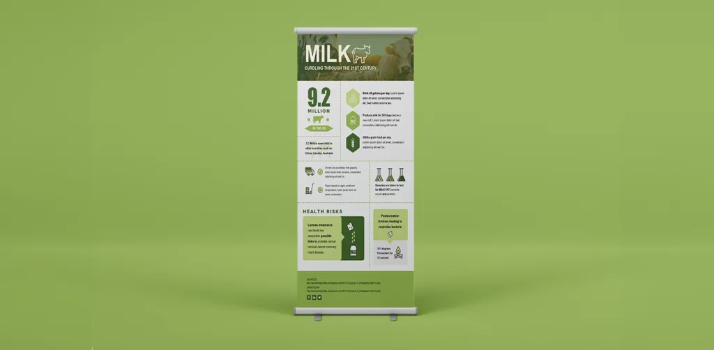
How beautifully the brand has put forth the process of milk curdling using numbers and text.
Another way of showing the infographic poster is through bars and graphs. Like this.
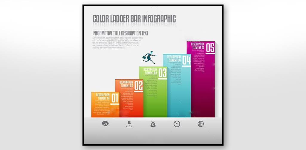
Companies usually use geometrical bars and graphs to display a lot of information in their posters. They often create these visuals for annual reports, business growth advertisements, and other corporate presentations.
Infographics are an excellent tool for visual communication, just make sure to check this article to avoid common design mistakes.
2. Information-centric Informational poster design
Some posters do not use too many images but rely only on information, yet send out their message in an effective way. And that’s the beauty of a good design.
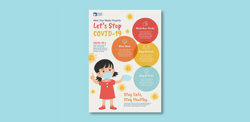
Through bubbles and some illustrations used in this poster, the information is systematically presented without making it look cluttered and overloaded.
Health professionals often create this kind of informational poster design to share preventive measures with the public. During the COVID-19 pandemic, posters like this were everywhere.
Another example of such kind of posters is this.
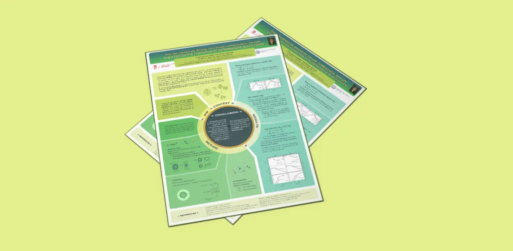
This is an information-only poster where there is a bifurcation of information in branches/ key elements. Though the information seems too much, this kind of poster is for a niche audience looking to consume the information mentioned in the poster.
If you have a lot of information to put on posters and you're wondering why you'd use a graphic design service, this article explains it.
3. Images-centric Informational poster design
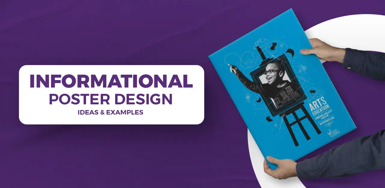
A lot of informational posters rely mostly on images to share information. For that, you need a creative designer who knows exactly how to get the message across.

This is a beautiful way to showcase that the brand is into Arts education. The messaging is very clear through the image and with very limited text, the audience would still understand what the brand is looking to advertise.
Another example of an image-centric poster is this.
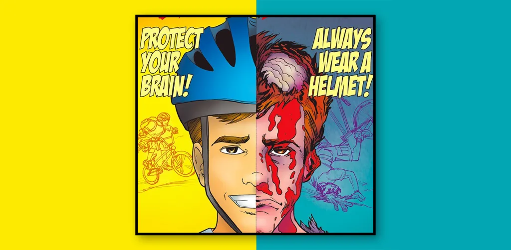
This accident-prevention poster compares two opposite scenarios. With strong graphics and a few bold words, it shares a lot of information about bike safety. It's another kind of image-centric informational poster design.
Looking to create posters like this? Design Shifu can design posters like these, and much more, from $549 per month.
4. More Creative Posters
Some more creative posters that can be also called informational poster designs are the following:

How do you convince customers that Hawaii is the best place to travel? Show them what happens in Hawaii. It's a reliable way to tempt customers to book their next trip with you.

A strong message is conveyed through minimalistic design. If you are a digital advertiser looking to create the perfect ads that could get you maximum conversions, refer to this.
Common informational poster design mistakes
Even a good idea can fail on the wall. Watch out for these:
- Too much text. If it reads like a page from a manual, people walk past. Cut the copy to the few points that matter.
- No clear starting point. Without one dominant headline or image, readers don't know where to look first.
- Low contrast. Pale grey text on white, or busy photos behind words, makes the poster hard to read from a distance.
- Too many fonts and colors. More than two fonts or a rainbow palette makes the poster feel messy and less trustworthy.
- Missing next step. Say what to do next, such as a website, QR code, phone number or "ask at the desk", and make it easy to spot.
- Blurry images. Images that look fine on screen can print blurry. Use high-resolution files and export at print quality.
Conclusion
Good informational poster design comes down to one clear message, a simple hierarchy and visuals that do most of the work. Start with the goal and the audience, keep the copy short, pick the right size, and test the poster before you print it.
You'll likely need more than a promotional poster to win more leads and sales. Design Shifu can help with that. For one fixed monthly rate, you get marketing materials, landing page designs, custom illustrations and more, all designed for your brand.
Frequently asked questions
What is an informational poster?
An informational poster explains a product, process or topic so people can understand it quickly, often in a single glance. It uses a short headline, a few key points, and visuals such as icons, charts or photos. Common uses include health and safety notices, product guides, process steps and event details.
What size should an informational poster be?
Common sizes are 11 × 17 in (tabloid), 18 × 24 in and 24 × 36 in in the US, or A3, A2 and A1 elsewhere. Pick the size by viewing distance. A poster read up close on a noticeboard can be A3 or 11 × 17 in, while one seen across a room or hallway needs A1 or 24 × 36 in.
How much text should an informational poster have?
As little as it needs to get one message across. Aim for a headline of a few words and three to five short points, then let icons, charts or images carry the rest. If you need more detail, add a QR code or link to a page with the full information.
About the author