In this blog

Need a quality design at scale?
Subscribe to receive the latest blog posts to your inbox every week.
A logo might catch the eye, but it’s your brand identity that makes people care, trust, and remember. Confusing a logo for your full brand identity is one of the biggest mistakes businesses make.
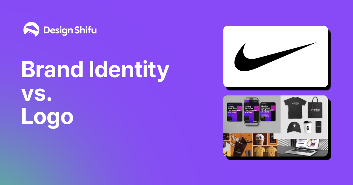
A logo is like your handshake quick and memorable, but your brand identity is the full conversation, the experience, the lasting impression. When you think of Nike, the swoosh probably flashes in your mind. But is that all the brand is? Not even close.
In this blog, we’re breaking down the real difference and showing you how to make both work together to grow your business. Let’s dive in.

What Is a Logo?
A logo is a symbol, mark, or word that stands for your company. It's usually the first thing people think of when they think of your brand. Consider Apple's bitten apple or McDonald's golden arches.
Logos are meant to be easily recognized. They encapsulate the nature of your brand in a graphic. However, they cannot tell it all by themselves
Your logo is the face of your brand but what makes it psychologically effective? Discover the psychology behind a great logo and how it influences consumer behavior
What Is Brand Identity?
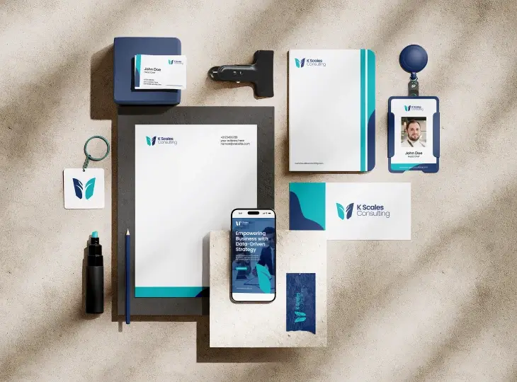
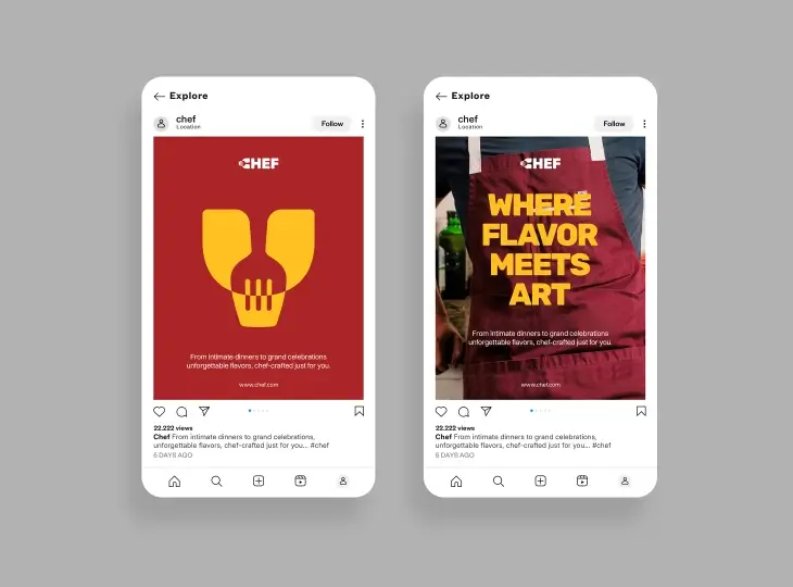
Your brand identity is everything that your audience observes, hears, and experiences concerning your business. Whereas the logo is a component of the picture, brand identity is the whole picture.
It consists of
- Your logo
- Typography
- Color palette
- Tone of voice
- Imagery
- And even the customer experience

Key Differences: Logo vs. Brand Identity
While a logo serves as your brand’s face, brand identity brings your brand to life through every interaction. Here’s why understanding the distinction matters.
Case Study: How Nike's Logo Powers a Global Identity
Nike’s iconic Swoosh isn’t just a logo it’s a symbol of movement, ambition, and performance. Designed in 1971, the Swoosh has become one of the most recognizable brand marks in the world.
But its real power lies in how Nike uses it as part of a cohesive brand identity system.
Here’s how Nike leverages visual identity to drive impact
- Minimal yet powerful design: The Swoosh works on everything from sneakers to stadiums, without the need for words.
- Consistent use of bold, motivational typography: Nike often pairs the logo with strong type (like their “Just Do It” slogan) to create energy and urgency.
- Unified color schemes and brand tone: Black, white, and bold accent colors dominate Nike campaigns, reinforcing a consistent look and feel.
Nike’s visual identity goes beyond aesthetic, it tells a story of empowerment, athleticism, and aspiration across every touchpoint.
When your logo and visual elements align with your mission and audience values, they don’t just decorate they convert.
Logo vs. Brand Identity Explained
Why the Distinction Matters
Relying solely on a logo can leave your brand feeling flat and fragmented. A logo might make an impression, but it's your brand identity that builds a connection.

A strong brand identity provides
- A memorable and consistent customer experience
- Clear differentiation in a crowded market
- Trust and brand recognition across every touchpoint
Think of it this way: a logo gives your brand a face, but without identity, it has no voice, personality, or lasting impact. To create a brand people trust and remember, your visuals, messaging, and experience must work together cohesively.
For more insights and inspiration on logo design, explore our Logo Designs
How to Build a Strong Brand Identity
Here’s how to move beyond the logo and build a brand that truly resonates.
1. Define Your Mission and Values
Your mission is your brand’s reason for existing, it’s the "why" behind everything you do. Your core values are the guiding principles that shape how you behave and communicate.
Ask yourself:
- What impact do we want to make?
- What do we stand for?
- What do we never compromise on?
These answers shape everything from your messaging to your visuals.
2. Understand Your Audience
Your brand should speak directly to the people you want to reach. That means getting clear on who they are, what they care about, and how they perceive the world.
Create a customer persona by identifying:
- Age, gender, and demographics
- Pain points and desires
- Values and aspirations
- Where they spend time (online and offline)
Design and messaging that’s tailored to your audience creates connection and relevance.
3. Develop a Consistent Brand Voice
Just like a person, your brand needs a recognizable "voice." Whether it’s playful, authoritative, quirky, or inspirational, your tone should feel consistent across every touchpoint.
Use your voice in:
- Website copy
- Social media captions
- Email campaigns
- Customer support interactions
A consistent voice helps people feel your brand personality beyond visuals alone.
4. Craft a Visual Language
Your brand’s visual identity is more than just a logo. It’s a set of design rules that creates a cohesive, recognizable look.
This includes:
- A defined color palette (2–4 primary + secondary shades)
- Typography (headlines vs. body fonts)
- Logo variations and clear space rules
- Iconography and supporting graphics
- Photography or illustration styles
Make sure your visuals align with your brand values and appeal to your target audience.
If you're looking for a creative way to select colors that stand out and still work together, Explore how to use a triadic color scheme to enhance your brand visuals.
5. Apply Your Identity Consistently
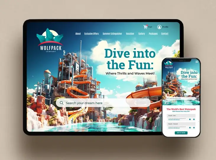
Your brand should look and feel the same across every interaction, whether someone sees your packaging, visits your Instagram, or reads an email.
Use your identity guidelines consistently across:
- Your website
- Social media platforms
- Marketing materials
- Packaging and print
- Internal communications
Consistency builds trust and recognition over time.
Pro Tip
A logo is not your brand, it’s your stamp. When it works in harmony with your mission, visuals, and voice, it becomes the finishing touch to a much larger system
To delve deeper into crafting a comprehensive brand identity, explore our How to create brand identity -A step by step guide
Brand Identity Checklist
Use this quick checklist to make sure your brand identity is clear, cohesive, and complete
Strategy
- Mission and core values defined
- Audience clearly understood (pain points, desires, persona)
Voice
- Consistent tone of voice chosen (e.g., friendly, expert, bold)
- Messaging aligned across all platforms
Visuals
- Logo integrates seamlessly with overall brand style
- Defined color palette and typography
- Consistent image and illustration style
Application
- Brand identity applied consistently across website, social, print, email
- A brand style guide is created and shared with your team
How to Build a strong Brand Identity
Coming up with a logo is only the starting point developing a complete brand identity requires purpose, simplicity, and consistency. Here's how you can put it together:
1. Define Your Brand Values
Begin by determining what your brand really stands for. Are you disruptive and fearless? Reliable and soothing? Your values will inform every decision you make on design and communication.
2. Select Your Visual Language
Choose a color scheme, font, and image style that is an extension of your personality. Ensure that they are versatile enough to carry over from your website, packaging, social media, and more.
Need help choosing brand colors? Canva’s color psychology tool can guide you based on emotion and tone
3. Establish a Consistent Tone of Voice
Determine how your brand speaks. Is your voice friendly, playful, formal, or inspirational? Use that same voice throughout taglines, product copy, and even social posts.
4. Create a Logo That Fits the Whole
Your logo must be like family, not the entire house. It's an identifiable symbol, but the rest of your identity voice, visuals, colors is what gives your brand life.
5. Implement on Every Touchpoint
Brand identity is established through repetition. Implement your elements consistently across
- Website
- Packaging
- Social media
- Email templates
- Ads and presentations
Conclusion
A great logo might spark recognition, but your brand identity is what builds trust and turns attention into loyalty.
Don’t stop at the logo. Build a brand experience people connect with and remember.
Now that you know the difference, you can approach your branding with confidence and intention. Don’t just create a logo build a brand experience that people connect with and remember.
Whether you're just starting out or refreshing an existing brand, keeping your identity consistent and clear is what truly sets you apart. Ready to take your brand beyond the logo?
See how we bring brand identities to life view our portfolio for inspiration.
FAQ
How is a logo different from brand identity?
A logo is an image, but brand identity is an entire system of visuals, voice, and values that compose a total brand experience.
Is a logo sufficient to create brand recognition?
No. A logo is only one component of the brand puzzle. Authentic recognition is from repeated visuals, messaging, and customer experience.
What comprises brand identity?
It encompasses your logo, typography, color, tone of voice, imagery, customer journey, packaging, and all touchpoints of communication.
Can I create brand identity without a logo?
Technically yes, but a logo is key to visual consistency and recognition, it's the beacon for your visuals.
Why is consistency critical to brand identity?
Consistency creates trust. When visuals, message, and tone are consistent across all channels, people know and trust your brand.
In what ways can Design Shifu assist with brand identity?
Design Shifu provides unlimited design assistance to develop your logo, brand graphics, templates, and so much more all giving your brand a unified identity.


