In this blog

Need a quality design at scale?
Subscribe to receive the latest blog posts to your inbox every week.
Newsletter design is how you turn emails into clicks, sign-ups, and sales. It’s not just about looking good, it’s about guiding readers to take action.
This guide gives you real tips, tested examples, and proven strategies. You can use these ideas yourself, or work with pros like Design Shifu to handle it for you.
What Is Newsletter Design? (And Why Most Businesses Get It Wrong)
Newsletter design is the layout, colors, fonts, images, and structure of an email newsletter.
Here's what most people miss: a well-designed newsletter isn't just "pretty." It's built to guide the reader's eye, hold attention, and drive action. Research shows that 65% of readers prefer emails with mostly images, but emails with the right balance of text and visuals get better click rates.
A well-designed newsletter:
- Is easy to read on any device
- Looks professional and trustworthy
- Helps readers find what matters most in under 5 seconds
- Guides people toward the action you want them to take
All of this makes people more likely to engage with your brand.
Why Good Newsletter Design Actually Matters (The Data)
Let's look at what the numbers tell us:
- People scan, not read: According to research from litmus shows, most readers spend just 51 seconds looking at an email. They scan for headlines and key points first. If your design doesn't guide their eyes, they'll miss your message entirely.
- Most emails are opened on phones: Over 60% of email opens happen on mobile devices. If your newsletter doesn't look good on a small screen, you're losing more than half your audience.
- Clear calls-to-action get more clicks: Emails with a single, clear call-to-action button can increase clicks by up to 371%, according to email marketing studies.
- Visual appeal builds trust: A clean, professional newsletter makes your brand look stronger. One study found that 38% of people will stop engaging with a website or email if the layout is unattractive.
The 6 Non-Negotiable Elements of Great Newsletter Design
1. Mobile-First Layout (Not Just Mobile-Friendly)
Most companies say their newsletters are "mobile-friendly." But there's a difference between something that works on mobile and something that's built for mobile.
What this means:
- Use a single-column layout: Multi-column designs look cluttered on phones and force readers to zoom and scroll sideways. Keep your content in one clean vertical flow.
- Make buttons at least 44 pixels tall: Apple's design guidelines recommend this size because anything smaller is hard to tap with your thumb.
- Test on real devices, not just preview tools: Email clients render differently across iPhone, Android, Gmail app, and Outlook.
- Why it works: Over 60% of your readers will see your newsletter on a phone first. Design for them, not as an afterthought.
The same mobile-first design principles are used in Instagram-optimized graphics, where layouts, image sizing, and text readability must work perfectly on small screens.
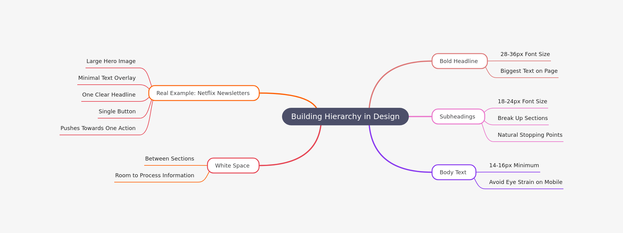
2. Visual Hierarchy That Guides the Eye
Your newsletter should answer three questions in 3 seconds:
- What is this about?
- Why should I care?
- What should I do next?
How to build hierarchy:
3. Strategic Call-to-Action Placement
The biggest mistake companies make? Burying their CTA or using weak, vague language.
What strong CTAs look like:
- Use action-oriented language: "Get Your Free Guide" instead of "Click Here"
- Make buttons stand out with contrasting colors. If your brand is blue, use orange or red for CTAs.
- Place the primary CTA above the fold and repeat it at the bottom. People who scroll deserve another chance to act.
- Use button CTA text that's 2-4 words maximum. Long button text reduces clicks.
- Test this: Emails with a single prominent CTA button get 371% more clicks than emails with multiple competing links.
4. The 60-40 Rule for Text and Images
Too many images slow load times and trigger spam filters. Too much text looks boring and gets ignored.
The sweet spot: Aim for 60% text, 40% images by visual weight.
How to apply this:
- Use one hero image at the top (this grabs attention).
- Break up text with smaller supporting images or icons. Include alt text for every image. If images don't load, readers still understand your message.
- Compress images to under 1MB total. Slow-loading emails get abandoned.
- Why this matters: Emails with just the right balance of text and images have a 42% higher transaction rate than all-text or all-image emails.
5. Typography That Works Everywhere
Fancy fonts look great on your screen. But they might render as gibberish in someone's email client.
Stick to web-safe fonts:
- Arial – Clean and universal
- Helvetica – Modern and readable
- Verdana – Designed for screens
- Georgia – Professional serif option
Font size guidelines:
- Headlines: 28-36px
- Subheadings: 18-24px
- Body text: 14-16px (minimum)
- Mobile body text: 16px minimum
Bonus tip: Use 1.5x line spacing. This makes text easier to read and reduces eye strain.
6. White Space Is Your Secret Weapon
White space isn't "wasted space." It's breathing room for your content.
Compare these two approaches:
- Bad: Cramming every inch of the newsletter with text, images, buttons, and offers. The reader's brain feels overwhelmed and shuts down.
- Good: Using generous margins, spacing between sections, and padding around buttons. The reader's eye naturally flows from one element to the next.
- Rule of thumb: Leave at least 20-30px of padding around every major element (images, text blocks, buttons).
5 Newsletter Design Ideas You Can Steal
The Storytelling Newsletter
Tell one cohesive story from top to bottom. Use images to support the narrative, and end with a clear CTA related to the story.
Best for: Content marketers, bloggers, nonprofits
Example structure:
- Hook headline + hero image
- 2-3 short paragraphs telling the story
- Supporting image or quote
- Clear CTA: "Read the full story"
The Single-Offer Promotion
Feature one product, service, or offer. Keep everything focused on that one thing.
Best for: E-commerce, SaaS companies, course creators
Example structure:
- Large product image
- 1-2 sentence benefit statement
- Price or offer details
- Bold CTA button
- Optional: small section of social proof
Why this works: The Hustle newsletter uses this format and averages a 40% open rate because it's clean, scannable, and doesn't overwhelm.
The Minimalist Digest
One hero image, one short headline, 2-3 sentences, and one link. That's it.
- Best for: Busy professionals, thought leaders, minimalist brands
- Why this works: Less is more. When every newsletter is screaming for attention with bells and whistles, a quiet, confident design stands out.
The Monthly Roundup
Share your top 3-5 pieces of content from the month. Use small thumbnail images and short descriptions.
Best for: Content-heavy businesses, agencies, publishers
Example structure:
- Brief intro paragraph
- Section 1: "Most Popular Article" with thumbnail + 2 sentences
- Section 2: "Customer Story" with thumbnail + 2 sentences
- Section 3: "Resource of the Month" with thumbnail + 2 sentences
- Footer CTA: "Visit our blog for more"
The Visual-First Newsletter
Lead with a stunning, full-width image. Add minimal text overlay. Make the entire image clickable.
- Best for: Fashion, travel, photography, lifestyle brands
- Pro tip: Use high-quality images but compress them properly. A slow-loading email kills engagement instantly.
How to Design a Newsletter: Simple Step-by-Step Workflow
Step 1: Define Your Goal
Before you design anything, ask: What do I want readers to do?
- Visit a blog post?
- Buy a product?
- Register for an event?
- Reply to the email?
Your entire design should support this one goal.
Step 2: Choose a Layout Template
Don't start from scratch. Use a proven template structure:
- Inverted pyramid: Most important info at top, supporting details below
- Z-pattern: Readers scan left-to-right at top, then diagonally down, then left-to-right at bottom
- F-pattern: Readers scan top-to-bottom on the left, then make horizontal sweeps
Pick the pattern that fits your content.
Step 3: Add Visual Elements Strategically
- Place your hero image first. This sets the tone.
- Use supporting images to break up text sections (but don't overdo it).
- Add icons or small graphics to draw attention to key points.
Step 4: Write Scannable Copy
- Use short sentences. Keep paragraphs to 2-3 lines maximum.
- Write headlines that tell the story on their own. Many readers only scan headlines.
- Use bold text sparingly to highlight key phrases (not entire sentences).
Step 5: Place Your CTA Strategically
- Put the primary CTA button above the fold (visible without scrolling).
- Repeat the CTA at the bottom for people who scroll through everything.
- Use contrasting colors and action-oriented text.
Step 6: Test on Multiple Devices
Send test emails to yourself and check:
- iPhone (native mail app)
- Android (Gmail app)
- Desktop (Outlook, Gmail web, Apple Mail)
- Tablet (if your audience uses them)
Pro tip: Test on an older iPhone with a smaller screen. If it looks good there, it'll look good everywhere.
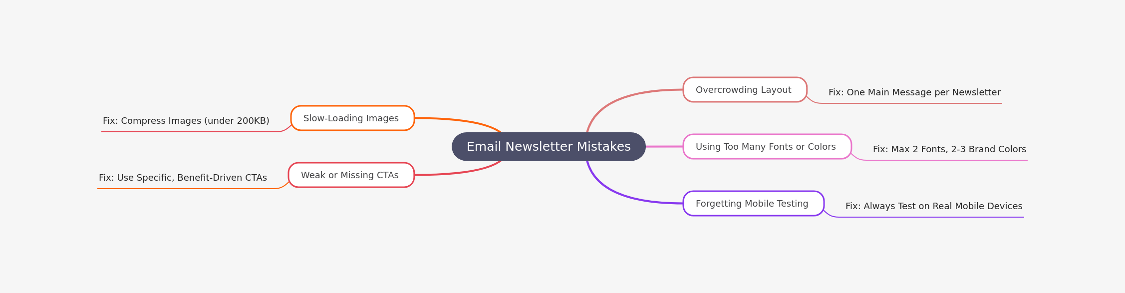
5 Newsletter Design Mistakes That Kill Engagement
Real Examples of Great Newsletter Design (With Details)
Let's look at what makes these newsletters stand out:
Netflix
What they do well: Large hero images, personalized content, and minimal text. Every newsletter feels custom-built for you.
The secret: They use dynamic content blocks that change based on your viewing history. But even without personalization, the design is clean and focused on one goal: get you to watch something.
Hodinkee (Watch Industry Newsletter)
What they do well: Single-column layout, beautiful product photography, and just enough text to be informative without overwhelming.
The secret: They understand their audience appreciates craftsmanship. The design mirrors that – clean, refined, and detailed.
InVision (Design Software Newsletter)
- What they do well: Balanced sections with clear visual hierarchy. Each section has a thumbnail, headline, short description, and CTA.
- The secret: They use subtle background colors to separate sections without being too loud. Everything breathes.
The Hustle (Business News Newsletter)
- What they do well: Conversational tone with simple design. No fancy graphics – just clean typography and smart formatting.
- The secret: They write like they're talking to a friend. The design supports this by staying simple and not getting in the way.
Vox (News Explainer)
- What they do well: Text-rich but organized with clear section headers and strategic use of links.
- The secret: They use hierarchy to make long-form content scannable. Even if you don't read every word, you get the main points.
When to Get Professional Help (And Why It's Worth It)
You might be thinking: "I can design newsletters myself in Canva or Mailchimp."
That's true. But here's what you're missing:
Professional designers understand:
- Email client compatibility (Gmail renders differently than Outlook)
- Coding for responsive design (not just template tweaking)
- A/B testing strategies to improve performance over time
- Brand consistency across all touchpoints
- Accessibility standards (so everyone can read your content)
The ROI is real: A professionally designed newsletter typically sees 25-50% higher engagement rates than DIY designs.
That's where Design Shifu comes in.
Why Growing Businesses Choose Design Shifu for Newsletter Design
Design Shifu isn't just another design service. Here's what makes them different:
- Expert newsletter design that actually converts They don't just make things look pretty. They design with metrics in mind – open rates, click-through rates, and conversions.
- Templates built for both mobile and desktop Every design is tested across devices and email clients before it goes to you. No surprises, no broken layouts.
- Brand-focused visuals that match your company Your newsletter should look like it came from your brand, not a generic template. Design Shifu builds custom designs that reflect your colors, tone, and style.
- Fast turnaround times Need a newsletter designed this week? They deliver quickly without sacrificing quality. You never miss a send date.
- No full-time designer needed You get professional results without hiring, onboarding, or managing an in-house designer. Perfect for small businesses, startups, and busy marketing teams.
Bottom Line: Design Matters, Results Follow
Strong newsletter design helps you:
- Get more opens (better subject lines + design preview)
- Increase clicks (clear CTAs + visual hierarchy)
- Build brand trust (professional appearance)
The formula is simple:
Clean layouts + scannable text + smart visuals + clear CTAs = newsletters that actually work.
If you want to level up your newsletter efforts and see real results, Design Shifu's expert design services can handle the heavy lifting while you focus on growing your business.
FAQ
What is the best layout for a newsletter?
A single-column layout works best because it's mobile-friendly and easy to scan. Multi-column designs often break on smaller screens.
How many images should I include?
Aim for a 60-40 text-to-image ratio. Use one hero image and 2-3 supporting images maximum. Too many images slow load times.
What's a good newsletter length?
Keep newsletters under 500 words if possible. Readers spend about 51 seconds on an email, so make every word count.
Should I use templates or custom designs?
Templates are great for consistency and speed. Custom designs are better for unique branding. Many businesses use templates as a foundation and customize them.
How do I make my CTA buttons more effective?
Use contrasting colors, action-oriented text (not "Click Here"), and make them at least 44 pixels tall so they're easy to tap on mobile.
About the author
Sameena is an Organic Growth Specialist and Content Writer at Design Shifu, crafting SEO-driven content that boosts visibility, builds brand authority, and drives meaningful organic growth.