In this blog

Need a quality design at scale?
Subscribe to receive the latest blog posts to your inbox every week.
You have three seconds.
That is all you have. In the time it took you to read this sentence, a driver has already zoomed past your billboard at 65 mph.
In today’s attention economy, digital billboards aren’t just oversized ads; they’re high-speed branding machines. When done right, they build awareness, drive traffic, and create unforgettable brand moments. When done wrong? They become expensive background noise.
This guide combines proven design principles with creative inspiration and real examples to help you design digital billboards that actually work.
Whether you’re designing for a highway, a busy intersection, or a city skyline, this is your complete playbook. Here is how to master the art of the 48-foot impact.
Why Billboard Design Still Matters in 2026
You might think billboards are old news, but the data says otherwise. In 2024, U.S. out-of-home advertising revenue crossed $9.1 billion, while the global billboard advertising market reached $60.7 billion and continues to grow.
Engagement remains strong, with studies showing that consumers notice billboards while driving at remarkably high rates.
And when it comes to performance, billboard advertising ROI averages around $6 for every $1 spent, with some billboard campaign ROI examples reaching as high as 497%.
The Golden Rules of Billboard Design
1. The 3-Second Rule (Keep It Lightning Fast)
People look at billboards for 3 to 7 seconds. That's your entire window.
Think about it. A driver going 55 mph sees your billboard for maybe 5 seconds. If they can't understand your message at that time, you've lost them.
What this means for you:
- One message only
- Big, bold text
- Zero clutter
- No paragraphs
A good test: Show your design to someone for 5 seconds. Can they tell you what it says? If not, you have to start over.
2. Seven Words or Less (Stop Talking So Much)
Here's a simple rule that most people ignore: use 7 words or less.
Why? Because reading takes time. And time is the one thing billboard viewers don't have.
Look at McDonald's directional billboards. They just show the golden arches and say "Exit here for McDonald's." Simple. Clear. Effective.
Good examples:
- "Hungry? Exit now."
- "Fresh coffee next left."
- "Save 50% today only."
Bad examples:
- "We are a family-owned business that has been serving the community for over 20 years with quality products."
See the difference?
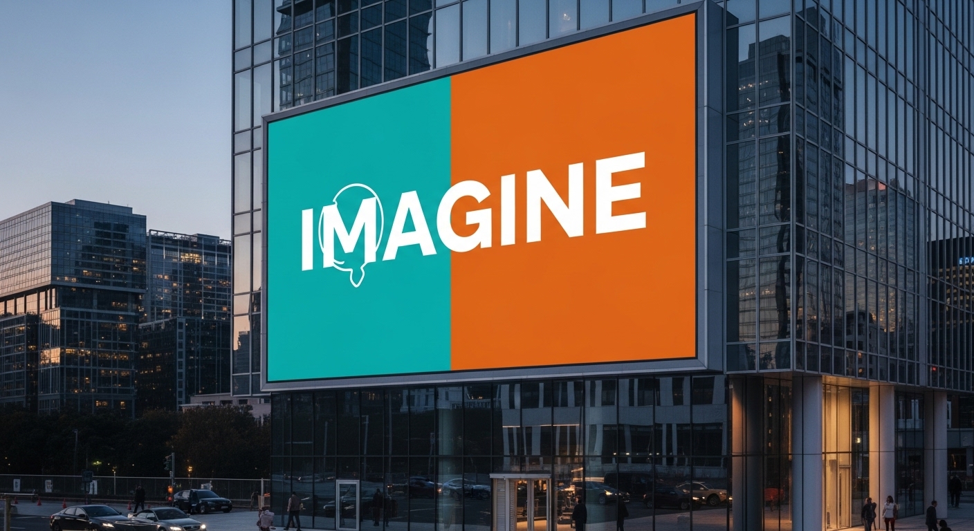
3. High-Contrast Colors (Make It Pop or Go Home)
Color contrast isn't just pretty. It's science.
Studies show that using high-contrast colors improves ad recall by 38%. That means more people remember your billboard when you use the right color combinations.
Best color combos:
- Black on yellow
- White on blue
- Black on white
- Red on white
- Yellow on dark blue
Worst color combos (never use these):
- Light gray on white
- Yellow on white
- Dark blue on black
- Red on green
Big brands get this. Coca-Cola uses white text on red. McDonald's uses yellow arches on red or black. These aren't accidents.
Pro tip: Test your design in grayscale. If the text disappears, your contrast is too weak.
4. Huge Fonts (Size Really Does Matter)
Here's the rule: for every 10 feet of viewing distance, your letters need to be at least 1 inch tall.
So if people see your billboard from 500 feet away, your letters should be at least 50 inches tall. But that's the minimum. Go bigger if you can.
Also, font choice matters:
- Use: Sans-serif fonts (like Arial, Helvetica)
- Avoid: Serif fonts (like Times New Roman)
- Never use: Script, cursive, or fancy fonts
Why? Sans-serif fonts stay readable at high speeds and long distances. Fancy fonts just blur together.
5. One Clear Message (Stop Confusing People)
Your billboard should have one job. Not two. Not three. One.
Are you:
- Building brand awareness?
- Announcing a sale?
- Giving directions to your store?
- Sharing a website?
Pick one. Then design everything around that single goal.
Why this matters: When you try to say everything, people remember nothing. When you say one thing clearly, it sticks.
6. Strong Call-to-Action (Tell People What to Do)
Don't make people guess what you want them to do. Tell them.
Weak CTAs:
- "Visit our website"
- "Learn more"
- "Contact us"
Strong CTAs:
- "Exit now for gas"
- "Call 555-1234 today"
- "Scan for 20% off"
- "Turn right in 500 feet"
The best billboards tell people exactly what action to take next. And they make it easy.
Important: Only include one way to contact you. Don't list your phone number, website, email, and social media. Pick the one that matters most.
7. White Space Is Your Friend (Less Is More)
New designers make this mistake: they fill every inch of the billboard.
Don't.
White space (or empty space) helps your message breathe. It makes your billboard easier to read and more professional.
Think of white space as a frame for your message. It directs the eye to what matters.
The Science Behind Why This Works
How the Brain Processes Billboards
Your brain processes images 60,000 times faster than text. That's why billboards with strong visuals work better than text-heavy designs.
High-contrast colors also help. Your brain can distinguish between strongly contrasting colors quickly, even at high speeds.
The Psychology of Color
Colors trigger emotions before you even read the words:
- Red: Creates urgency, grabs attention
- Blue: Builds trust, feels professional
- Yellow: Feels optimistic, energetic
- Green: Suggests growth, health
- Orange: Increases appetite
Use colors that match your message and your brand.
Real-World Examples That Prove It Works
McDonald's Directional Billboards
Simple arrows and the golden arches. No fancy text. Just "Turn right" or "Exit here." These billboards work because they follow every rule: simple message, high contrast, huge graphics.
Coca-Cola's Red and White
White text on red background. Every time. Everywhere. This consistency builds brand recognition. You can spot a Coca-Cola billboard from a mile away.
Spotify Wrapped Billboards
Spotify takes data from their app and turns it into billboard content. Spotify’s personalised, shareable creative works on and offline, just like real estate billboard campaigns that combine data and simplicity for maximum impact. These billboards work because they connect emotionally and stay simple.
Common Billboard Design Mistakes (And How to Avoid Them)
Too Much Text
- The problem: People can't read paragraphs at 60 mph.
- The fix: Cut your text in half. Then cut it in half again.
Low Contrast
- The problem: Light blue text on white background disappears.
- The fix: Always use high-contrast color combinations.
Small Fonts
- The problem: If you can't read it from across the street, it won't work on a highway.
- The fix: Make your smallest text at least 24 inches tall for a standard billboard.
Cluttered Design
- The problem: Too many images, logos, and text elements fight for attention.
- The fix: Remove everything that isn't absolutely necessary.
No Clear CTA
- The problem: People see your billboard but don't know what to do next.
- The fix: Add a simple, direct call-to-action.
Digital vs. Static Billboards: What You Need to Know
How to Test Your Billboard Design
Before you spend thousands of dollars, test your design:
The 5-Second Test
- Show your design to someone for 5 seconds
- Hide it
- Ask: What was the message? What should I do next?
- If they can't answer both questions, redesign
The Distance Test
Print your design and tape it on a wall. Stand across the room. Can you read it easily? If not, increase font size or improve contrast.
The Grayscale Test
Convert your design to black and white. Does the text still stand out? If it disappears, you need more contrast.
The Speed Test
Have someone drive past your design at normal speed. Did they get the message? If not, simplify.
Location Matters Too
Even the best design fails in the wrong location.
Good locations:
- High-traffic highways
- Slow-moving traffic areas
- Near your actual business
- At eye level for drivers
- Facing oncoming traffic
Bad locations:
- Too high or too low
- Sharp curves (people watch the road, not billboards)
- Behind trees or buildings
- Facing away from traffic
The Real Numbers Behind Billboard Success
Let's talk about money. Here's what the data shows:
- 71% of Americans consciously look at billboard messages
- 90% of consumers noticed outdoor advertising in the past month
- 48% of Gen Z and Millennials recommend products they saw on billboards
- Billboard advertising is effective in 38% to 86% of cases
- Average ROI: $6 for every $1 spent
- Best campaigns reach 497% ROI
Bottom line: When done right, billboards work.
Key Takeaways
Here's everything you need to remember:
- Keep it to 3 seconds - People glance at billboards quickly
- Use 7 words or less - More text = less impact
- High-contrast colors - Can improve recall by 38%
- Huge fonts - 1 inch per 10 feet of viewing distance
- One message only - Don't try to say everything
- Strong CTA - Tell people exactly what to do
- Test your design - Use the 5-second test
- Location matters - Even great designs fail in bad spots
Final Thoughts
Billboard design isn't rocket science. It's about clarity, simplicity, and respect for your viewer's time.
Follow these principles:
- Keep it short
- Make it readable
- Use high contrast
- Test before you launch
Do this, and your billboard will work. Ignore these rules, and you're wasting money.
The data doesn't lie. Billboards still work in 2026. But only if you design them right.
Now get out there and create a billboard that actually gets results. Ready to design a billboard that actually works?
Whether you’re launching your first OOH campaign or upgrading an existing one, the right design makes all the difference. If you want a billboard that’s clear, bold, and built for real-world impact, work with designers who understand how attention really works.
Start with smarter design and make every second count.
FAQ
How many words should be on a billboard?
Seven words or less. Most successful billboards use 5-6 words maximum.
What colors work best for billboards?
High-contrast combinations like black on yellow, white on blue, or white on black. Avoid low-contrast pairs like gray on white.
How big should billboard text be?
Follow the rule: 1 inch of letter height for every 10 feet of viewing distance. For a billboard viewed from 500 feet, use 50-inch letters minimum.
Are digital billboards better than static ones?
Digital billboards get 400% more views and grab more attention, but static billboards still work well and cost less. Choose based on your budget and goals.
How long do people look at billboards?
The average viewer looks at a billboard for 3 to 7 seconds. Design for the 3-second viewer.
What's the average ROI for billboard advertising?
Billboard advertising returns about $6 for every $1 spent on average. The best campaigns can reach up to 497% ROI.
Can I put my phone number and website on the same billboard?
Pick one. Including multiple contact methods clutters your design and reduces impact. Choose the contact method that's easiest for your audience to use.
About the author
Sameena is an Organic Growth Specialist and Content Writer at Design Shifu, crafting SEO-driven content that boosts visibility, builds brand authority, and drives meaningful organic growth.