In this blog

Need a quality design at scale?
Subscribe to receive the latest blog posts to your inbox every week.
Make it pop."
"Can you make the logo bigger?"
"I'll know it when I see it."
If you've ever said these words in a design meeting, you're not alone. But you're also the reason your designer just died a little inside.
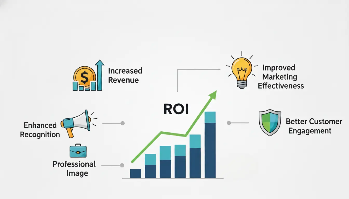
Here's what nobody tells you: 90% of design projects that drag on forever aren't failing because of bad designers. They're failing because of bad feedback. You think you're being helpful. The designer hears white noise. Three revisions later, you're both frustrated and no closer to the finish line. If you’re working with a unlimited graphic design service, clear feedback becomes even more critical to get fast turnaround.
The good news? Fixing this is very simple. You don't need a design degree. You just need to stop saying vague things and start saying specific things. This guide shows you exactly what to say, when to say it, and how to get better designs faster without the tension.
Why Design Feedback Goes Wrong
Picture this: You're in a two-hour meeting. Someone says "make it pop." Someone else wants the logo bigger. A third person says "it's just not working for me."
The designer nods, takes notes, and has no idea what to actually change.
This happens because:
- People share opinions, not problems
- Feedback focuses on taste instead of goals
- No one explains the "why"
- Everyone tries to be the designer
The result? More meetings. More revisions. Same problems.
The 3-Second Rule for Better Feedback
Before you say anything, ask yourself:
"Can the designer take action based on what I'm about to say?"
If not, rephrase it.
Examples:
Before (Unclear Feedback)
After (Actionable Feedback)
“I don’t like it.”
“The navigation is below the fold on mobile, so users can’t find it easily.”
“Make it more premium.”
“Since our target audience is luxury buyers, can we replace bright yellow with gold accents?”
The CLEAR Framework for Design Feedback
Use this 5-step method every single time: This is especially important for assets like landing page design, where every design decision directly impacts conversions.
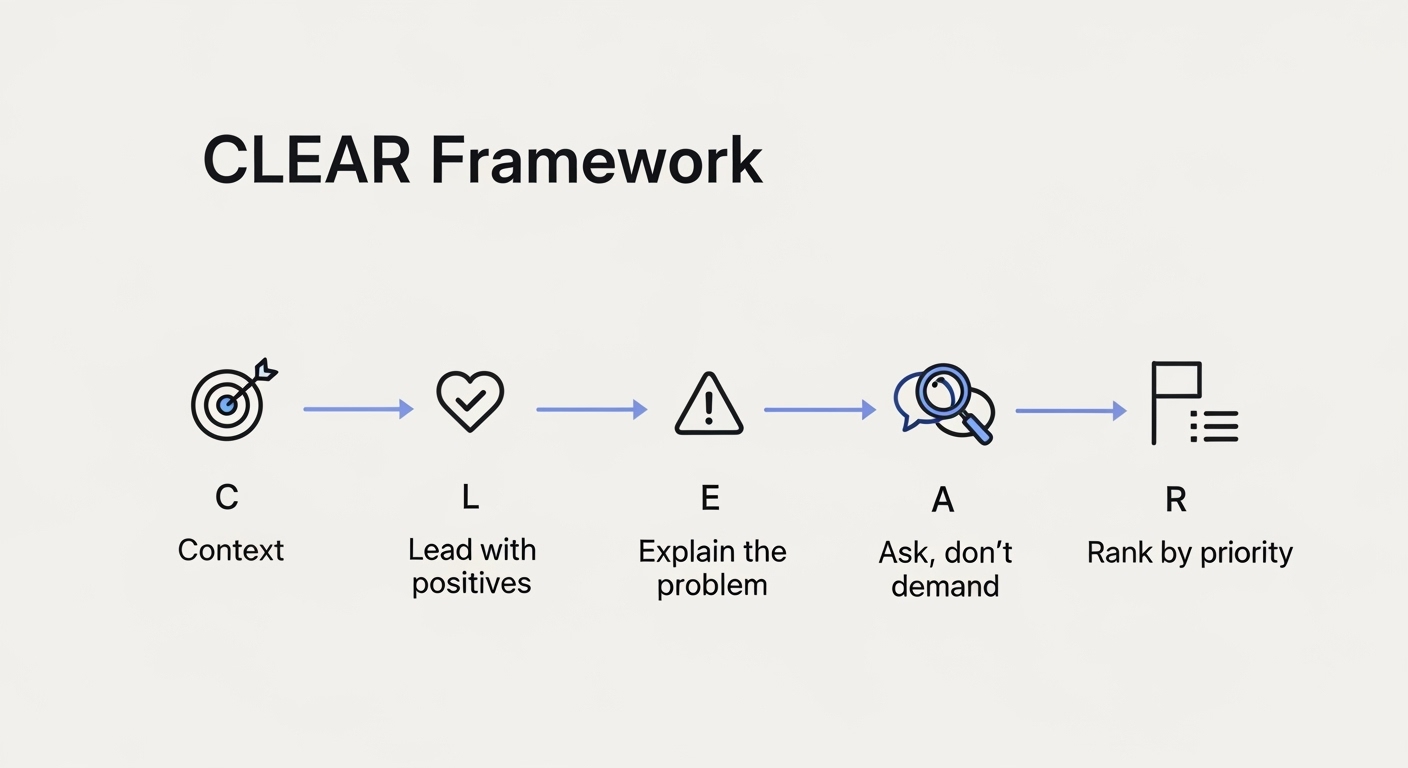
C - Context First
Start by confirming you understand the goal.
"Just to confirm, this landing page needs to convert free users to paid subscribers, right?"
This prevents you from giving feedback that doesn't match the project's purpose.
L - Lead with Positives
Name 2-3 things that work well.
"The hierarchy is clear. I immediately saw the headline and CTA button. The color scheme matches our brand perfectly."
This isn't fluff. It shows the designer what to protect when they make changes.
E - Explain the Problem
Describe the issue you're seeing and why it matters.
"The form has 12 fields. Our analytics show that forms over 5 fields have a 60% drop-off rate."
Notice: You're explaining the business impact, not just your feelings.
A - Ask, Don't Demand
Invite solutions instead of dictating them.
"What if we broke this into a multi-step form? Or could we collect some info after signup?"
Designers often have better ideas than your first suggestion.
R - Rank by Priority
Tag each piece of feedback:
- Critical: Breaks functionality, violates brand, or loses money
- Important: Improves experience significantly
- Nice-to-have: Small polish items
This helps designers know what to fix first.
The 10 Rules of Useful Design Feedback
1. Point to Specifics, Not Feelings
Bad: "It feels cluttered."
Good: "There are 7 CTAs above the fold competing for attention. Can we reduce this to 1 primary action?"
2. Reference Data, Not Opinions
Bad: "I think green works better."
Good: "Our A/B tests showed green buttons increased clicks by 18%."
3. Focus on User Needs, Not Your Preferences
Bad: "I prefer sans-serif fonts."
Good: "Our audience is 55+. Studies show serif fonts are easier for older adults to read on screens."
4. Explain the "Why" Every Time
Never give feedback without the reason behind it.
"The CTA text says 'Submit.' That's vague and doesn't tell users what happens next. Can we try 'Get My Free Guide' instead?"
5. Compare to Competitors or Best Practices
Bad: "This layout is old-fashioned."
Good: "Airbnb, Booking.com, and VRBO all put search front and center on their homepage. Should we consider that pattern?"
6. Give Feedback Early and Often
Don't wait until everything is "done."
Check in at these stages:
- Wireframes: Comment on layout and flow
- First design: Comment on visual direction
- Revisions: Comment on specific changes
- Final: Only catch last-minute issues
7. Separate Personal Taste from Business Goals
You might hate pink. But if your target audience loves it, your opinion doesn't matter.
Ask: "Does this work for our users?" Not: "Do I personally like this?"
8. Use Real Content in Your Review
Looking at "Lorem ipsum" text? You're not seeing the real design.
Review designs with actual headlines, product names, and copy. Placeholder text hides problems.
9. Check Multiple Devices and Scenarios
Don't just review on your laptop.
Check:
- Mobile phone
- Tablet
- Slow internet connection
- With real customer photos (not stock images)
- In different browsers
10. Limit the Number of Reviewers
Five people means five different opinions and endless compromise. Choose 1-2 decision-makers. Everyone else can share input, but they don't get final say. Too many reviewers slow down execution, something high-growth teams avoid by using a dedicated creative team model.
What to Say Instead of Common Vague Feedback
Here's a translation guide
When Feedback Contradicts Itself
Sometimes you get conflicting opinions:
- Person A: "Add more content".
- Person B: "Remove content".
Here's what to do:
- Ground it in goals: "Our goal is to increase signups. Which approach is better?"
- Look at the data: "Let's check heatmaps to see what users actually read."
- Test both: "Can we A/B test these two versions?"
- Let the expert decide: "Designer, what's your recommendation based on UX best practices?"
The Best Way to Deliver Tough Feedback
Sometimes you need to tell a designer their work missed the mark.
Here's how to do it without crushing them:
Don't Sugarcoat, But Don't Attack
Bad: "This is terrible. Start over."
Good: "This doesn't solve the problem we discussed. Let me explain what I'm seeing."
Be Direct About the Gap
"We need this to convert enterprise clients, but the design feels too casual. Our enterprise customers expect a more professional, data-driven presentation."
Offer Support
"What information do you need from me to nail this? Should we look at competitor sites together?"
Acknowledge the Effort
"I know you put hours into this. The animation work is impressive. The issue is the strategy, not the execution."
How to Handle Bad Feedback as a Designer
If you're receiving vague or contradictory feedback:
Ask Follow-Up Questions
- "Can you show me an example of what you mean?"
- "What specific element isn't working?"
- "How does this conflict with the project goals?"
Ground Discussions in Objectives
"Our goal is to reduce checkout abandonment. How does this suggestion help with that?"
Present Options with Tradeoffs
"I can make the logo bigger, but it will push the CTA below the fold on mobile. Which is more important?"
Push Back When Necessary
"That suggestion would violate accessibility standards for color contrast. Can I show you the WCAG guidelines?"
Red Flags in Feedback Sessions
Watch out for these warning signs:
- "I'll know it when I see it" → Translation: They don't actually know what they want
- Changing feedback after every revision → Decision-maker isn't thinking through requests
- "My spouse doesn't like it" → Using random opinions instead of target audience insights
- "Let's try this other completely different direction" → Scope creep
- Designing by democracy → Too many people with equal say
Tools That Make Feedback Easier
Stop sending emails with descriptions like "the thing in the upper right corner."
Use these instead:
For Visual Feedback:
- Figma comments (pin to exact spots)
- InVision (markup tools)
- Loom (record video walkthroughs)
For Organizing Feedback:
- Notion (feedback database)
- Asana/Monday (task tracking)
- Google Docs (comment threads)
For Testing Designs:
- Maze (user testing)
- Hotjar (heatmaps)
- Google Analytics (data validation)
The Feedback Session Template
Copy this structure for your next design review:
Before the Meeting (24 hours ahead):
- Share designs in review tool
- Include project goals and context
- Ask people to add comments beforehand
During the Meeting (30-45 minutes):
- 5 min: Designer presents goals and approach
- 15 min: Walk through design, explaining decisions
- 15 min: Discuss feedback (start with positives)
- 5 min: Summarize action items and priorities
After the Meeting:
- Send recap email within 24 hours
- List all changes with priority tags
- Confirm timeline for next review
Examples of Feedback Done Right
Example 1: E-commerce Product Page
- Bad: "The product photos need work."
- Good: "The product photos are only 500px wide. On the desktop, they look pixelated. Can we use 1200px images so customers can see details clearly? Our return rate for clothing is 30%, often due to quality expectations not matching reality." This is especially critical in product image design, where clarity directly impacts conversions.
Example 2: SaaS Dashboard
- Bad: "The dashboard is confusing."
- Good: "The most critical metric (MRR) is buried in the bottom right. User interviews showed 80% of customers check MRR first thing. Can we make that the hero element in the top left?"
Example 3: Mobile App
- Bad: "Navigation is bad."
- Good: "The hamburger menu hides our main features. Usability tests showed users couldn't find the messaging feature. Can we switch to a bottom tab bar with icons for the 4 main features?"
Common Mistakes That Kill Productivity
Mistake 1: Asking for Changes You'll Reverse Later
Think before you speak. Flip-flopping wastes everyone's time.
Mistake 2: Giving Feedback on Typography When the Layout Is Wrong
Fix big problems before small ones. Don't tweak font sizes if the whole page needs restructuring.
Mistake 3: Debating Pixel Perfection in Early Drafts
Save nitpicking for final rounds. Early stages are about direction, not details.
Mistake 4: Ignoring Technical Constraints
"Can we add a 3D product viewer?" Maybe. But it might slow load time to 10 seconds.
Always ask: "Is this technically feasible within budget and timeline?"
Mistake 5: Treating Every Project Like a Portfolio Piece
Not every design needs to win awards. Sometimes "good enough to convert" beats "breathtakingly beautiful."
The Culture Shift: Make Feedback Normal
The best teams make feedback feel routine, not scary.
How to build this:
- Share Feedback Often: Don't save everything for formal reviews. Quick Slack messages work too.
- Make It Two-Way: Designers should feel comfortable pushing back on bad feedback.
- Celebrate Good Feedback: When someone gives specific, helpful feedback, call it out.
- Separate Feedback from Identity: "This design needs work" is not the same as "You're bad at your job."
- Learn Together: Share articles, take courses, improve as a team.
Your Feedback Checklist
Before sharing feedback, check these boxes:
- [ ] I understand the project goals
- [ ] I've reviewed the design thoroughly
- [ ] My feedback is specific and actionable
- [ ] I've explained the "why" behind each point
- [ ] I've started with positives
- [ ] I've prioritized issues (critical vs. nice-to-have)
- [ ] I'm focusing on user needs, not personal taste
- [ ] I'm open to solutions I haven't thought of
Key Takeaways
- Be specific, not vague: Replace "I don't like it" with "The navigation is hidden below the fold on mobile"
- Use the CLEAR Framework: Context → Lead with positives → Explain → Ask → Rank
- Apply the 3-second rule: Ask "Can the designer take action on this?" before speaking
- Back feedback with data: Reference analytics, user testing, or competitor research
- Separate taste from strategy: Your personal preferences don't matter user needs do
- Prioritize feedback: Tag as Critical, Important, or Nice-to-have
- Give feedback early: Review wireframes, first drafts, and revisions, not just final designs
- Limit decision-makers: Too many voices create contradictions and delays
The Bottom Line
Good feedback isn't about being nice or mean. It's about being clear.
- Stop saying "I don't like it." Start explaining the problem and why it matters.
- Stop demanding solutions. Start asking questions and trusting expertise.
- Stop making feedback personal. Start making it about goals, users, and data.
The designers you work with want to create great work. Your job is to help them understand what "great" means for your specific project with specific words, not vague feelings. Try this framework in your next design review. You'll see better designs, faster iterations, and way less drama. If you want faster design turnaround without endless revisions, working with a structured team makes all the difference. Explore how Design Shifu helps teams streamline feedback and get high-quality designs faster.
FAQ
How do you give constructive feedback to a designer?
Use the CLEAR Framework: Start with context (confirm the goal), lead with positives (mention what works), explain the problem with reasoning (not just opinions), ask for solutions instead of demanding them, and rank feedback by priority. Always be specific; instead of "this needs work," say the form has 12 fields, and our data shows 60% drop-off on forms over 5 fields.
What is the sandwich method of feedback?
The sandwich method means giving positive feedback first, then criticism, then ending with more positives. While this can work, it's often seen as manipulative. A better approach is to be genuine with positives that help the designer know what to keep, then give clear, specific feedback about improvements tied to business goals.
How do you give feedback without being rude?
Focus on problems, not people. Say "This design doesn't meet accessibility standards for contrast" instead of "You didn't follow accessibility rules." Explain the "why" behind your feedback and invite solutions rather than demanding them. Ask "What if we tried..." instead of "You need to change this."
What should you not say when giving design feedback?
Avoid vague phrases like "make it pop," "I don't like it," "something's off," or "make it more modern." These don't give designers actionable direction. Also avoid subjective words like "boring," "ugly," or "cool" without explaining the actual issue. Never give feedback based purely on personal taste without connecting it to user needs or business goals.
How often should you give design feedback?
Give feedback at multiple stages: wireframes (layout and flow), first design draft (visual direction), revisions (specific changes), and final review (last-minute catches). Don't wait until a design is "complete" to share major concerns. Early, frequent feedback prevents wasted work and endless revisions.
What tools are best for giving design feedback?
Use visual feedback tools like Figma (for pinned comments), InVision (for markup), or Loom (for video walkthroughs). For organizing feedback, try Notion, Asana, or Monday. These let you comment directly on designs instead of vague email descriptions like "the thing in the upper right."
How do you prioritize design feedback?
Use a three-tier system: Critical (breaks functionality, violates brand, loses money), Important (significantly improves user experience), and Nice-to-have (small polish items). This helps designers tackle the most impactful issues first rather than getting lost in minor tweaks.
About the author
Sameena is an Organic Growth Specialist and Content Writer at Design Shifu, crafting SEO-driven content that boosts visibility, builds brand authority, and drives meaningful organic growth.