In this blog

Need a quality design at scale?
Subscribe to receive the latest blog posts to your inbox every week.
You've been asked to review a design, but you're not a designer. Your palms are sweaty. You're staring at a mockup thinking, I have no idea what I'm looking for.
Don't worry. You're not alone. Many people without design training need to review designs as part of their job.
Research shows that nearly half of design review feedback (43%) is never documented or addressed, highlighting how common it is for valuable input to be missed in review processes. This happens because most non-designers don't know what aspects of a design to evaluate.
This guide will give you a simple checklist to review designs like a pro even if you've never used Photoshop in your life.
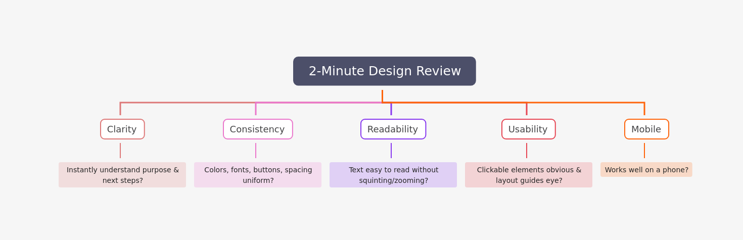
Skim This First: 2-Minute Design Review
If you only have 2 minutes, check these five things:
What Is a Design Review?
A design review is a milestone within a product development process where a design is evaluated against its requirements to verify the outcomes of previous activities and identify issues before committing to further work.
Think of it as a team huddle where everyone comes together to catch problems before they become expensive to fix. Often, non-designers have to sign off on design elements. That's where this checklist comes in.
The Non-Designer's Design Review Checklist
Here's your simple checklist. Work through each section when reviewing any design.
1. Visual Consistency
Consistency makes designs look professional. The most common mistake non-designers notice is the lack of consistency in designs.
Check these things:
- Colors: Are the same colors used throughout? Visual consistency means using exact color codes, typography, and design patterns to help customers recognize your brand instantly across every touchpoint
- Fonts: Do headings look the same on every page?
- Buttons: Do all buttons have the same style?
- Spacing: Is there similar space between elements?
- Images: Do photos have the same style or filter?
Ask yourself: If I saw two random pages from this design, would I know they're from the same product?
2. Typography and Text
For readability purposes, 50 to 60 characters per line is the ideal length.
Check these things:
- Font count: Depending on how big your design is, you can use one font in varying weights, or up to 3 fonts
- Text size: Can you read body text easily? Website body text is typically 16px, with H1 headers set at 48px
- Letter spacing: Spacing between letters (called kerning) can make a big difference in how your project looks
- Line length: Are text lines too long or too short?
- Hierarchy: Can you tell which text is most important?
Ask yourself: Can I scan this quickly and understand the main message?
3. White Space (Empty Space)
A sure sign of an amateur designer is the lack of white space (or negative space) in a visual design.
Check these things:
- Breathing room: Do elements have space around them?
- Crowding: Does the design feel stuffed or cramped?
- Balance: Are some areas heavy with content while others are lighter?
- Margins: Is there space at the edges of the design?
Ask yourself: Does my eye know where to look, or am I overwhelmed?
4. Image Quality
Non-designers often make the mistake of using raster images instead of vectors. Images should look sharp and clear.
Check these things:
- Clarity: Are images sharp or blurry?
- Stretching: Do any images look squished or stretched?
- Size: Are images too small or too large?
- Relevance: Do images support the message?
- Style: Do all images have a similar look?
Ask yourself: Would I use these images in a professional presentation?
5. Color Use
One of the single most important design decisions you will make is your choice of color combinations.
Check these things:
- Contrast: Can you read text against its background?
- Color count: Are there too many colors? (Usually 3-5 is enough)
- Meaning: Do colors make sense? (Red for error, green for success)
- Brand match: Do colors fit the brand?
Ask yourself: Are any color combinations hard to look at or read?
6. Layout and Organization
Non-designers often place elements on the page based on eye alone, simply guessing and putting things where they think they look good.
Check these things:
- Alignment: Do elements line up with each other?
- Balance: Does one side feel heavier than the other?
- Flow: Does your eye move naturally through the design?
- Grid: Do elements seem organized or random?
Ask yourself: Does the layout feel intentional, or does it feel like things were randomly placed?
7. Functionality Check
Design isn't just about looks. It needs to work, especially when you’re building designs that actually convert, where usability directly impacts results. because if users don’t know what to click or where to go next, even great visuals won’t perform
Check these things:
- Buttons: Are clickable things obvious?
- Forms: Are input fields clear?
- Navigation: Can you find your way around easily?
- Actions: Is it clear what you should do next?
- Error states: What happens when something goes wrong?
Ask yourself: If I had never seen this before, would I know how to use it?
8. Message Clarity
The goal of good design is not just to be aesthetically pleasing, but to effectively communicate a message.
Check these things:
- Main message: What is this design trying to say?
- Target audience: Who is this for?
- Tone: Does it match the brand personality?
- Calls-to-action: Are they clear and compelling?
- Value: Is the benefit obvious?
Ask yourself: Could my mom understand what this is about in 5 seconds?
9. Mobile-Friendliness
If the design appears on phones or tablets, check this.
Check these things:
- Size: Will buttons be big enough to tap?
- Text: Will text be readable on small screens?
- Layout: Does the design work vertically?
- Images: Will images scale properly?
Ask yourself: Would I use this on my phone?
10. Brand Consistency
The checklist prompts you to review design flexibility and feasibility and any legal implications.
Check these things:
- Logo: Is it placed correctly?
- Voice: Does the writing match the brand?
- Style: Does it feel like the brand?
- Guidelines: Does it follow brand rules?
Ask yourself: Does this feel like our brand, or could it be anyone's?
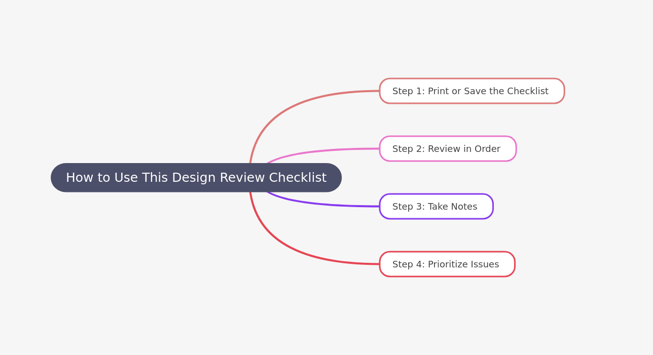
How to Use This Design Review Checklist
A design review checklist works best when you follow a systematic approach to design evaluation.
Here's how to make the most of it
Common Design Mistakes to Watch For
Now that you have the checklist, here are the most common mistakes non-designers spot:
1. Too Many Fonts
Non-designers have a tendency to overdo it by combining too many fonts, which tends to give the design a disorganized and unprofessional look.
Solution: Point out if you see more than 3 different fonts.
2. Not Enough White Space
If you overload designs and try to fill every bit of space, you won't give individual elements a chance to stand out.
Solution: If the design feels cramped or overwhelming, say so.
3. Poor Color Contrast
Many times, a project with good communicative potential can go awry if the right colors are not chosen.
Solution: If you can't read text easily, the contrast is wrong.
4. Blurry Images
If you are worried about your design getting pixelated, a good rule is to make your design bigger than it needs to be.
Solution: Point out any images that look fuzzy or unclear.
5. Inconsistent Styles
You should use the same visual elements such as image filters or types of buttons and layouts throughout your project.
Solution: If buttons look different on different pages, mention it.
6. Text That's Too Small
If you make your visitors zoom to see your content, you are making a mistake which can cost you people leaving or not coming back.
Solution: If you're squinting to read something, it's too small.
7. Too Much Text
Using way too much text could make your design cluttered and ineffective.
Solution: If you see large blocks of text, suggest breaking them up.
8. Confusing Layout
People with no design training simply place all elements on the page based on eye alone, guessing and putting things where they think they look good.
Solution: If you can't figure out where to look first, the layout needs work.
How to Give Your Feedback
Having a checklist is one thing. Delivering feedback well is another.
Be Specific
Don't say: "I don't like it."
Do say: "The red text on the green background is hard to read."
Explain Why
Don't say: "The font is bad."
Do say: "This font feels too playful for a legal services company."
Ask Questions
Don't say: "This is confusing."
Do say: "I'm not sure what button I should click first. Can we make that clearer?"
Focus on Problems, Not Solutions
You're not the designer. Don't tell them how to fix it.
Don't say: "Make the logo bigger and move it to the left."
Do say: "I'm having trouble seeing the logo. Could we make it more visible?"
Be Kind
Designers put a lot of work into their creations. Give feedback like you're talking to a friend.
Don't say: "This looks terrible."
Do say: "I think we can make this stronger. Here's what I'm noticing..."
Before You Review: Setting Yourself Up for Success
1. Understand the Goals
Define clear objectives and set specific goals for the review, such as validating the design against requirements or identifying potential issues.
Ask: What is this design supposed to do? Who is it for?
2. Look at the Design Brief
If there's a document explaining what the design should achieve, read it first.
3. Set Context
It's important to set context as it levels the playing field and helps explain the "why" behind what you're doing.
Ask the designer: What problem were you trying to solve?
4. Take Your Time
Don't rush. Most non-designers don't have a clue how to give design feedback if they haven't seen the designs before.
Spend at least 10-15 minutes really looking at the design.
5. Look at It on Different Devices
If possible, view the design on your phone, tablet, and computer.
During the Review: What to Do
1. Start with the Positive
Begin by pointing out what works well. This helps the designer feel heard.
2. Work Through Your Checklist
Go section by section. Don't try to remember everything at once.
3. Take Notes
Write down your observations as you go.
4. Think Like a User
Prioritize usability and user experience during the design review by evaluating the design from the end-user perspective.
Pretend you've never seen this before. What would confuse you?
5. Don't Be Afraid to Ask "Why?"
If something seems odd, ask the designer why they made that choice. There might be a good reason.
After the Review: Following Up
1. Summarize Your Feedback
Send a quick email listing your main points.
2. Prioritize Issues
Mark which issues are critical (must fix) and which are nice-to-have (could fix).
3. Be Available
The designer might have questions about your feedback. Make time to clarify.
4. Thank the Designer
Recognize their hard work, even if you had a lot of feedback.
Red Flags That Need Immediate Attention
Some issues are deal-breakers. Flag these right away:
- Spelling mistakes: Spelling errors make your design look bad instantly and makes viewers lose trust in the message
- Wrong logo: Using an old or incorrect version of the company logo
- Broken functionality: Buttons that don't work or links that go nowhere
- Legal issues: Missing required disclaimers or copyright notices
- Brand violations: Colors or fonts that don't match brand guidelines
- Accessibility problems: Text that can't be read or buttons that can't be clicked.These issues violate basic accessibility standards defined in the WCAG accessibility guidelines.
- Missing information: Key details that should be there but aren't
Tools That Can Help You
You don't need fancy software to review designs well. Here are simple tools:
For Taking Notes
- Google Docs (free)
- Your email
- A notebook
For Marking Up Designs
- Screenshot and draw on it
- Use comment features in design tools (if you have access)
- Print it and use a pen
For Checking Colors
- WebAIM Contrast Checker (free online tool)
For Measuring Text
- Your browser's zoom function
- A ruler on your screen
Key Takeaways
- Consistency is king: Check if colors, fonts, and buttons look the same throughout
- White space matters: Designs need room to breathe, not every inch filled
- Text should be readable: If you're squinting, something's wrong
- Images should look crisp: Blurry or stretched images look unprofessional
- The message should be clear: If you don't understand it, neither will customers
Quick Reference: Your 1-Page Checklist
Print this and keep it handy:
Visual Consistency
- ☐ Colors match throughout
- ☐ Fonts are consistent
- ☐ Buttons look the same
- ☐ Spacing is similar
Typography
- ☐ Easy to read
- ☐ 3 or fewer fonts
- ☐ Good letter spacing
- ☐ Clear hierarchy
White Space
- ☐ Elements have breathing room
- ☐ Not too crowded
- ☐ Balanced layout
Images
- ☐ Sharp and clear
- ☐ Not stretched
- ☐ Relevant to message
- ☐ Consistent style
Colors
- ☐ Good contrast
- ☐ Not too many colors
- ☐ Makes sense (red = stop)
Layout
- ☐ Elements line up
- ☐ Feels balanced
- ☐ Easy to follow
Functionality
- ☐ Buttons are obvious
- ☐ Easy to navigate
- ☐ Clear next steps
Message
- ☐ Main point is clear
- ☐ Right tone
- ☐ Obvious benefit
Mobile
- ☐ Works on small screens
- ☐ Text readable
- ☐ Buttons tappable
Brand
- ☐ Logo correct
- ☐ Matches brand voice
- ☐ Follows guidelines
Final Thoughts
You don't need to be a designer to review designs well. You just need to be observant, use a checklist, and think about whether the design does its job.
Design reviews are about receiving constructive criticism with clear goals in mind. Your role is to bring a fresh perspective and catch things the design team might have missed.
Remember:
- Use the checklist
- Be specific with your feedback
- Focus on problems, not solutions
- Think like a user
- Be kind
With this guide, you're ready to review designs with confidence. Your team will appreciate your thoughtful input, and you'll help create better products.
Now go forth and review those designs like the pro you are.
Want to make design reviews easier?
If you’d rather spend less time spotting issues and more time moving projects forward, working with a dedicated design team can remove the guesswork. Professional designers ensure consistency, usability, and brand alignment, so reviews become faster and stress-free.
FAQ
What should a non-designer focus on during a design review?
Focus on three main areas: consistency (do things match?), clarity (can you understand it?), and usability (can you use it?). You don't need to judge artistic choices. Just check if the design works for its purpose.
How do I review a design if I have no design experience?
Use a checklist and trust your instincts. Design reviews are about receiving constructive criticism with clear goals in mind for what you wish to accomplish. If something confuses you, it will confuse users too. Focus on whether the design communicates clearly and works well.
What are the most common design mistakes?
The most common mistakes include using too many fonts, not having enough white space, poor color contrast, blurry images, inconsistent styles, text that's too small, too much text, and confusing layouts. Non-designers often make mistakes with font selection, spacing, and color choices.
Can a non-designer give valuable feedback?
Yes! Design reviews work best when they involve a variety of people, including non-engineers like suppliers, manufacturing, procurement, and customers. Fresh perspectives help catch issues that designers might miss. Your job isn't to redesign, it's to spot problems from a user's point of view.
How long should a design review take?
For a simple project like a social media graphic, spend 10-15 minutes. For complex projects like a website, spend 30-60 minutes. A formal design review follows a structured agenda that includes a brief overview, background, the design review, feedback gathering, and prioritizing next steps.
Should I tell the designer how to fix the issues I find?
No. Point out problems, but let the designer solve them. The goal is to collect feedback that is meaningful and useful. Say "This text is hard to read" instead of "Make the text bigger and change the font to Arial."
What if I don't understand design terms?
That's okay. You don't need to use fancy words. Just describe what you see. Instead of saying "The kerning is off," say "The letters look too close together." Clear, simple feedback is better than trying to sound like a designer.
How do I know if my feedback is useful?
Useful feedback is specific, explains why something doesn't work, and focuses on the design's goals. Document actionable feedback and recommendations throughout the design review process. If the designer can take action based on what you said, your feedback is useful.
About the author
Sameena is an Organic Growth Specialist and Content Writer at Design Shifu, crafting SEO-driven content that boosts visibility, builds brand authority, and drives meaningful organic growth.