

In this blog

Need a design partner that scales with you?
See exactly how Design Shifu can become your on-demand design team. Book a free demo call.
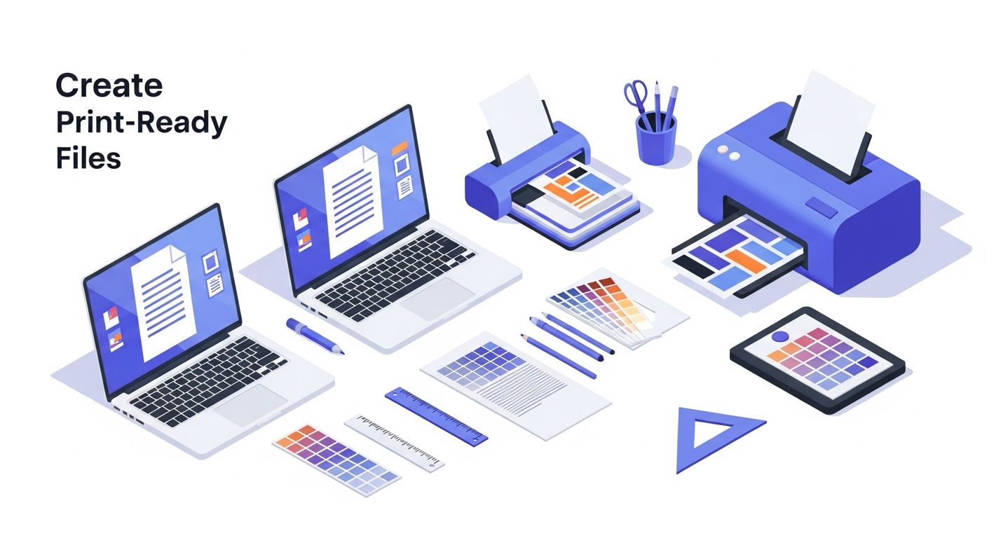
Struggling to turn your brilliant design into a print-ready masterpiece? Whether it’s a poster, business card, or flyer, sending the wrong file to a printer can turn your hard work into blurry chaos. Don’t worry, you’re not alone.
In this guide, we’ll break down everything you need to know to create a professional, print-ready file that looks crisp, polished, and exactly like you imagined without the stress. Let’s dive in and make your designs shine in the real world!
TL;DR
- Always check your printer’s specs before starting.
- Use CMYK color mode and 300 DPI resolution.
- Add 0.125" bleed and safe margins.
- Export as a PDF Print / PDF/X-1a with crop marks.
- Proof before mass-printing to avoid costly mistakes.
Why Print-Ready Files Matter (And Why It’s Not as Scary as It Sounds)
Ever spent hours designing the perfect poster, business card, or flyer. But when you send it to the printer, they email back with a list of cryptic terms like CMYK, bleed, resolution and suddenly you’re spiraling, thinking, “Did I just waste all that time?” I’ve been there.
Once, I sent a low-res JPEG to a printer and got back something that looked like it was run through a 90s fax machine. Printers need files set up a certain way to make your work shine in the real world. A print-ready file is just a digital file formatted to play nice with a printer’s requirements. It’s not rocket science, it’s more like baking a cake with the right ingredients.
With digital printing and design trends evolving rapidly, knowing how to create a print-ready file is more important than ever.
Let’s break it down so you can nail this without the stress.
Step 1: Know Your Printer’s Requirements
First things first, talk to your printer. I know, I know calling or emailing a print shop feels like asking a chef to explain their secret sauce. But trust me, printers love clear communication. Every shop has slightly different specs, so ask them for a checklist. They’ll usually tell you things like:
- File format: PDF is the gold standard for print-ready files. It’s like the universal remote of file types works everywhere.
- Color mode: Use CMYK, not RGB. RGB is for screens (vibrant but deceptive), while CMYK is for ink on paper. If you use RGB, your bright neon green might print as swamp sludge. I hated that.
- Resolution: Aim for 300 DPI (dots per inch). Anything less, and your design might look pixelated, like a Minecraft character in real life.
- Bleed and margins: Bleed is extra space around your design (usually 0.125 inches) to account for trimming. Think of it as an overflow room for your artwork.
Pro tip: Save their email or jot down their specs on a sticky note. It’ll save you from scrambling later.
Step 2: Set Up Your Canvas the Right Way
Whether you’re using Adobe Illustrator, Photoshop, Canva, or even free tools like GIMP, start with the right canvas size. This is where a lot of beginners (including past me) trip up. If you’re designing a 5x7-inch postcard, don’t just set your canvas to 5x7. Add that bleed I mentioned 0.125 inches on all sides, so your final size might be 5.25x7.25 inches.
Here’s a quick setup checklist:
- Set your document to the final print size plus bleed.
- Switch to CMYK color mode from the start. (In Canva, you’ll need to export as a PDF with CMYK settings, check their help docs.)
- Use 300 DPI for crisp results.
- Add guides for “safe zones” (usually 0.25 inches inside the edges) to keep important stuff like text away from the trim line.
I once forgot to add bleed to a flyer, and the edges got chopped off like a bad haircut. Don’t be me. Set it up right from the jump.
Step 3: Design with Print in Mind
This part’s fun but tricky. You’re probably excited to slap on bold colors and tiny fonts because they look cool on your screen. But printers aren’t magic, they can’t always match what you see digitally. Here’s how to keep things print-friendly:
- Colors: Stick to CMYK-safe colors. If you’re using a tool like Canva, preview your design in CMYK mode if possible. Bright RGB colors (like electric blue) are often dull in print, so tweak them early.
- Fonts: Keep fonts legible, nothing below 6pt for small text. Fancy script fonts can look like spaghetti if they’re too tiny. Test by zooming out on your screen.
- Images: Use high-res images (300 DPI or higher). That cute photo from your phone might look great on Instagram but blurry on a poster. If you’re grabbing stock images, double-check their resolution.
And a quick tangent double-check your spelling. I once printed 100 flyers with "Restaurant" instead of “Restaurant.” My client was not amused.
Step 4: Export Like a Pro
Okay, you’ve got your design looking sharp. Now it’s time to export it as a print-ready PDF. This is where the magic happens or where things go sideways if you’re not careful. Here’s how to nail it:
- In Adobe software: Export as a PDF/X-1a file. It’s a fancy way of saying “printer-friendly PDF.” Make sure “bleed” is checked in the export settings.
- In Canva: Choose “PDF Print” when downloading, and enable “Crop marks and bleed” to include that extra space.
- In other tools: Look for “high-quality print” or “CMYK” export options. If you’re unsure, Google your software’s name + “print-ready PDF” for specific steps.
Before you hit send, open the PDF and zoom in, if you want to see professional results, see examples of our print-ready designs.
Step 5: Double-Check with Your Printer
Before you send your file, do a final gut check. Email your printer a low-res version or a screenshot and ask, “Does this look good to you?” Most shops are happy to give a quick thumbs-up or flag issues like low resolution or missing bleed. It’s like getting a second opinion before surgery better safe than sorry.
If you’re nervous, order a proof (a test print). It costs a little extra, but it’s worth it to avoid printing 500 posters with a typo or funky colors.
Key Takeaways
- Printers need specific formats, don’t skip their checklist.
- CMYK + 300 DPI = professional quality prints.
- Always add bleed & safe margins to avoid cut-off edges.
- Preview and proof your file before committing.
- Better safe than sorry, printers will happily flag issues if you ask.
How to Nail Your Print-Ready File Like a Pro
Look, creating a print-ready file sounds intimidating, but it’s just a process. You’re not designing a spaceship, you’re telling a printer how to bring your vision to life. You’ve got this. The first time I nailed a print-ready file, I felt like I’d cracked some secret code. And honestly? It’s just a matter of knowing the steps and checking your work. If I can do it (after all my rookie mistakes), you can too.
So, go fire up your design software, double-check those specs, and send that file off with confidence. And if you mess up? Laugh it off, learn, and try again. Printers have seen it all, and they’re not judging. (Okay, maybe a little, but they’ll still help you out.)
Got a specific design project you’re sweating over? Drop a comment or shoot me a message, and I’ll help you troubleshoot. Now go make something awesome, and make it print-ready!
Conclusion
Creating a print-ready file doesn’t have to be stressful. But if you’d rather skip the technical setup and focus on your business, let Design Shifu handle it for you.
Our unlimited design subscription ensures your flyers, posters, and business cards are always pixel-perfect and print-ready.
Check out our affordable unlimited design plans here.
FAQ
Can I print from a JPEG or PNG?
You can, but it’s not the best choice. These formats may lose quality, while a PDF/X-1a ensures cleaner, professional results.
What happens if I forget to bleed?
Your design edges might get cut off during trimming. Adding at least 0.125 inches of bleed prevents this issue.
Do I need CMYK if my printer accepts RGB?
Yes. RGB is for screens and can print with dull colors. CMYK is specifically designed for accurate printing.
Is Canva good enough for print design?
Yes, as long as you export using PDF Print with crop marks and bleed. For advanced projects, Adobe tools are better.
What’s the easiest way to avoid mistakes?
Talk to your printer before sending files. Getting their specs and ordering a proof can save you costly errors.
Why is resolution important?
Low resolution makes prints blurry or pixelated. Stick to 300 DPI for sharp, high-quality results.
About the author
Sameena is an Organic Growth Specialist and Content Writer at Design Shifu, crafting SEO-driven content that boosts visibility, builds brand authority, and drives meaningful organic growth.
.webp)


