

In this blog

Need a design partner that scales with you?
See exactly how Design Shifu can become your on-demand design team. Book a free demo call.
Hey, designer. Have you ever wondered how some designs last and others are forgotten? It’s not luck, it’s a process. Great design is not about gimmicks. It’s about making things that do both, tell a story, solve a problem and make people say, “Wow.”
Hadley 5-Step Test Here is a simple 5-step test to take your writing from good to unforgettable. And if you’re looking for professional help along the way, try our unlimited graphic design services for fast, affordable support.
TL;DR
Designing great isn’t about glossy exteriors, it’s about clarity, purpose and connection. Beginning with “why”, accepting constraints, being for users, iterating tirelessly, and remaining a student won’t just help you make better work that wows, solves, and endures, it will build resilience, drive change, and have lasting impact.
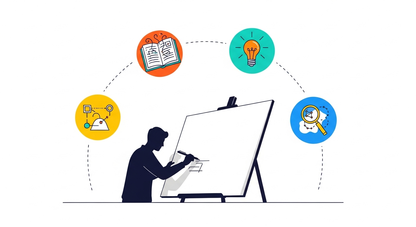
1. Start with the Why (It’s Not Just About Pretty Pictures)
Design excellence starts with curiosity. Before opening Figma, Illustrator, or Photoshop, dig deep into the problem. Learn about your client, their audience, and their competitors.

- Dig deep: Talk to clients or users. Ask what they need, not just what they want. I once worked with a bakery owner who thought she needed a “modern” logo but really wanted something that felt like her grandma’s kitchen. A quick chat over scones revealed that.
- Sketch the purpose: Write down the project’s core goal in one sentence. For example, “Make users feel empowered to track their fitness goals in under 10 seconds.”
- Check yourself: If your design doesn’t serve that purpose, it’s just decoration. And nobody’s got time for that.
Example: BrewHaven Café wanted an eco-friendly rebrand. Instead of going straight to logos, research uncovered their customers loved sustainability but disliked corporate “greenwashing.” This insight shaped a brand identity rooted in authenticity.
Tip: Strong research = stronger design foundation.
2. Embrace Constraints (They’re Your Secret Weapon)
Now it’s time to play. Explore different directions before locking onto one idea.
Ways to brainstorm:
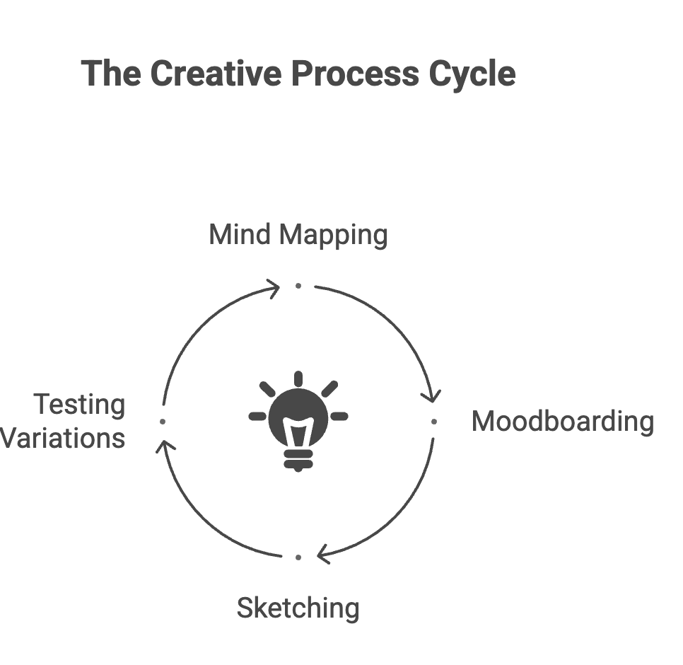
Don’t be afraid to experiment. Creative chaos is where innovation lives.
- Reframe limits: A small budget means you focus on what matters most. A tight deadline? You’ll prioritize and avoid overthinking.
- Get resourceful: Use free tools like Canva for quick mockups or Unsplash for stunning stock images. I once pulled off a killer poster for a local band using nothing but free fonts and a $0 budget.
- Test boundaries: Constraints aren’t rules set in stone. Push back gently, like suggesting a bold color palette when a client insists on “safe” neutrals.
Example (hypothetical): PixelPulse, a startup, had a $500 budget for a product launch campaign. The designer used minimalist vector graphics and a single accent color, creating a cohesive look that felt premium and increased sign-ups by 12%.
Every design comes with limits, like canvas size, brand guidelines, or even color restrictions. For inspiration and free design resources, check out platforms like Canva or Unsplash to spark ideas.
3: Keep the User at the Center
You don’t nail a masterpiece on the first try. Trust me, I’ve cried over too many “final” drafts that looked like garbage the next morning. Excellence comes from iterating, tweaking, testing, and sometimes throwing it all out and starting over.
- Start messy: Sketch rough ideas on paper or a digital whiteboard. Don’t aim for perfection; aim for something.
- Get feedback early: Show your work to colleagues, friends, or even your mom. Fresh eyes catch what you miss. I once saved a project from disaster because my roommate pointed out my font was unreadable on mobile.
- Refine relentlessly: Tweak one element at a time, color, spacing, typography. Small changes add up to big impact.
Example (hypothetical): GlowFit, a fitness app, went through five prototypes before landing on a clean, neon-accented interface. User testing showed the final version cut onboarding time by 20% because it was so intuitive.
4. Design for Humans, Not Just Screens
Here’s where a lot of designers trip up. We get so caught up in pixels and grids that we forget we’re designing for people. Real humans with messy lives, short attention spans, and emotions that drive their choices. Make your designs feel like a conversation, not a lecture.
- Tap into emotions: Use colors, imagery, and layouts that evoke the right mood. A charity’s website should feel hopeful, not sterile.
- Keep it simple: If your grandma can’t navigate your design, it’s too complicated. I learned this the hard way when my first website baffled half my clients.
- Test with real users: Watch how people interact with your design. Are they confused? Delighted? Bored? Adjust accordingly.
Example (hypothetical): CareConnect, a nonprofit, redesigned its donation page with warm images of smiling families and a single “Give Now” button. Donations rose 25% because the design felt personal and urgent.
Great design doesn’t just look good it makes people feel something.
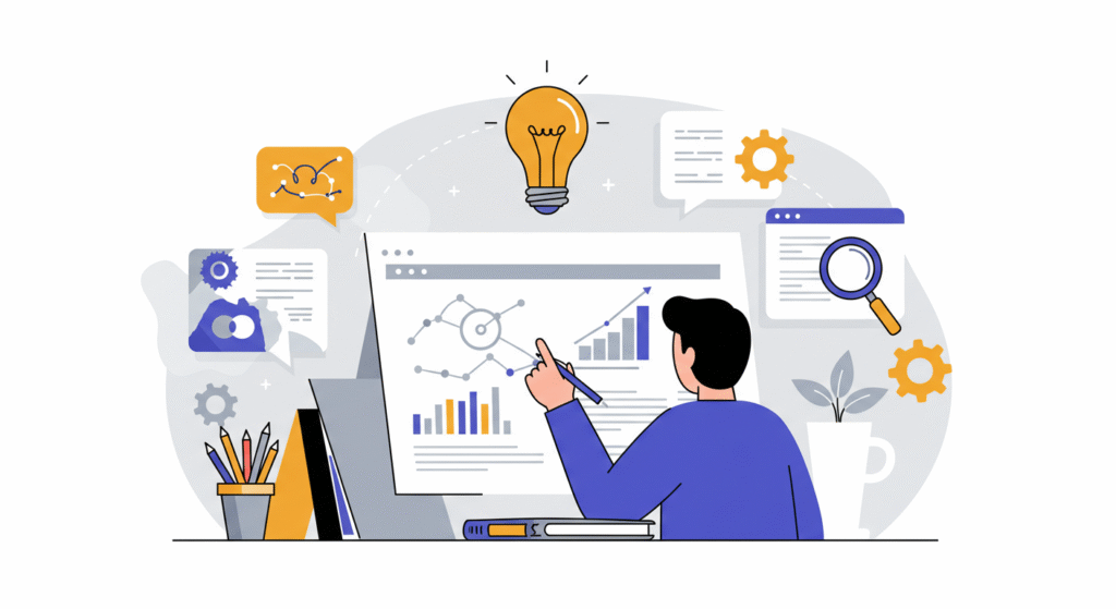
5. Stay Curious and Keep Learning
Design excellence isn’t a destination; it’s a journey. Trends change, tools evolve, and what worked yesterday might flop tomorrow. Stay curious, like a kid exploring a new playground. That’s how you grow.
- Follow the pros: Check out sites like Dribbble or Behance for inspiration. I spent hours scrolling there early in my career, stealing ideas (ethically, of course!).
- Learn new tools: Experiment with Figma, Adobe XD, or even AI design tools. They’re like new paintbrushes for your creativity.
- Study the world: Great design ideas come from life, nature, architecture, even a cool coffee shop menu. I got a logo idea once from the pattern on a seashell.
Example (hypothetical): SparkVibe Studio, a design agency, revamped its portfolio after the team attended a UX workshop. The new, interactive portfolio increased client inquiries by 22% because it showcased their fresh skills.
Good design is never “done.” Trends change, tools evolve, and your creativity grows the more you practice. Explore design communities like Dribbble or Behance to see how professionals push boundaries.
Key Takeaways
- Great design starts with intention, not decoration.
- Constraints fuel creativity: budget/time limits spark resourcefulness.
- User-centered design: higher engagement and conversions.
- Iteration is not failure: it’s the path to brilliance.
- Stay curious, keep learning, and evolve with trends.
Conclusion: Elevate Your Designs with Design Shifu
You’ve got this. By starting with purpose, embracing constraints, iterating like mad, designing for humans, and staying (forever and always) curious, you’re on your way to making work that doesn’t just look good, it changes things.
It is not always easy, but it is worth it. And you want them to be unforgettable? Partner with Design Shifu, the graphic design magicians that will create visuals that pop and connect.
Start with us here at Design Shifu and we will help you create a design that makes you say, “Wow!”
FAQ
What makes a design excellent?
It solves a problem, feels intuitive, and connects emotionally with users. Think clarity, purpose, and a touch of magic.
How do I know if my design is working?
Test it with real users. If they navigate easily and feel inspired to act (e.g., buy, click, donate), you’re on the right track.
Can I achieve great design on a tight budget?
Absolutely! Use free tools like Canva or GIMP and focus on one bold element, like a striking color or clean layout.
How often should I redesign my work?
Revisit designs every 6-12 months or when user feedback shows issues. Trends shift, so stay fresh but don’t overdo it.
What if my client hates my design?
Listen to their concerns, ask about their goals, and iterate. Sometimes they just need to see the why behind your choices.
How can I stand out as a designer?
Blend your unique style with user needs. Partner with pros like Design Shifu for polished visuals that elevate your work.
About the author
Sameena is an Organic Growth Specialist and Content Writer at Design Shifu, crafting SEO-driven content that boosts visibility, builds brand authority, and drives meaningful organic growth.
.webp)


