In this blog

Need a design partner that scales with you?
See exactly how Design Shifu can become your on-demand design team. Book a free demo call.
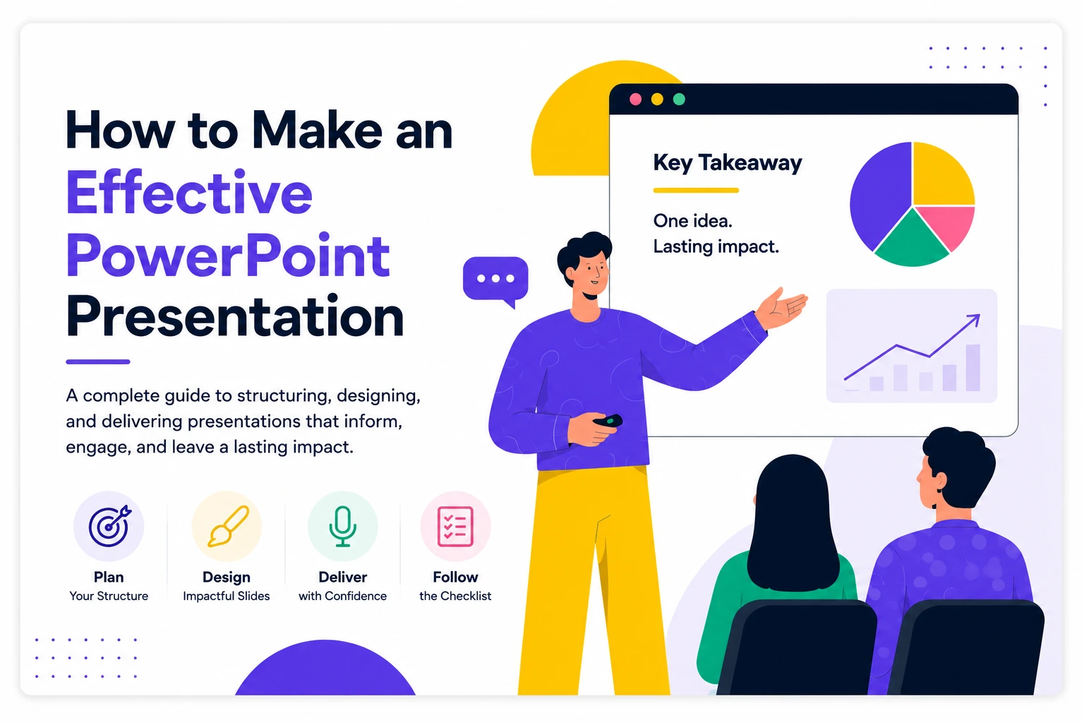
A good PowerPoint presentation is one that integrates clear messaging, a proper presentation, and attractive visuals. Begin with an outline, use fewer texts, apply readable fonts, keep your color theme the same throughout, add supporting graphics or charts to your messages, and conclude your presentation in a powerful manner.
TL;DR
- Most "bad" presentations aren't a design problem, they're a structure problem, and it's fixed before you ever open PowerPoint
- Guy Kawasaki's 10/20/30 rule is still one of the simplest constraints for pitch-style decks
- One idea per slide, always bundle two and your audience loses both
- Delivery matters as much as the slide itself rehearsed pacing beats a memorized script
- A short pre-presentation checklist catches the mistakes that actually sink decks
Search "how to make a good PowerPoint presentation" and most of what comes back is slide-design advice better fonts, better icons, smoother transitions. That's usually not what breaks a presentation. A gorgeous slide with a confusing message still confuses people.
Structure first. Design second. Delivery third. That order matters more than any single tip inside each of them.
How Do You Structure an Effective PowerPoint Presentation? (7 Steps)

- Define your audience — what they already know, what they care about, what they're deciding
- Write your story — the problem, the idea, the outcome
- Create an outline — before you touch a slide template
- Build your slides — one idea per slide, no exceptions
- Simplify the visuals — cut anything that isn't carrying its weight
- Rehearse — out loud, not just read-through
- Deliver — pace, pause, and let the slide support you instead of replacing you
The sections below go deeper on each of these starting with the one most presentations skip.
Structure Your PowerPoint Presentation Before You Design It
Before you touch a template, know three things: the problem you're addressing, the one idea you want people to remember, and what you want them to do with it afterward. If you can't say those three things in a sentence each, you're not ready to start designing slides yet.
For pitch-style decks specifically, Guy Kawasaki's 10/20/30 rule is still one of the best constraints around: 10 slides, no more than 20 minutes, nothing smaller than 30-point font. Kawasaki built it after sitting through countless overlong startup pitches, and the logic holds well beyond fundraising, it forces you to cut everything that isn't the actual point.

Whatever the format, resist the urge to cover everything you know. One throughline, backed by supporting slides, beats ten scattered ideas competing for the same five minutes.
What Presentation Type Are You Building?
The advice above holds in general, but the emphasis shifts depending on what you're actually presenting:
- Sales presentations — lead with the prospect's problem, not your product. Nobody's bought in yet.
- Investor pitch decks — this is Kawasaki's rule's home turf, and it's worth keeping the deck's visuals as consistent as its story; our guide to brand style guides covers keeping a pitch deck visually aligned with everything else your brand puts out.
- Classroom and training presentations — repetition and recap matter more than brevity here. Audiences forget faster than you'd think, so restate the key point more than once.
- Project updates — lead with status and blockers. Busy stakeholders want the headline before the context.
What Are the Best PowerPoint Slide Design Principles?
We've already gone deep on this in our guide to creating stunning PowerPoint graphics and our font-pairing guide for presentations, so we won't repeat all of it here. The short version: presentation expert Nancy Duarte describes slides as "glance media" like a billboard, your audience should process one clearly before turning their attention back to you. One idea per slide isn't a style preference, it's the whole mechanism of how slides work.
If you want the deeper design guidance hierarchy, spacing, icon use, color those two posts cover it properly.
How Do You Deliver a PowerPoint Presentation Confidently?
The slide is a visual aid, not a teleprompter. If you're reading it word for word, your audience is reading ahead of you and waiting for you to catch up which is the opposite of engagement.
TED's own guide to public speaking puts a lot of weight on connection over polish knowing your opening and closing lines are cold, so you're not searching for words at the two moments that matter most. Beyond that: rehearse it out loud at least once (silently reading through slides in your head is not the same skill), and build in pauses on purpose. A pause feels like confidence to an audience; a rushed monotone feels like nerves, even if you're not actually nervous.
What Are the Most Common PowerPoint Presentation Mistakes?
- Walls of bullet points that get read verbatim instead of expanded on out loud
- No single clear takeaway, if someone had to summarize your talk in one sentence afterward, could they?
- Ignoring the time limit, which reads as disrespect for everyone else's schedule, not thoroughness
- Cramming two ideas onto one slide because splitting them "felt like too many slides"
- Designing for print, not the room, text sized for a laptop screen disappears from the back of a conference room

Myth: more animations and transitions make a presentation more engaging.
Reality: audiences remember structure and story, not motion effects. Save animation for the one moment it actually earns its place, not every slide.

PowerPoint Presentation Checklist
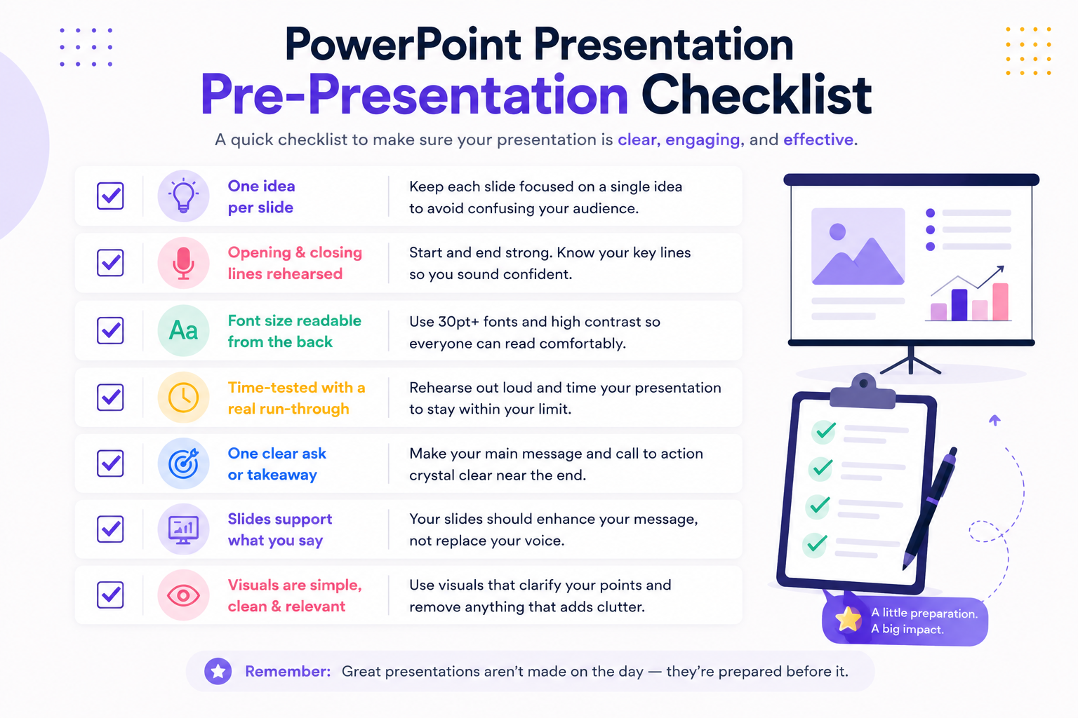
- One idea per slide, no exceptions
- Fewer than 6 bullet points per slide (a rough rule of thumb, sometimes called the 6x6 rule)
- Opening and closing lines rehearsed, not improvised
- Font size readable from the back of the room
- Time-tested with a real run-through, not just a read-through
- One clear ask or takeaway, stated explicitly near the end
- Slides support what you're saying, they don't replace it
Wrapping Up
Great presentations start with a strong story but polished visuals are what make that story memorable. An effective PowerPoint presentation isn't the one with the best transitions, it's the one where the structure was solid before the design ever started, and the delivery matched the effort put into the slides.
If you need a presentation that looks as professional as your ideas, our presentation design team can help, no rebuilding from a template at 11pm the night before.
FAQ
What makes a PowerPoint presentation effective?
Structure first a clear problem, one core idea, and a specific ask followed by clean slide design and rehearsed delivery. Most presentations that feel "off" have a structure problem, not a design one.
How many slides should a presentation have?
It depends on the format, but Guy Kawasaki's 10/20/30 rule (10 slides, 20 minutes, 30-point font) is a solid starting constraint for pitch-style presentations specifically.
What's the 10/20/30 rule for presentations?
A framework from Guy Kawasaki: no more than 10 slides, no longer than 20 minutes, and no font smaller than 30 points. It was built for startup pitches but works as a general discipline for cutting bloat from any deck.
How do I make my slides less text-heavy?
Stick to one idea per slide, keep it under about six bullet points, and say the supporting detail out loud instead of writing it on the slide. If a slide needs a paragraph to explain itself, it's doing the job your voice should be doing.
How long should a presentation be?
Match it to your actual time slot, not the number of things you want to say. A tightly-run 15 minutes lands better than a rushed 25 minutes that goes over.
What's the biggest mistake people make in PowerPoint presentations?
Reading slides word for word. It disengages the audience and signals you haven't rehearsed, even if you know the material well.
Should I read from my slides while presenting?
No, the slide should support what you're saying, not duplicate it. If you find yourself reading it verbatim, that's a sign the slide has too much text on it.
About the author

Sameena is an Organic Growth Specialist and Content Writer at Design Shifu, crafting SEO-driven content that boosts visibility, builds brand authority, and drives meaningful organic growth.


.webp)