In this blog

Need a design partner that scales with you?
See exactly how Design Shifu can become your on-demand design team. Book a free demo call.
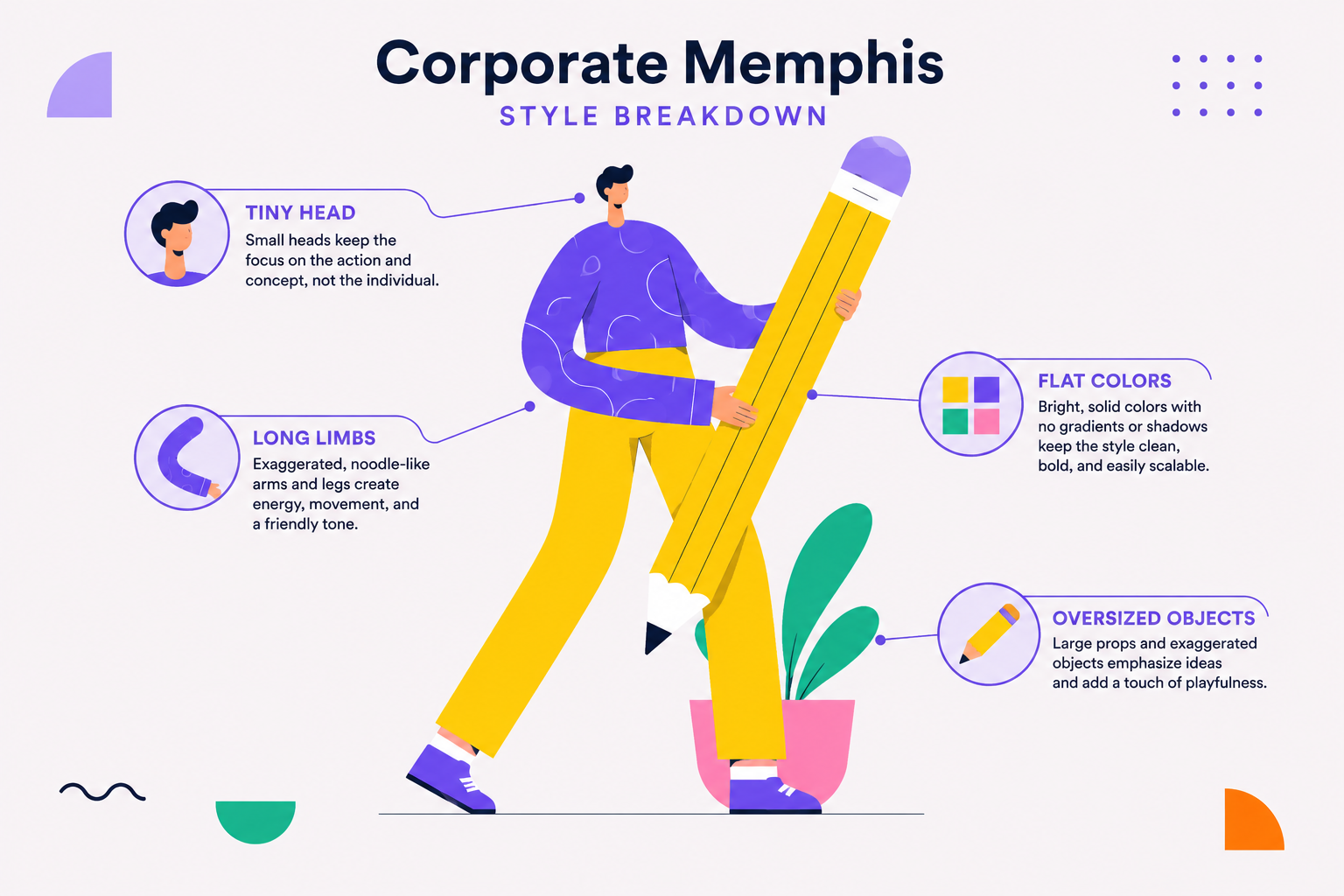
You know it before you can name it. A tiny-headed person with impossibly long, noodle-thin limbs, watering an oversized plant or high-fiving a giant checkmark, in flat purple and orange. You've seen this exact illustration or something close enough to it, on dozens of SaaS homepages, onboarding screens, and pitch decks. It has a name. It's called Corporate Memphis, also known as Alegria.
Here's where it came from, why it took over the internet, and what's replacing it now.

What Corporate Memphis Actually Looks Like
The style is easy to spot once you know what you're looking at:
- Flat shapes, no gradients or shadows in its original form
- Bright, saturated colors a lot of purple, blue, and orange
- Human figures with tiny heads, long elastic limbs, and disproportionate torsos
- Abstract, generic activities: watering plants, high-fiving, climbing ladders, staring at oversized phones
None of it is meant to represent a specific person that's the point, it's built to represent concepts (productivity, collaboration, growth) rather than anyone real.
Where Corporate Art Style Came From
In 2017, Facebook approached the agency Buck to rebuild its in-product illustration and animation system from the ground up. About a year later, the result was launched under the internal name Alegria Spanish for "joy." Buck's own case study describes a scalable library of flat, minimal, geometric figures with oversized limbs and non-representational skin tones, built specifically to feel universal rather than tied to any one demographic.
The "Corporate Memphis" nickname came later, and from somewhere else entirely: coined by advertising creative producer Mike Merrill, who named it after the title of an Are.na mood board collecting early examples, itself a nod to the Memphis Group, a 1980s Italian postmodern design movement known for bold, playful, flat geometry. The illustration style borrows that spirit of flat abstraction; it isn't a direct descendant of the movement, just a knowing reference to it.
Why Corporate Art Style Took Over the Internet
Once Alegria was out in the world, it spread fast, and for practical reasons. It was scalable and relatively quick to produce, which mattered to tech companies illustrating abstract, hard-to-photograph ideas, what does "seamless integration" actually look like in a photo?
It also became widely available through stock illustration platforms, so teams without a dedicated illustrator could license something close enough and drop it straight onto a homepage.
As Marketplace's primer on the trend and Webflow's design blog both cover, it wasn't long before Google, Slack, and WeTransfer among plenty of others were all leaning on some version of the same Facebook-illustration-style visual language.

The Backlash
Here's the thing about a style that solves a real problem cheaply: everyone adopts it, and then it stops feeling distinctive. By the early 2020s, AIGA's Eye on Design was already covering a wave of think-pieces criticizing the trend, and by 2023, Creative Bloq was writing its obituary outright generic, oversaturated, and parodied enough that "looks like Corporate Memphis" became shorthand for "looks like everyone else."
Corporate Memphis vs. What Came After
Corporate Memphis wasn't the last word in generic-startup-visual-language, it was just the first. Here's how it stacks up against what replaced it:
How to Avoid Looking Generic
None of this means flat illustration or bright color is off-limits, the problem was never the technique, it was everyone reaching for the exact same stock assets.
A few things actually move the needle if you want illustration that feels like your brand instead of a template:
- Build an illustration system around your actual brand colors, not whatever palette the stock asset shipped with.
- Base figures and scenes on real customer scenarios, what your users actually do instead of generic "high-fiving a checkmark" stock activities.
- Mix photography with illustration rather than leaning on illustration alone; it breaks up the sameness immediately.
- Keep character proportions consistent across every illustration you use, so the set reads as one system instead of assorted stock grabs.
- Write it down as a guideline once you land on something that works, so every future asset stays on-brand instead of drifting back toward whatever's easiest to license.
Pros and Cons of Corporate Memphis
Like any design trend, Corporate Memphis has strengths and weaknesses. Whether it's the right choice depends on your brand goals.
Key Takeaways
- Corporate art style usually refers to Corporate Memphis (Alegria), the flat illustration style popularized by Facebook in 2018.
- It became the go-to visual language for SaaS and tech companies because it was easy to scale, recognizable, and ideal for illustrating abstract concepts.
- The style is known for bright colors, geometric shapes, exaggerated human figures, and minimal details.
- As more brands adopted the same stock-inspired illustrations, Corporate Memphis became associated with generic, indistinct branding.
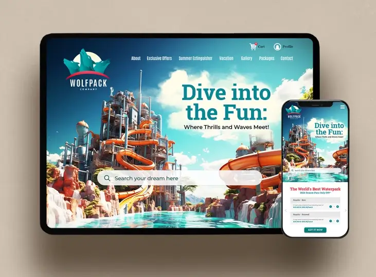
- Many modern brands now favor glassmorphism, soft 3D illustrations, or custom illustration systems to create a more unique visual identity.
- If brand differentiation matters, custom illustrations tailored to your brand are often a stronger long-term choice than relying on widely used illustration styles
If your site is still leaning on generic stock illustrations, there's a good chance your brand is quietly disappearing into a crowd of everyone else who licensed the same asset pack. That's exactly the gap custom illustration closes.
Need a system that actually looks like you, not a template? Our illustration and branding teams build custom illustration systems around your brand, not someone else's stock library.
FAQ
What is corporate art style called?
Corporate Memphis, also known as Alegria. Both names refer to the same flat, brightly colored illustration style.
Where did Corporate Memphis come from?
Facebook commissioned the agency Buck in 2017 to rebuild its illustration system; the result launched in 2018 under the internal name Alegria.
Why do so many websites use the same illustration style?
It's scalable and relatively fast to produce, works well for illustrating abstract concepts that are hard to photograph, and became widely available through stock illustration platforms, so almost any team can license it without hiring an illustrator.
Is Corporate Memphis still popular in 2026?
It's largely fallen out of favor after a wave of backlash starting in the early 2020s, though it still lingers on older sites. Glassmorphism and soft 3D illustration have taken over as the current "default" aesthetics.
What's the difference between Corporate Memphis and the 1980s Memphis Design movement?
The name is a reference, not a direct lineage. The original Memphis Group was a product and furniture design movement known for bold, clashing patterns and postmodern geometry. Corporate Memphis borrows the flat, playful spirit but isn't part of that movement.
Is it bad to use Corporate Memphis-style illustrations for my brand?
Not inherently, but because it's so widely recognized at this point, it risks making your brand blend into everyone else who's used the same stock assets. Custom illustration is the fix if differentiation matters to you.
About the author

Sameena is an Organic Growth Specialist and Content Writer at Design Shifu, crafting SEO-driven content that boosts visibility, builds brand authority, and drives meaningful organic growth.