

In this blog

Need a design partner that scales with you?
See exactly how Design Shifu can become your on-demand design team. Book a free demo call.
In the world of online business, your landing page acts as your digital storefront, a valuable opportunity to engage visitors and encourage them to become customers.
With 80% of users deciding to stay or bounce within seconds, visuals are your secret weapon to captivate, convince, and convert. This isn’t just about pretty pictures; it’s about emotionally intelligent design that speaks to your audience’s desires and drives commercial success.
Let’s explore how strategic visuals can skyrocket your conversions and grow your bottom line.
Why Visuals Are Your Conversion Catalyst
Your audience is bombarded with choices. A visually compelling landing page cuts through the noise, grabbing attention and holding it.
Science backs this up: visuals are processed 60,000 times faster than text, and 93% of consumers say images influence their purchase decisions. The right visuals don’t just decorate, they persuade, building trust and guiding visitors to click “Buy Now” or “Sign Up.”
Crafting a High-Converting Hero Section
Your hero section is the first thing visitors see, and it’s your chance to make them feel something excitement, trust, or urgency. A powerful hero image paired with a bold headline can increase conversions by up to 40%.
How to nail it:
- Emotion-Driven Imagery: Choose images that mirror your customer’s goals or challenges. Selling productivity software? Show a calm professional conquering their to-do list, not a generic laptop. Make them feel the transformation your product offers.
- Color That Converts: Colors trigger emotions that drive action. Red creates urgency for flash sales, blue builds trust for financial services, and orange feels approachable for e-commerce. Align your palette with your brand and intent.
- Clear Value Proposition: Pair your visual with a headline that screams value. “Boost Your Sales Today” beats “Welcome to Our Site” every time. Keep it short, punchy, and benefit-focused.
Building Trust with Visual Credibility
Trust is the currency of conversions. Skeptical shoppers need reassurance before they commit. Visuals can communicate reliability faster than any sales pitch.
Trust-building visuals:
- Customer Testimonials with Photos: A glowing review with a real customer’s face boosts credibility. Studies show testimonials with images increase conversions by 34%. Use authentic, relatable faces not stock models.
- Trust Badges: Display logos of trusted partners, security seals, or “Featured In” media icons. These visual cues scream, “You’re in safe hands.” Keep them subtle but prominent near your CTA.
- Professional Polish: Consistent fonts, cohesive colors, and high-quality images signal professionalism. A sloppy design can tank trust and sales in seconds.
The Power of a Conversion-Focused CTA
Your call-to-action (CTA) is where the magic happens. A visually irresistible CTA turns interest into action, driving purchases, sign-ups, or leads.
Make your CTA irresistible:
- Bold Contrast: Use colors that pop, think green on white or yellow on navy. A contrasting CTA button can lift click-through rates by 20%.
- Actionable Language: Ditch “Submit” for “Get Your Free Trial” or “Shop Now.” Action-oriented text feels like an invitation, not a chore.
- Visual Guidance: Use arrows or subtle animations to draw the eye to your CTA. A button that gently pulses or an icon pointing to “Buy” nudges visitors to act.
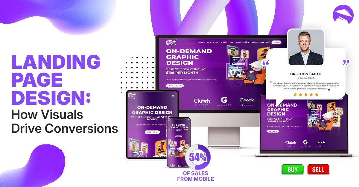
Mobile Optimization: Don’t Lose Half Your Audience
With 54% of e-commerce sales happening on mobile, a desktop-only design is a conversion killer. Mobile-optimized visuals ensure every visitor has a seamless experience, no matter their device.
Mobile must-haves:
- Fast-Loading Images: Compress images (use WebP or JPEG) to load in under 2 seconds. Slow pages lose 50% of visitors.
- Thumb-Friendly Design: Make CTAs and links large enough for easy tapping. A cramped layout frustrates users and tanks conversions.
- Streamlined Visuals: Simplify your mobile design. One striking hero image and a single, clear CTA outperform cluttered carousels.
Storytelling That Sells
Great landing pages don’t just showcase products, they tell stories that resonate. Visual storytelling connects emotionally, making your offer impossible to ignore.
How to tell a visual story:
- Authentic Imagery: Use real customers or behind-the-scenes shots to humanize your brand. Authentic visuals build trust and boost engagement by 25%.
- Visual Flow: Arrange elements to guide the eye naturally headline, image, CTA. Follow the Z-pattern for commercial pages: top left, across, down to the right.
- Micro-Animations: Subtle animations, like a hovering button or loading bar, add personality and keep visitors engaged without distracting from the sale.
Testing for Maximum ROI
Even the best-designed landing page can improve. A/B testing lets you optimize visuals based on real data, ensuring every pixel drives revenue.
What to test:
- Hero Images: Test different emotions does a smiling customer outperform a product shot?
- CTA Colors: Try red vs. green to see which drives more clicks.
- Layout Tweaks: Experiment with button placement or image size to maximize engagement.
Tools like Optimizely or VWO make testing easy, helping you refine your page for peak performance.
Invest in Visuals, Reap the Rewards
A visually stunning landing page isn’t just a nice-to-have, it’s a revenue driver. By blending emotional intelligence with commercial intent, you create a page that doesn’t just attract visitors but converts them into loyal customers. From trust-building testimonials to irresistible CTAs, every visual element is an opportunity to grow your business.
Ready to boost your conversions? Invest in a landing page that captivates, connects, and closes the deal. Your audience and your revenue will thank you.
FAQ
Why are visuals so important for landing page conversions?
Visuals grab attention, evoke emotions, and build trust faster than text. They influence 93% of purchase decisions and can increase conversions by up to 40% when used strategically.
What’s the best color for a CTA button?
It depends on your brand and audience, but high-contrast colors like orange, green, or red tend to perform best. Test different colors to find what drives the most clicks for your page.
How do I make my landing page mobile-friendly?
Optimize images for fast loading, use large, tappable CTAs, and simplify your design. Ensure your visuals and layout adapt seamlessly to smaller screens.
Should I use stock photos on my landing page?
Avoid generic stock photos. Use authentic images of real customers or your product to build trust and connect emotionally with your audience.
How often should I test my landing page visuals?
Test regularly start with A/B tests for hero images, CTAs, and colors. Monitor performance monthly to keep your page optimized for conversions.
About the author
Sameena is an Organic Growth Specialist and Content Writer at Design Shifu, crafting SEO-driven content that boosts visibility, builds brand authority, and drives meaningful organic growth.
.webp)


