In this blog

Need a design partner that scales with you?
See exactly how Design Shifu can become your on-demand design team. Book a free demo call.
TL;DR
- A monochromatic color scheme uses one hue carried through tints, shades, and tones, no other colors added
- It's not the same as analogous or complementary schemes, even though "monotone" gets used as a casual stand-in for it
- Four real-world patterns and two well-known brands show how it plays out
- A simple four-step process gets you from "one color" to a full palette
- It's a great fit for a lot of brands but not every brand. Here's how to tell.
Here's a pattern we see a lot: a design feels "boring," and the instinct is to add more color. Nine times out of ten, that's not the problem the color isn't the issue, the lack of range within it is.
A monochromatic color scheme is one hue, stretched across a full spread of tints, shades, and tones. Done well, it's one of the fastest ways to make something feel considered instead of chaotic. Done lazily, it's just one flat color. Here's the difference.
What Is a Monochromatic Color Scheme?
A monochromatic color scheme uses a single hue, varied through tints, shades, and tones without introducing any other color into the mix. AStudioBinder's breakdown of the concept puts it, the whole scheme lives inside one hue's range, nothing borrowed from anywhere else on the wheel.
That's it. No wheel-spinning, no complicated math. One color, several versions of itself.
Hue, Tint, Shade, and Tone: What's the Difference?
These four words get used loosely, so here's the plain version
- Hue is the base color itself- blue, not "navy" or "sky blue." Just blue.
- Tint is that hue lightened with white- think baby blue.
- Shade is that hue darkened with black- think navy.
- Tone is that hue muted with gray- think a dusty, slightly desaturated blue.
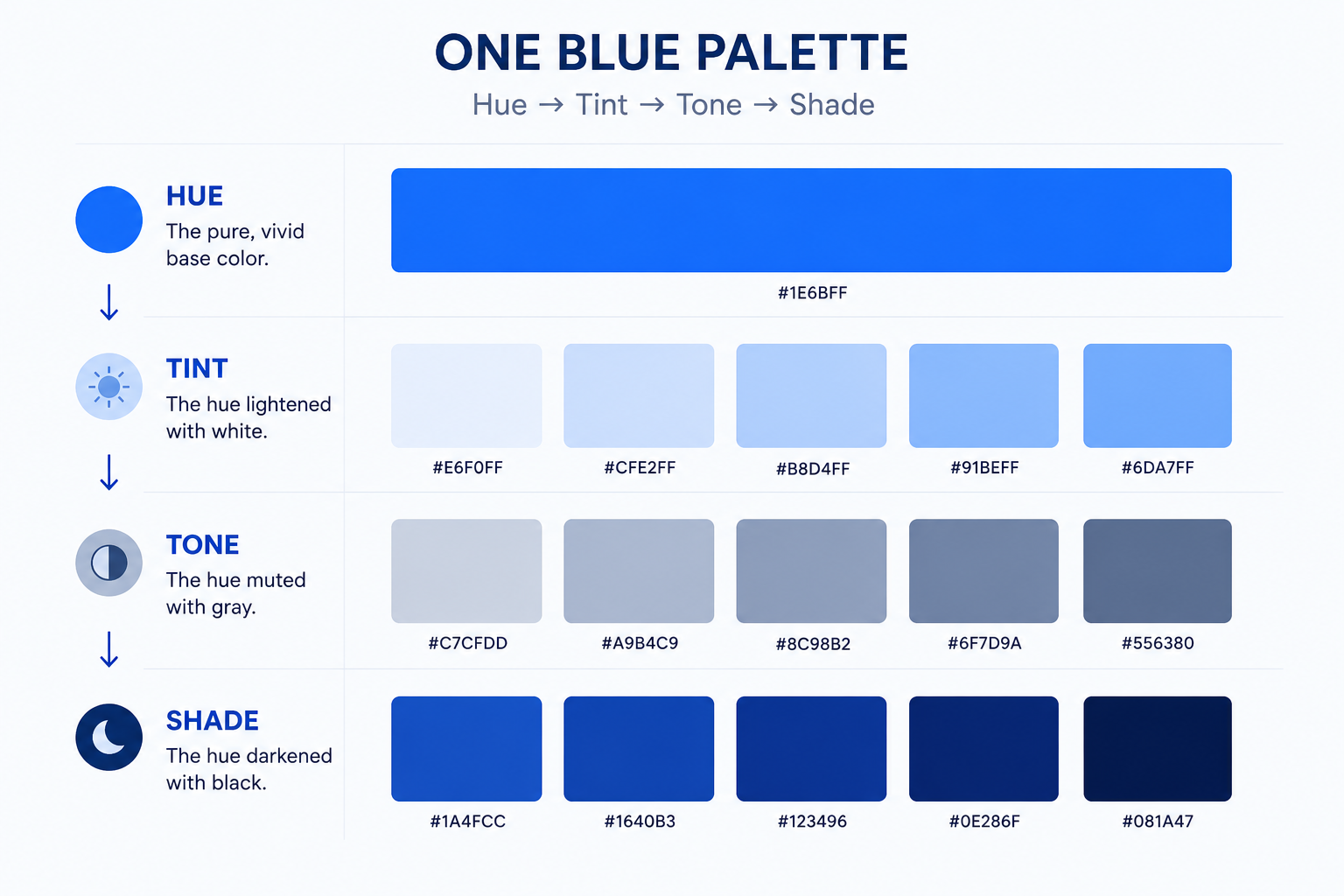
Most working palettes land somewhere between 3 and 7 variations of the base hue enough range to create hierarchy, without losing the "one color" feel.
Monochromatic vs. Monotone vs. Analogous vs. Complementary?
Quick answer: in casual, everyday search design software labels, blog posts, general conversation "monotone" and "monochromatic" get used interchangeably. In print and production contexts, though, "monotone" has a more specific meaning: single-ink reproduction of an image, which can include gray. If you're writing a spec sheet for a printer, the distinction matters. If you're describing a color palette to a client, it usually doesn't.
Analogous and complementary are genuinely different, though
- Analogous colors sit next to each other on the color wheel blue, blue-green, green. Multiple hues, but close neighbors.
- Complementary colors sit opposite each other blue and orange. Built for contrast, not harmony.
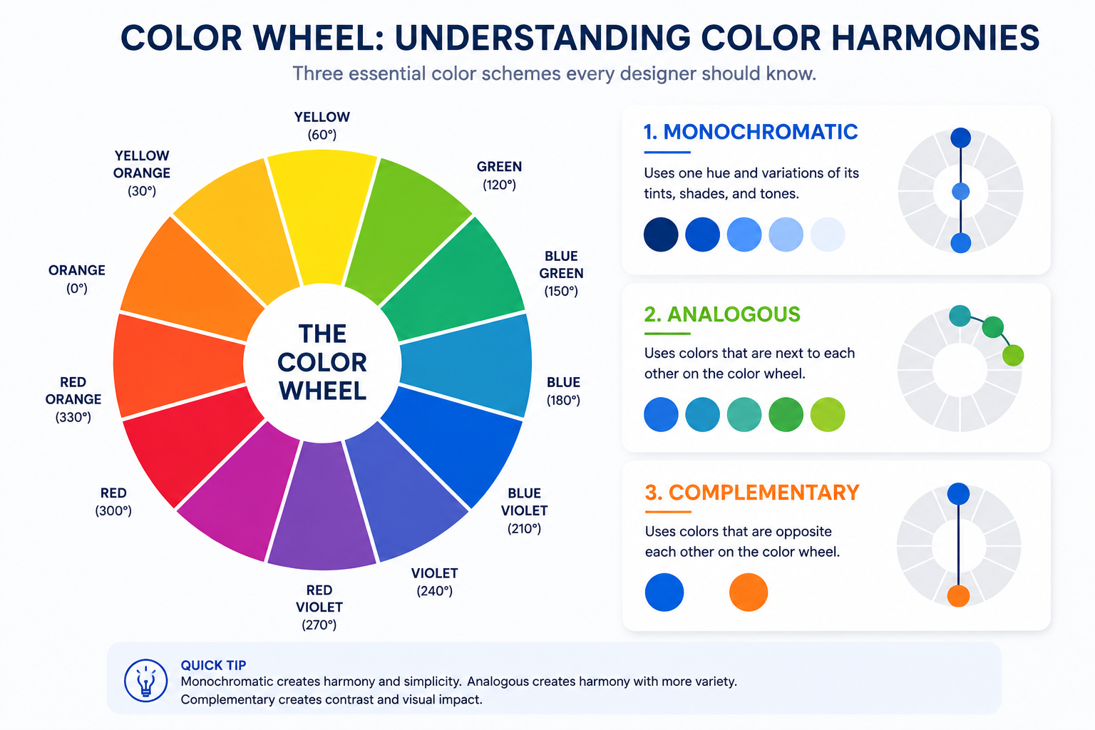
Monochromatic is the odd one out here because it's not about relationships between hues at all. It's one hue, full stop.
If you want the "more than one color, still cohesive" version of this conversation, our guide to triadic color schemes covers what happens once you bring three evenly-spaced hues into play instead of one. And if you want the fundamentals underneath all of this, our color theory in graphic design guide is the place to start.
Monochromatic Color in Action
You'll recognize these patterns even if you've never named them and a few major brands have built entire identities on the same idea.
Common Patterns
- A SaaS dashboard in five blues - from a near-white background blue down to an ink-navy for primary buttons, with nothing else competing for attention.
- A coffee brand in warm browns - cream packaging, tan labels, near-black type, all one hue doing every job.
- A single-color logo mark - a mark that works in one deep shade of a brand's core color, built to hold up whether it's printed on a box or dropped onto a busy webpage.
- A monochromatic Instagram grid - an entire feed built around tints and shades of one color, so the grid reads as a single visual block instead of nine separate posts.

Brands Built on One Hue
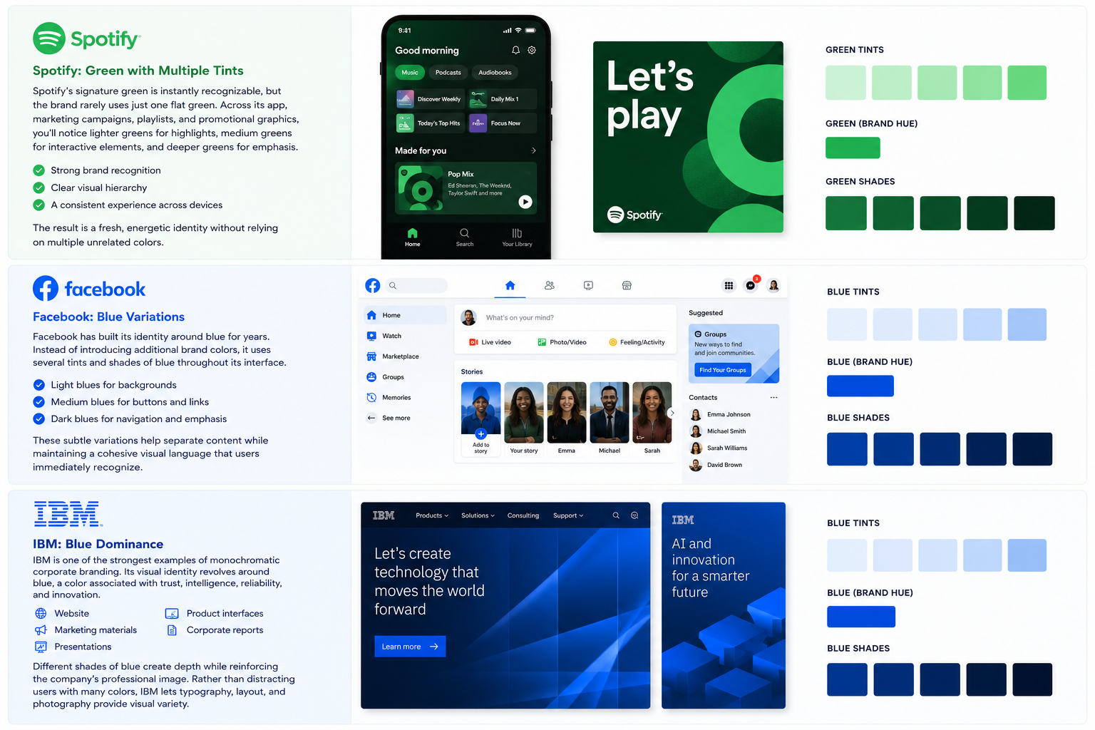
IBM is one of the clearest examples of monochromatic corporate branding. Its identity revolves around blue, a color associated with trust, reliability, and stability and across its website, marketing materials, and product interfaces, different shades of that same blue create depth without introducing a second color. Typography, layout, and photography carry the visual variety instead.
Facebook has leaned on blue for its interface for years, using lighter tints for backgrounds and darker shades for navigation and emphasis. The exact shades have shifted with redesigns over time, but the underlying approach of one hue, several values, used to separate content without adding a second color has stayed consistent.

Spotify is a slightly different case worth calling out: its green is instantly recognizable, but the app itself is mostly black, white, and gray, with green used deliberately as a single accent color rather than a full system of green tints and shades. It's a good example of restraint working alongside a signature hue, even if it's not a pure monochromatic system.
How to Build a Monochromatic Palette (4 Steps)?
- Pick your base hue, ideally one that already means something for the brand, not a random pick.
- Generate your tints and shades. Most design tools can do this in a few clicks once you drop in a base hex code in Figma, this typically means a color-scale plugin rather than a native feature, since Figma itself doesn't auto-generate a full tint-and-shade ramp from one hex value out of the box.
- Add one neutral for contrast- a true white, black, or gray. Pure monochromatic palettes can flatten out without something neutral to separate foreground from background.
- Test it in context, not in isolation. A palette that looks great as five swatches in a row can still fall apart once it's actually on a button, a card, and a headline together. Getting the balance right is a layout problem as much as a color problem. Check the palette against real pages before you call it done.

Using Monochromatic Color in Logos and Branding
A monochromatic logo works especially well when:
- You need it to survive being printed in one ink color, embossed, or dropped onto a photo background
- The brand feel you're going for is minimal, premium, or restrained
- You want one strong color to be the brand, the way certain productivity and design-tool brands build recognition around a single signature hue
It works against you when:
- Your category is already color-coded and everyone's fighting over the same hue finance and blue is the classic example
- You need to stand out in a visually loud environment, a shelf, a feed, a lineup of competitors where a second color would actually help you get noticed
Monochromatic Color in Art vs. Graphic Design
In fine art, a monochromatic palette is usually a mood decision, it strips away color as a variable so the viewer's eye goes straight to form, light, and composition instead.
In graphic design, the goals shift toward brand consistency and functional contrast: a monochromatic UI still needs to meet accessibility contrast requirements between text and background, which a painting never has to worry about. Same technique, different job.
Wrapping Up
A monochromatic color scheme isn't a limitation, it's a discipline. One hue, handled with enough range in tints, shades, and tones, can carry a brand further than three colors thrown together ever will. If you've got the hue but not the time to turn it into a full system, logo, palette, the works that's exactly what our branding team does. Send us the color, or let us help you find it, and we'll build the rest.
Need help creating a consistent brand identity?
Design Shifu's dedicated designers can create logos, brand guidelines, social media graphics, presentations, and marketing assets that follow a cohesive color system and strengthen your brand across every touchpoint. Start a free trial today
FAQ
What is a monochromatic color scheme in one sentence?
It's a color palette built from a single hue, varied through tints, shades, and tones, with no other colors added.
Is monotone the same as monochromatic?
In everyday design conversation and search, yes the two get used interchangeably. In print and production work, "monotone" has a stricter meaning (single-ink reproduction, which can include gray), so the terms aren't always identical there.
How many colors are in a monochromatic palette?
There's no fixed rule, but most working palettes use 3 to 7 variations of the base hue enough for visual hierarchy without losing the "one color" feel
What's a good example of a monochromatic color scheme?
A SaaS dashboard built entirely in shades of blue, a pale blue background, mid-blue accents, and a near-navy for primary actions is a common real-world example.
Is monochromatic the same as black and white?
No, and this is a common mix-up. Grayscale (black, white, and gray) has no hue at all. Monochromatic means one hue carried through tints, shades, and tones for example, light blue, medium blue, and navy, all still recognizably "blue." A black-and-white photo is often described loosely as "monochromatic," but technically it's grayscale, not a hue-based scheme.
Does a monochromatic logo work for every brand?
No. It's strong for minimalist, premium-feeling brands and for logos that need to survive one-color printing, but it can work against you in categories where everyone already uses the same hue, or where you need to stand out in a crowded, colorful space.
Can monochromatic designs use gradients?
Yes. A monochromatic gradient blends lighter and darker variations of the same color to add depth and dimension without introducing additional hues. It's a common way to make an otherwise flat monochromatic design feel more dynamic in backgrounds, app interfaces, and marketing graphics.
About the author

Sameena is an Organic Growth Specialist and Content Writer at Design Shifu, crafting SEO-driven content that boosts visibility, builds brand authority, and drives meaningful organic growth.